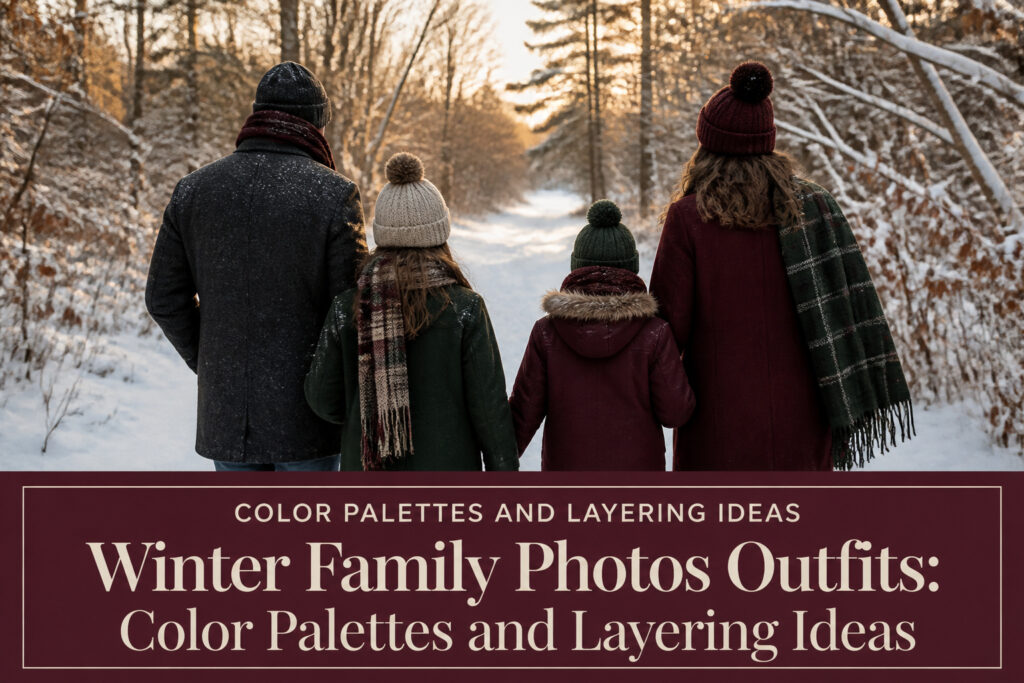
Winter family photos outfits are the color palettes and layered textures that keep a group looking connected under flat, gray light instead of letting everyone blur into the background. The catch is that the same snow or bare branches that make winter backdrops beautiful will also drain color from anything too pale or too bright. Photographers keep returning to forest green and deep burgundy against charcoal because those tones already exist in the winter woods, and they flatter skin without casting odd reflections.
Dark Neutrals with Green or Burgundy
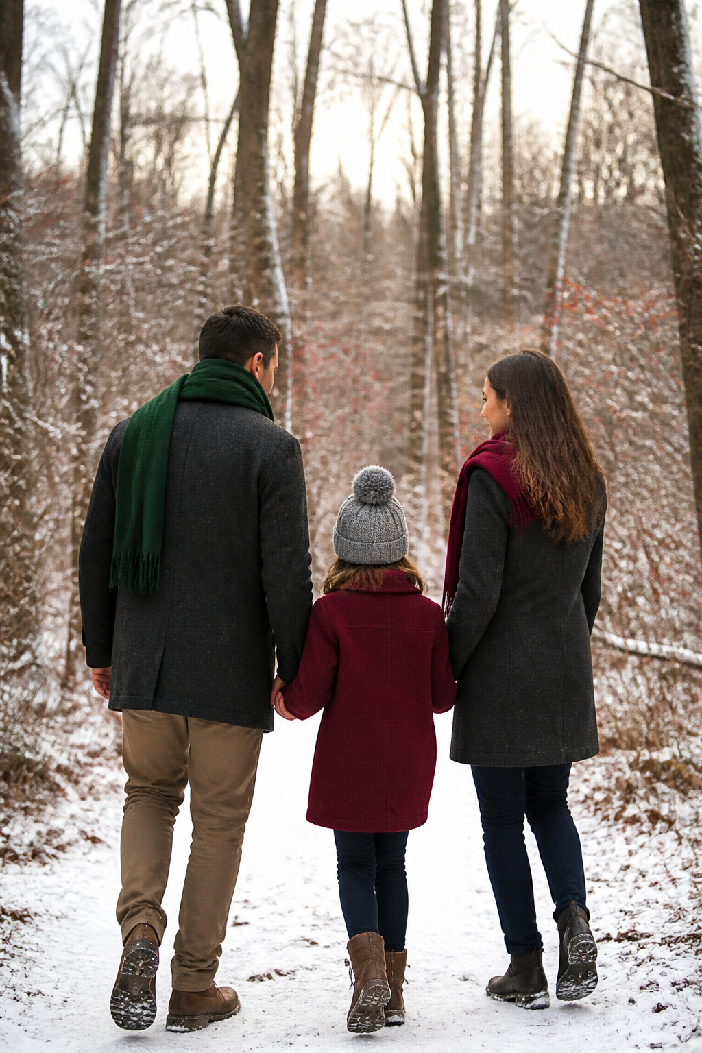
Forest green and deep burgundy against charcoal, navy, or black reads as polished without trying too hard, which is why photographers keep recommending it. The colors mirror what is already in front of the camera: pine needles, bare branches with berries, the muted depth of winter woods. Against snow, the contrast is sharp enough that no one fades into the background, but the palette never tips into holiday-costume territory. That versatility matters if you are shooting in December but framing the prints for year-round walls.
Everyone already owns something in one of these tones, so building a cohesive group takes less shopping than you would expect. One person might wear a burgundy wool coat, another a forest green scarf, the third a charcoal base with just a hint of one accent color. Mixing green and burgundy together works, but focusing on just one and letting the others anchor it in black, grey, or cream keeps the look grounded. The deep, earthy quality flatters most skin tones without casting the odd color reflections that brighter shades can throw in outdoor light.
Dark Neutrals with Rust, Terra Cotta, Tan, and Brown
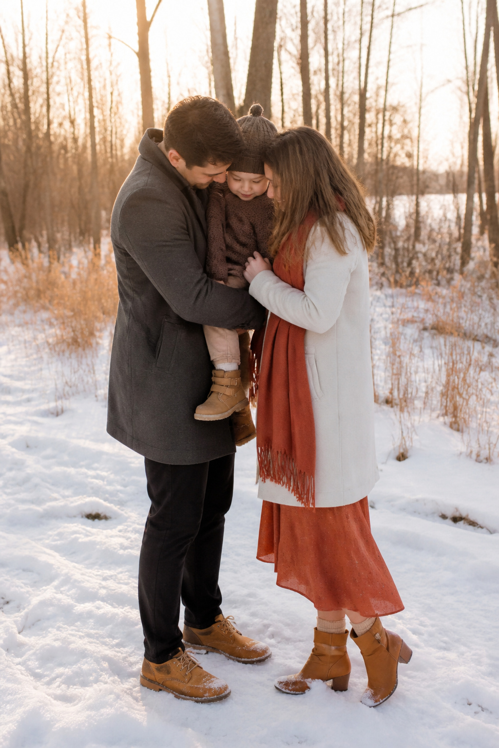
Late afternoon winter light has a way of draining color from everything it touches, which is exactly why rust and terra cotta matter so much against a dark base. A charcoal coat or deep chocolate sweater absorbs that flat light instead of fighting it, and the warm clay tones sitting on top read as living skin rather than costume. I have seen the same family shot at 3:30 and 4:15; the rust scarves and terra cotta pocket squares were the only colors that still carried weight as the sun dropped.
The Christmas-red problem is real. True crimson against black or navy in winter light goes straight to greeting card territory, and it pulls focus from faces. Rust sits in the same warm family but lower in saturation, so it photographs as texture first and color second. Terra cotta does the same work at a slightly lighter value, which keeps it from sinking into dark wool the way a true red might.
Tan and brown keep the whole palette from floating. Without them, rust and terra cotta can start to look like makeup on the wrong skin tone, too deliberate. A camel boot, a tan leather belt, or a brown corduroy vest gives the eye somewhere neutral to rest and grounds the family group against snow or bare trees. The dark base provides depth, the warm accents provide life, and the mid-tone browns provide the bridge that makes them read as one intentional choice rather than three separate outfits.
Light Neutrals with Navy and Cranberry
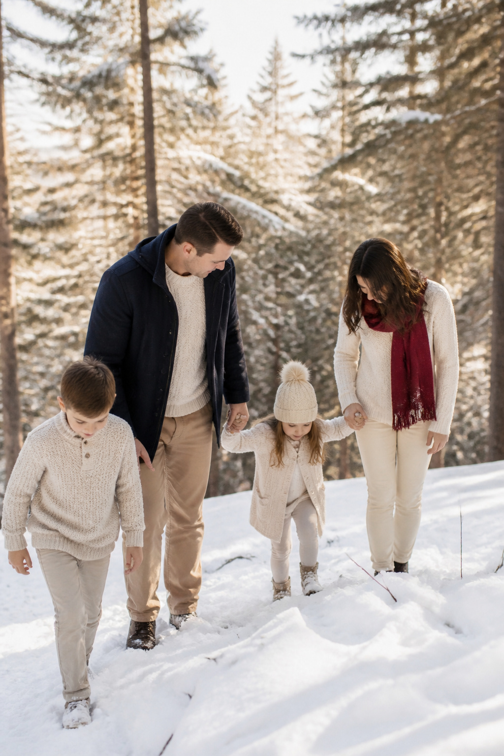
Cream and beige bases do something practical in overcast winter light that darker palettes cannot: they catch the gray sky and bounce it back into the frame, keeping faces visible instead of letting them sink into shadow. Navy and cranberry fit into this scheme as anchors, not centerpieces. The deep blue keeps the combination from reading as holiday-themed when green is already in the mix, and the cranberry adds just enough warmth to stop the neutrals from washing out entirely.
The risk with this palette is snow. Cream or off-white blends into a white background and erases the body, which is why pure white and large cream fields are the first things to avoid in a snowy session. Small cream touches, a beige coat, a oatmeal sweater under a navy jacket, those read as texture rather than disappearing acts. The balance works when one person carries the cranberry, another the navy, and the rest stay in those lighter neutrals with no single shade repeated head to toe.
Jewel Tones
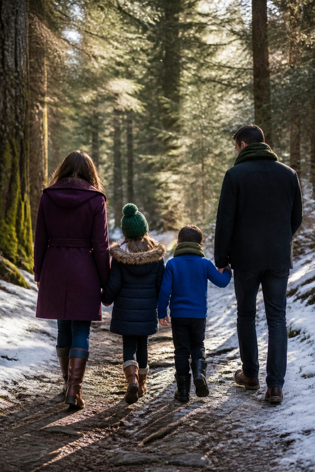
Jewel tones bring back the saturation winter light tends to flatten. Deep blues, emerald, amethyst, and sapphire read as rich rather than neon, and that matters when overcast skies drain color from everything in the frame. These shades flatter most skin tones without casting the odd reflections that bright neons can leave on faces.
The trick is keeping the family coordinated without turning matchy. One person in a sapphire coat, another in a deep blue scarf, a third in olive green corduroy: the colors talk to each other without anyone blending into the person beside them. Bodies start to merge when two people wear the same exact shade, so vary the depth and the piece. A solid jewel tone on one person pairs well with a textured version, like corduroy, on another. If you want a pattern, limit it to one or two people and keep the rest in solids that pick up a single color from the print.
Earth Tones and Neutrals
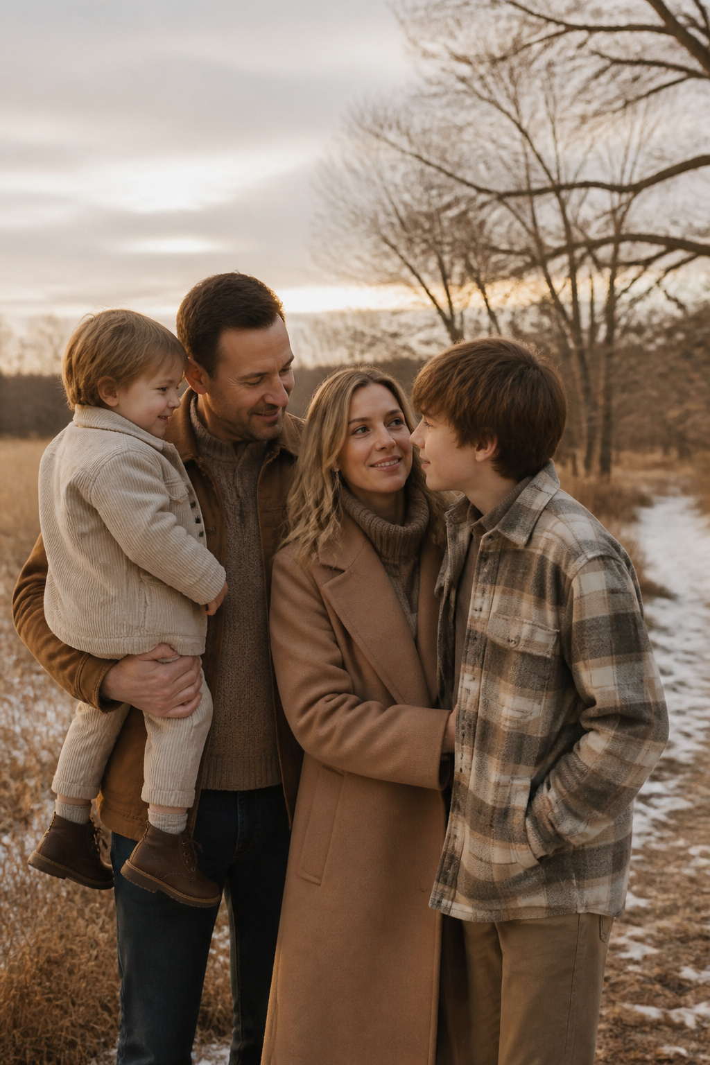
Camel, cognac, oatmeal, and stone form the most forgiving palette for winter family photos outfits when relatives are pulling from closets rather than shopping together. These four shades read as a single family without anyone needing the exact same sweater. A toddler in oatmeal corduroy, a teenager in stone flannel, parents in camel and cognac layers: the tones warm each other without demanding anyone match.
The safety here is practical. Most people already own something in this range, and the colors sit quietly in winter light instead of competing with faces. Cream or off-white can work as an accent, though I would keep it away from large expanses in snow, where it risks washing out. Forest green or burgundy can layer in for depth if one person wants a richer tone, but the core four carry the group on their own.
Texture does the coordinating work. Corduroy, wool, knit, and denim all read as related neutrals even when the pieces came from different decades and stores. That variation keeps the frame from flattening into a single block of color, which is what happens when everyone wears the same shade head to toe. The goal is looking like yourselves in the same photograph, not like a catalog spread.
Soft Neutrals with One Accent Color
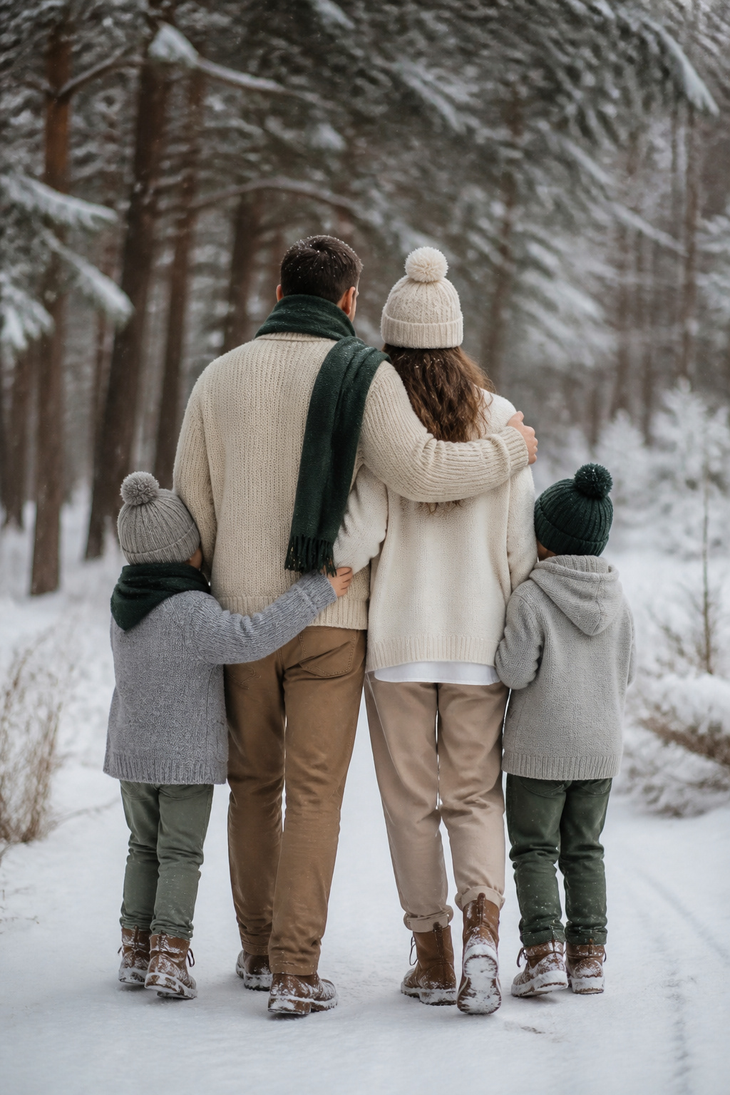
A base of cream, beige, or gray keeps winter family photos outfits from turning into a shouting match of competing colors. The sources lean toward whipped cream as the lightest neutral, with warm grey as a quieter alternative, and both play well against almost any skin tone. The restraint matters most once the group hits six people or more; too many competing accents and the frame starts to look like a catalog spread instead of a family.
One person carries the accent color, but the trick is giving them enough of it that the eye registers the pop, then echoing that same shade in smaller doses on two or three others. A forest green scarf on the person in the center, olive socks on the kid to the left, a burgundy belt on the adult to the right. The olive or burgundy becomes the thread, not the spotlight. Rusty copper works as that optional extra only if the group is small enough to absorb one more variable without chaos.
Gray in particular earns its place here because it pairs with any accent without fighting for attention. Charcoal pants, heather sweaters, the same tone in different textures, knit against velvet against denim. The visual interest comes from the material shift, not from adding another hue. For the person holding the accent, a solid block of olive or forest green in a coat or cardigan reads as intentional; the same color scattered in tiny pieces across six bodies reads as an accident.
Rich Browns and Warm Neutrals
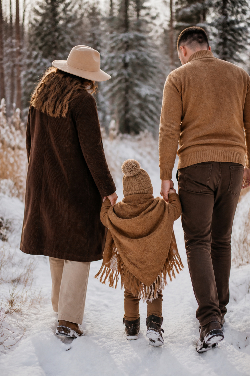
Pale neutrals tend to go chalky under flat winter light, which is why chocolate, espresso, and caramel carry the photo better than beige or cream ever could. The depth keeps skin tones from looking drained and gives the camera something to register even when the sky is a solid gray sheet.
Texture matters as much as color here. A chunky popcorn knit in deep brown photographs with real dimension; the shadows fall between the stitches and give the fabric shape instead of letting it flatten into a solid blob. Fringe does something similar, adding movement at the edges without the bulk of a heavy coat. Last year I put a toddler in a knit bonnet with a caramel fringe blanket against dormant grass, and the brown range held up across every shot, morning to late afternoon, where a sand-colored set would have disappeared into the ground.
For adults, layering these tones at different depths works better than matching exactly. One person in espresso corduroy, another in a lighter caramel sweater, keeps the group connected without the uniform look. The warm end of brown also plays well with the mustard and deep orange accents that show up in a lot of winter backdrops, so you are coordinating with the season rather than fighting it.
Deep Oranges and Reds
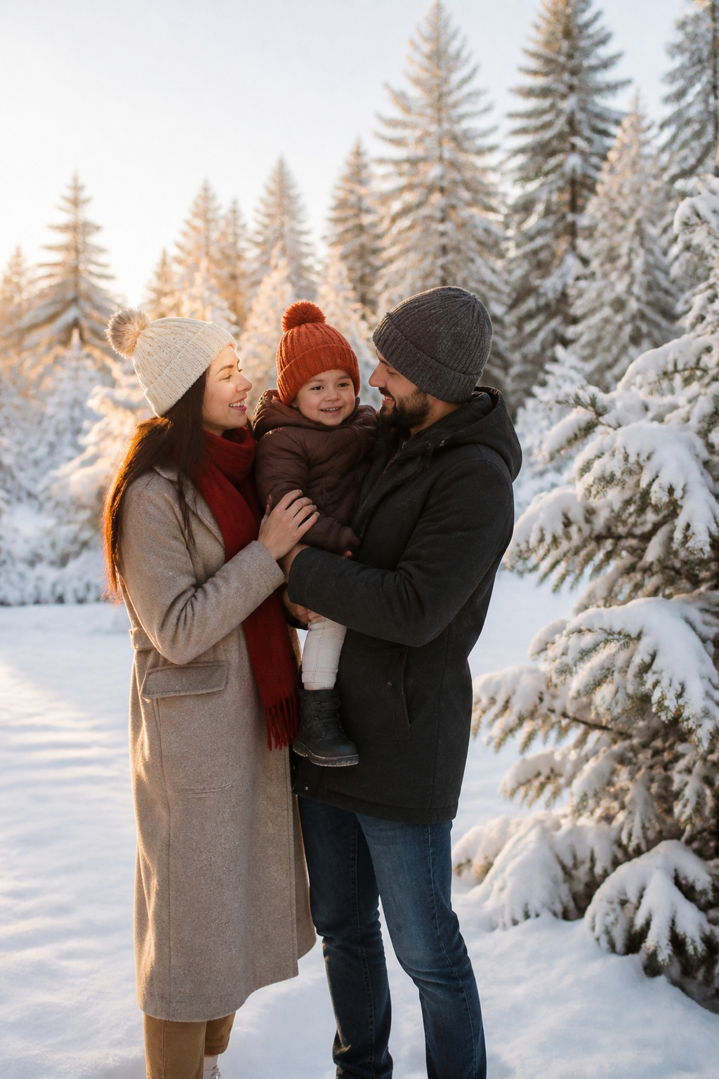
Burnt orange and brick red carry a real risk of looking like a Christmas card if you drop them into a winter photo without a plan. The difference is usually saturation: a true cherry red reads festive, while a muted cabernet or cranberry reads seasonal. Limit the boldest shade to one family member, and keep it away from whoever stands at the center of the grouping. That person draws the eye already; dressing them in the loudest color collapses the whole frame toward one spot.
Chocolate brown or warm taupe do the grounding work here. They replace black, which can go flat in winter light, and they let the deeper reds breathe without competing. I would put the burnt orange on a secondary figure, a child or a partner off-center, and anchor the rest of the family in those browns and a creamy white that brightens without stealing focus. Burgundy works as an alternative accent if two people want a warm color but you need to keep them from matching too closely.
Forest green or soft gray, drawn from other palettes that work in this season, can step in if the reds start to feel too heavy. The goal is depth, not a holiday greeting. Three to five colors total, each person choosing within that range, keeps the photo looking coordinated rather than staged.
Shades of Blue
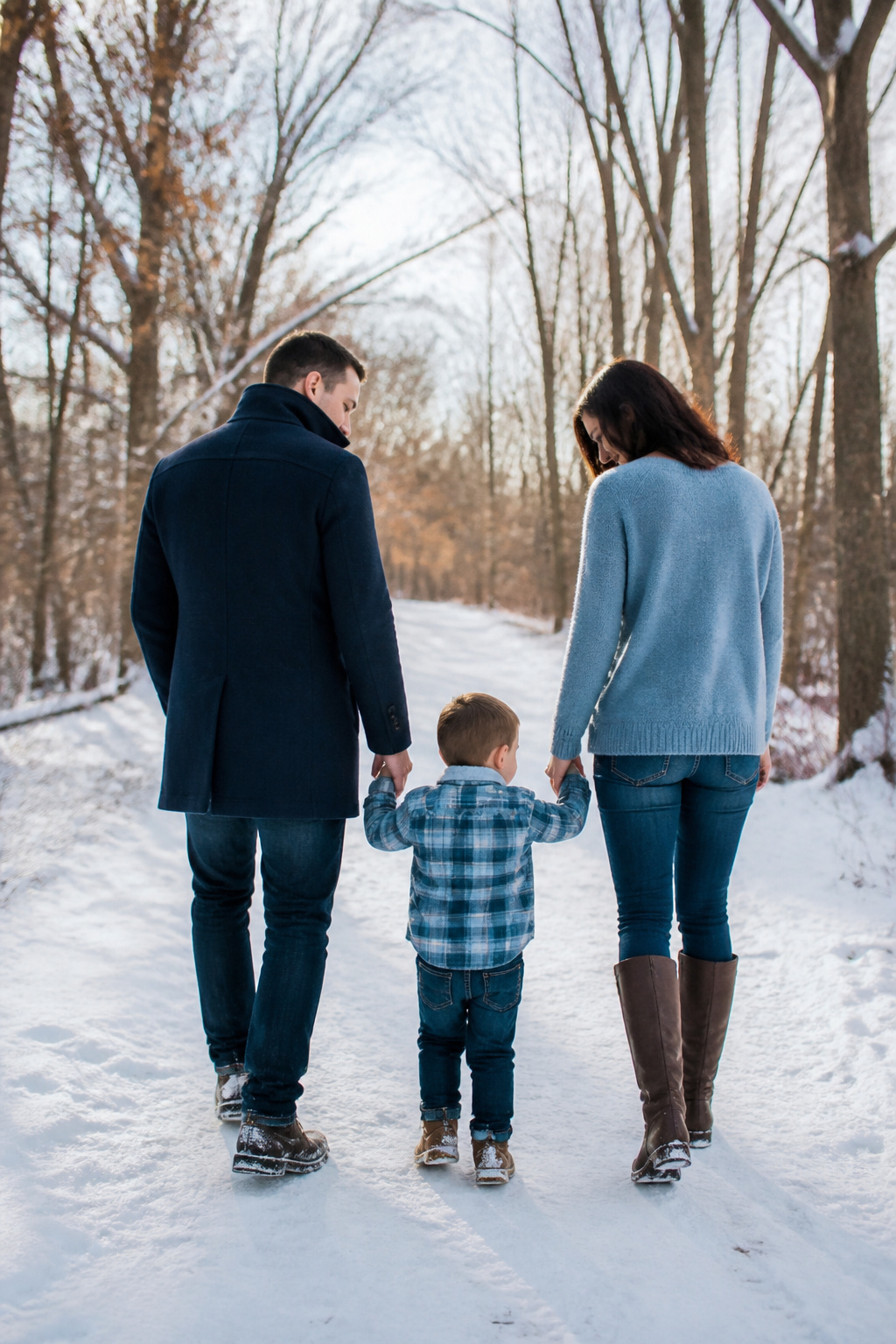
A monochromatic blue family grouping works because navy, steel, sky, and powder blue all register as the same color family on camera while staying far enough apart to keep bodies from bleeding together. The sources keep pointing to deep blues as the anchor, and that tracks with what I have seen in winter light: a midnight navy coat reads as structure, not shadow, against snow.
The trick is varying value and texture, not just hue. Put one person in a matte navy wool, another in a steel-blue cashmere with a slight sheen, a third in powder blue flannel. The camera sees depth where the eye sees blue. Skin tone matters less with this palette than with warm colors; blue reflects cleanly rather than casting orange or pink onto faces.
What breaks the look is putting everyone in the same flat medium blue. The sources warn against matchy-matchy dressing for exactly this reason: bodies merge, and the group turns into a single blue blob with five heads. One pattern at most, kept to a single person, with everyone else in solids that sit at different points on the light-to-dark scale. A sky blue scarf against a navy coat gives the eye a place to travel without leaving the palette.
Mustard Yellows
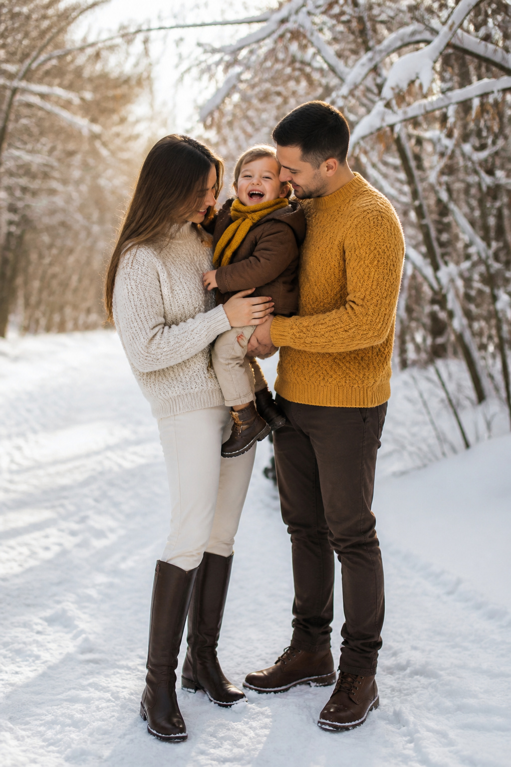
Mustard yellow reads as intentional in winter family photos because it carries enough brown pigment to sit comfortably against bare branches and evergreen boughs rather than shouting for attention. In golden-hour light, which already tilts warm, the shade can turn jaundiced on anyone with strong yellow undertones in their skin. Against that same light, it flatters cooler complexions and anyone whose natural coloring leans pink or olive. The family member who wears it well is usually the one who already owns a camel coat without looking washed out.
Texture matters as much as tone. A chunky popcorn knit or a fringe-trimmed scarf in mustard catches the low winter light and keeps the color from reading flat on camera. The added dimension helps the shade hold its own against brown-toned backdrops like the rock and dormant brush at a state park setting. Keep the mustard to one piece per person, or one person per group, and anchor it with chocolate brown or a deep cream rather than pairing it with black, which turns the yellow harsh and accidental.
Layering with Textures
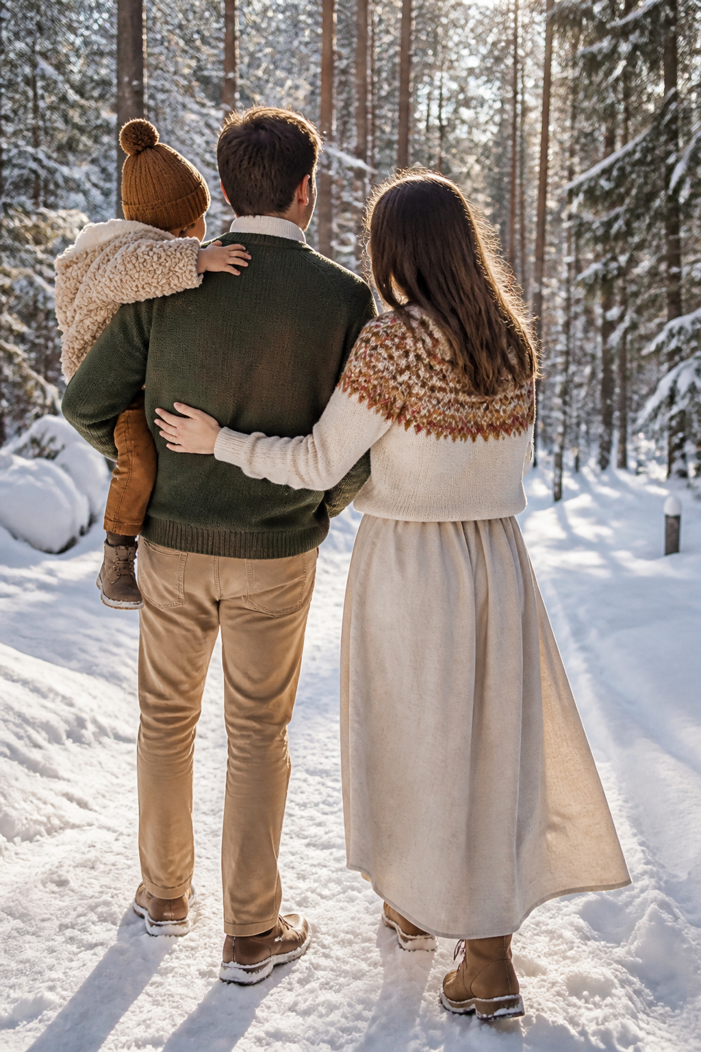
Thin thermals sit closest to the skin across every palette, followed by a long-sleeved shirt, then a sweater. That three-tier stack traps heat without the puff that blocks a child’s face when someone lifts them. Corduroy belongs in this lineup more than it gets credit for; its ridged surface catches light differently than flat denim or smooth knit, so even in a two-dimensional photo you read it as depth. A brown knit bonnet or a popcorn cardigan works the same way: the eye registers the texture before it registers the color. The fringe on a jacket adds interest without bulk, and a mustard blanket draped over a baby reads as a layer, not an afterthought. The mistake is stopping at color and forgetting that fabric does the actual work of making a group look dimensional against a winter backdrop.
Accessories Like Scarves and Hats
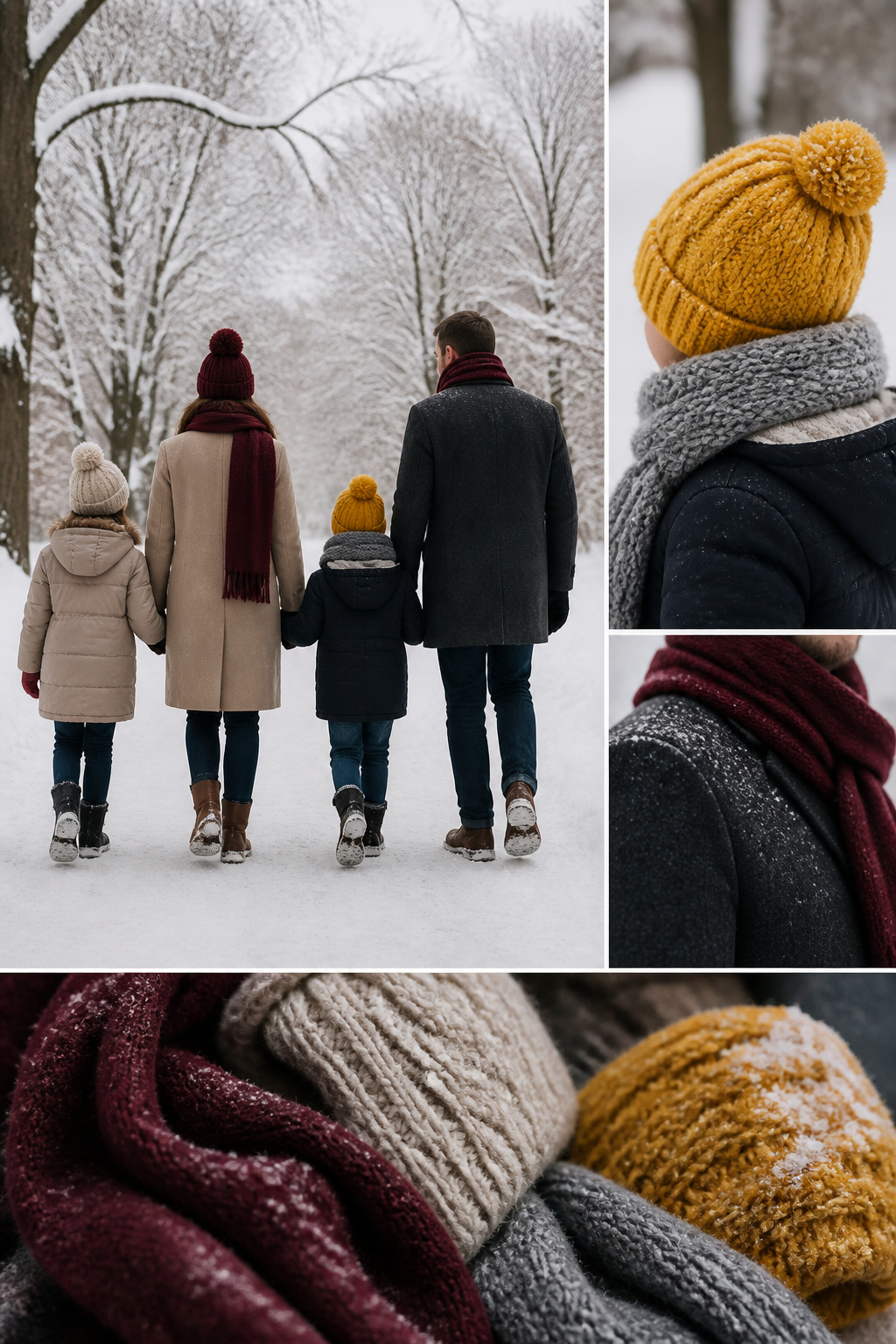
A beanie on a toddler or a wool scarf looped over a coat collar does more than fight the cold. Those pieces become the punctuation that finishes a winter family photo outfit, the detail that keeps a gray sweater from looking like a gray blob against snow. Chunky knits, a soft blanket wrapped around a baby, even thick socks peeking from boots: they all add texture the camera actually reads.
The trick is making sure everyone in the frame looks related without looking uniform. One color story does that work. Pick a base neutral, cream or gray, then one accent like burgundy or forest green. Each person wears those colors differently: Dad in a gray beanie, Mom in a burgundy scarf, the kids in gloves that split the difference. Mix the materials too, knits against velvet or denim, so the eye moves across the group instead of locking on identical stripes.
Wool and acrylic blends build the static that sends hair flying the second a hat comes off. Cotton knits, cashmere, or fleece-lined pieces keep warmth without the charge, especially for anyone going hatless part of the session. For little ones, plan gloves and hats into the outfit even if you ditch them once everyone is warm. Bare hands hitting snow tend to end the shoot faster than a missed nap.
Color Palettes That Work
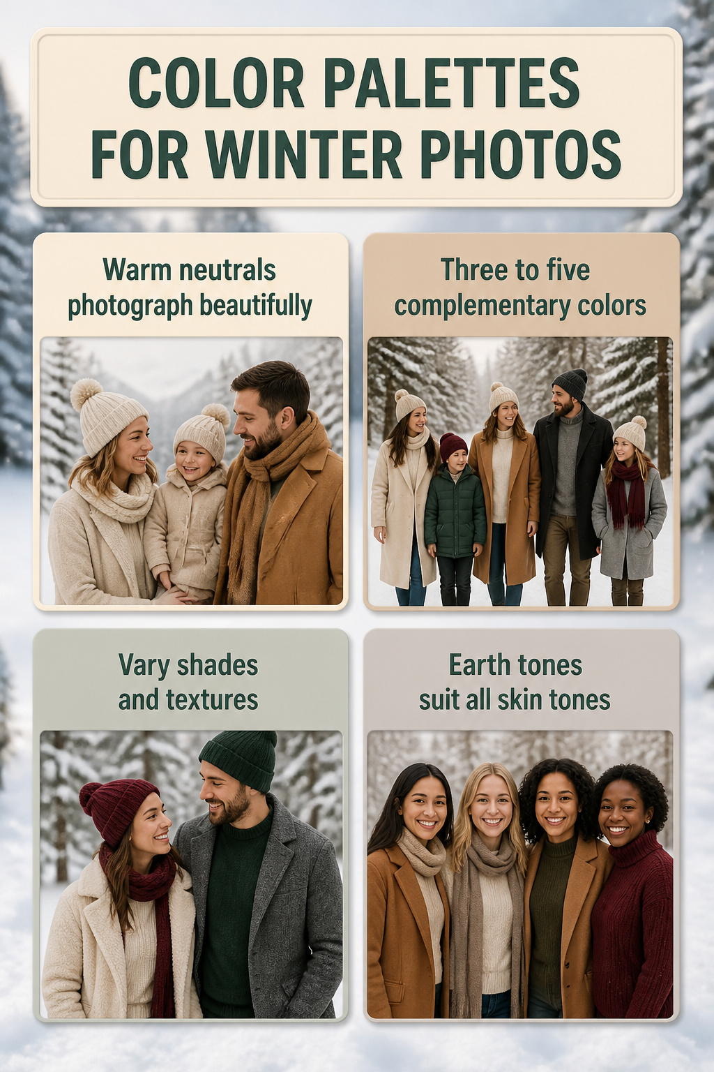
Warm neutrals like cream, beige, and camel photograph beautifully in winter light, and they flatter most skin tones without casting unwanted colors across faces. The trick is choosing among them based on where you are standing. Against snow, cream and camel keep you visible while white washes you out; against bare trees and dark evergreens, those same warm tones catch the light and separate the family from the background. Forest green, burgundy, and soft gray add depth without overwhelming the frame, and they pair naturally with the wood and pine that dominate winter scenery.
A palette of three to five complementary colors gives everyone room to move. Let each person pick pieces they actually want to wear within those shades; the coordination comes from the range, not from matching exactly. Bodies blend together when everyone wears the same color, and the eye loses track of individual faces. Vary the shades and textures instead. If one person wears a pattern, keep the rest in solids that coordinate with it. Earth tones and muted neutrals work across the widest range of skin tones and backdrops, which is why they show up in so many finished galleries. The palettes that last are the ones where everyone feels like themselves.
Coordinating Without Matching
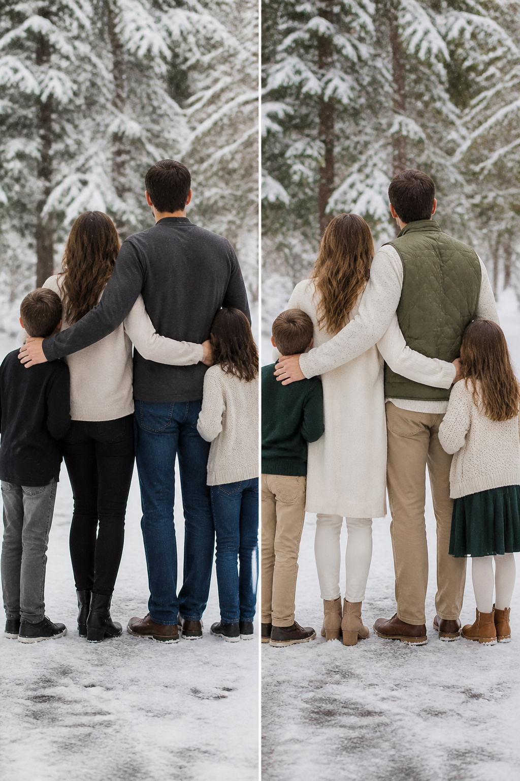
Pick a color story instead of identical outfits. One base neutral, cream or gray or beige, plus one or two accents like forest green, burgundy, or navy, gives everyone something different to wear without the group looking scattered. Each person carries a different piece from that palette, and the camera reads depth instead of flat repetition.
Identical outfits flatten the image. When everyone wears the same sweater in the same shade, the eye stops at the surface and the people underneath blur together. Mixing knits, velvet, and denim keeps the look cohesive while the textures do the actual work of separating one body from the next.
Two main colors plus neutrals is enough to narrow things down without stripping away personality. Cream photographs better than white against snow. Muted or rich tones suit more skin tones than anything bright or neon, so pick the one that actually works on you and let the rest of the family orbit around it. The question to ask is how each person already dresses to look like themselves, because matching day-to-day is not the goal, and a photo session should not be the one time you pretend otherwise.
What Parents Should Wear
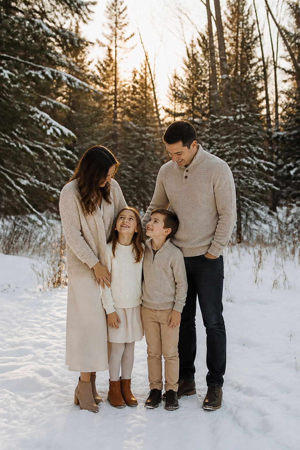
Parents anchor the family’s color palette, and that order matters more than most people realize. The kids fill in around the parents’ choices, not the reverse. Start with a statement piece that still feels like something you’d actually wear: a midi skirt or maxi dress layered with a cozy cardigan works well for moms, while neutral sweaters or a clean button-up with chinos or dark jeans photograph cleanly for dads. Comfortable pieces that photograph well should still reflect your personal style within the chosen scheme. The principle runs both ways; stiff, unrecognizable versions of yourself show in the finished image just as clearly as clashing colors do. Jewel tones can shift the whole mood toward playful or classy depending on the cut and fabric, but the richness works because it doesn’t fight skin tones or a winter backdrop. Let the children pick between two pre-selected options so they feel involved without breaking the palette you’ve already set.
Dressing Kids for Outdoor Winter Photos
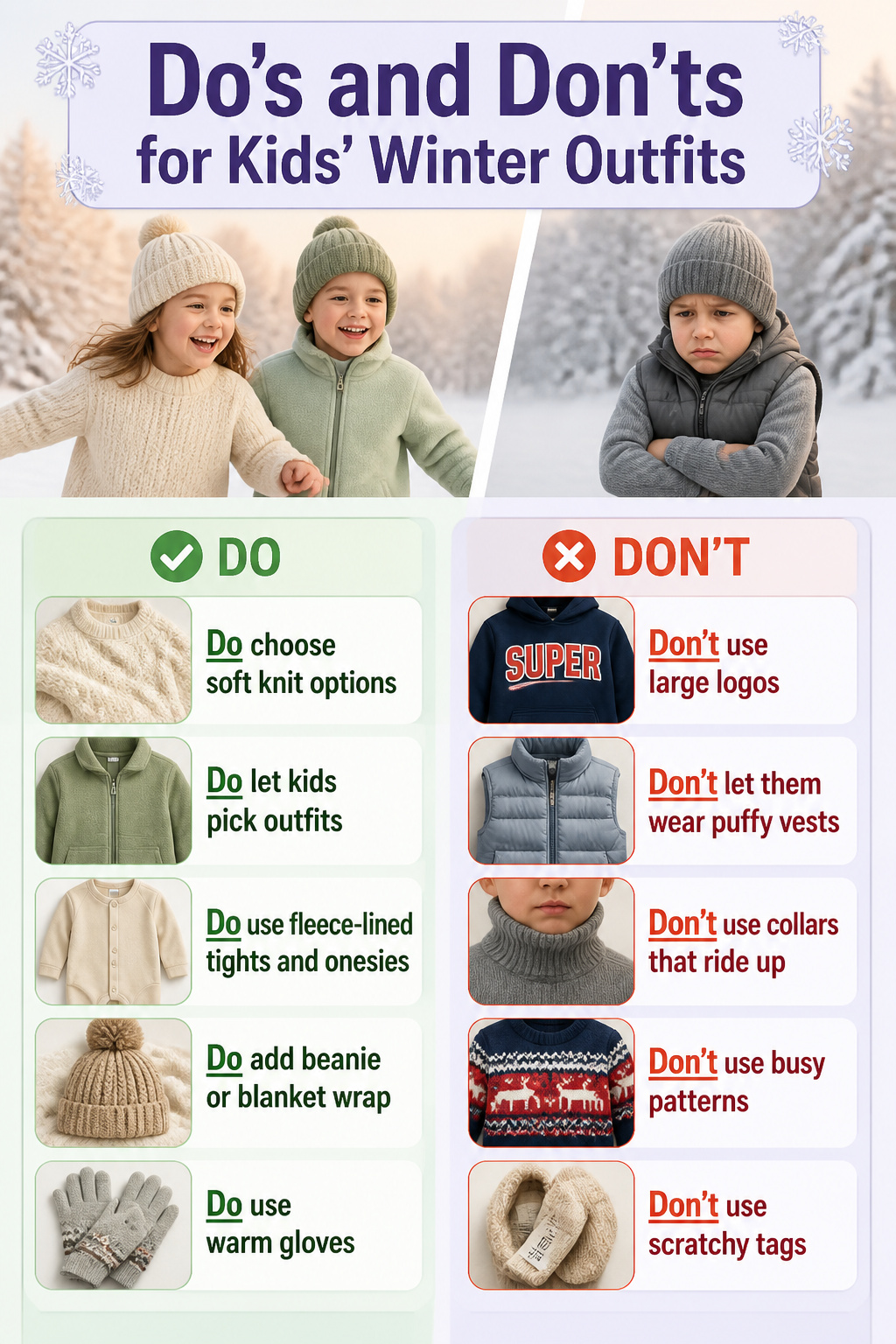
Kids who cannot move do not smile like kids who can. I learned this the hard way after stuffing my niece into a cable-knit sweater so thick she could barely bend her arms; the photos show her looking like a stiff little bell. Soft knit sweaters, fleece jackets, and cozy rompers let children actually play, which is what produces the unguarded expressions parents want. The same rule applies to what goes underneath. Fleece-lined tights and warm onesies add heat without the bulk of puffy vests, which tend to block faces when a parent lifts a child. Collars that ride up are another common culprit.
Comfort also means giving kids some control. Letting them choose between two pre-selected outfits cuts the morning struggle and lets them feel involved. Try everything on a few days ahead, accessories included, so scratchy tags or tight waistbands surface early. Large logos and busy patterns will pull focus in every frame, so skip them. Solid colors from the family palette keep the eye where it belongs. For babies, a chunky knit beanie or a blanket wrap adds warmth and texture at once. Gloves matter too; cold hands end sessions faster than almost anything. If the kids warm up and want to ditch the hats, you can always remove them once the camera is rolling.
Frequently Asked Questions
What colors look best for winter family photos?
Warm neutrals like cream, beige, and camel catch winter light well and flatter most skin tones without casting odd color reflections. Forest green, burgundy, and soft gray add depth without overwhelming the frame. A palette of three to five complementary colors gives everyone room to choose pieces they actually want to wear.
How do I coordinate family outfits without matching exactly?
Pick a color story with one base neutral plus one or two accents, then let each person carry a different piece from that palette. Mixing knits, velvet, and denim keeps the look cohesive while textures separate one body from the next. Identical outfits flatten the image and make people blur together.
What should parents wear for winter family photos?
Parents anchor the palette, so kids fill in around their choices. A midi skirt or maxi dress layered with a cozy cardigan works well for moms; neutral sweaters or a clean button-up with chinos or dark jeans photograph cleanly for dads. The pieces should still feel like something you’d actually wear, since stiffness shows in the finished image.
How should I dress kids for winter outdoor photos?
Soft knit sweaters, fleece jackets, and cozy rompers let children move and play, which produces the natural expressions parents want. Fleece-lined tights and warm onesies add heat without the bulk of puffy vests that block faces when a parent lifts a child. Let kids choose between two pre-selected options so they feel involved without breaking the palette.
What winter outfit colors work for both Christmas and general winter photos?
Cream, beige, forest green, and burgundy read as seasonal without tipping into holiday-costume territory. The deep, earthy quality flatters most skin tones and mirrors what is already in winter backdrops: pine needles, bare branches, and muted woods. Against snow, the contrast stays sharp enough that no one fades into the background.