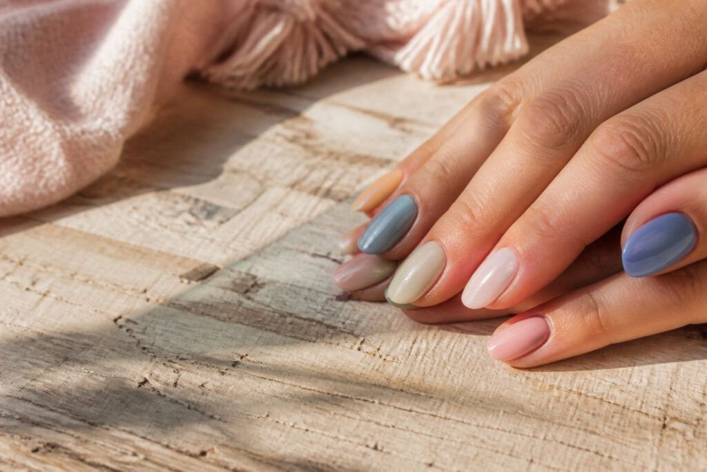
Trendy pastel nails are a soft, muted manicure palette built on milky pinks, powder blues, and pistachio creams rather than their brighter cousins.
The trap is assuming every pastel reads the same; a dusty sky blue with a denim undertone looks modern while the wrong yellow turns immediately chalky against skin.
Naomi Yasuda, who paints nails for celebrities, singles out that denim-toned pastel blue specifically as the way to avoid the Easter-egg effect.
1. Sky Blue
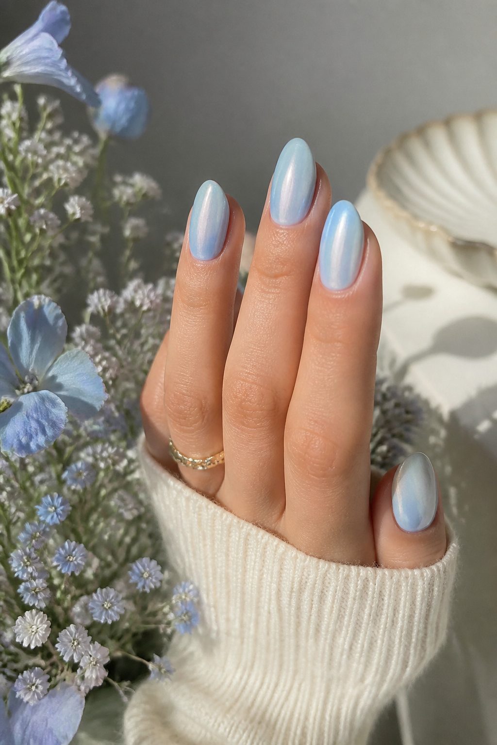
Sky blue keeps showing up across spring and summer collections as the pastel shade that still feels fresh.
The color carries that slightly milky quality that separates pastels from brighter blues, giving nails a soft, wearable finish instead of something too electric or too babyish.
Celebrity nail artist Naomi Yasuda calls out denim-toned pastel blue specifically as a way to keep the look sophisticated and avoid the Easter-egg trap that lighter shades sometimes fall into.
A dusty or muted sky blue reads modern where a brighter version might feel dated.
For shape, a soft almond or short squoval keeps the color elegant, while a high-shine or pearlized glazed finish updates it further. If you are color-shy but want to move past nudes, this is the gentle entry point.
2. Lavender Milk
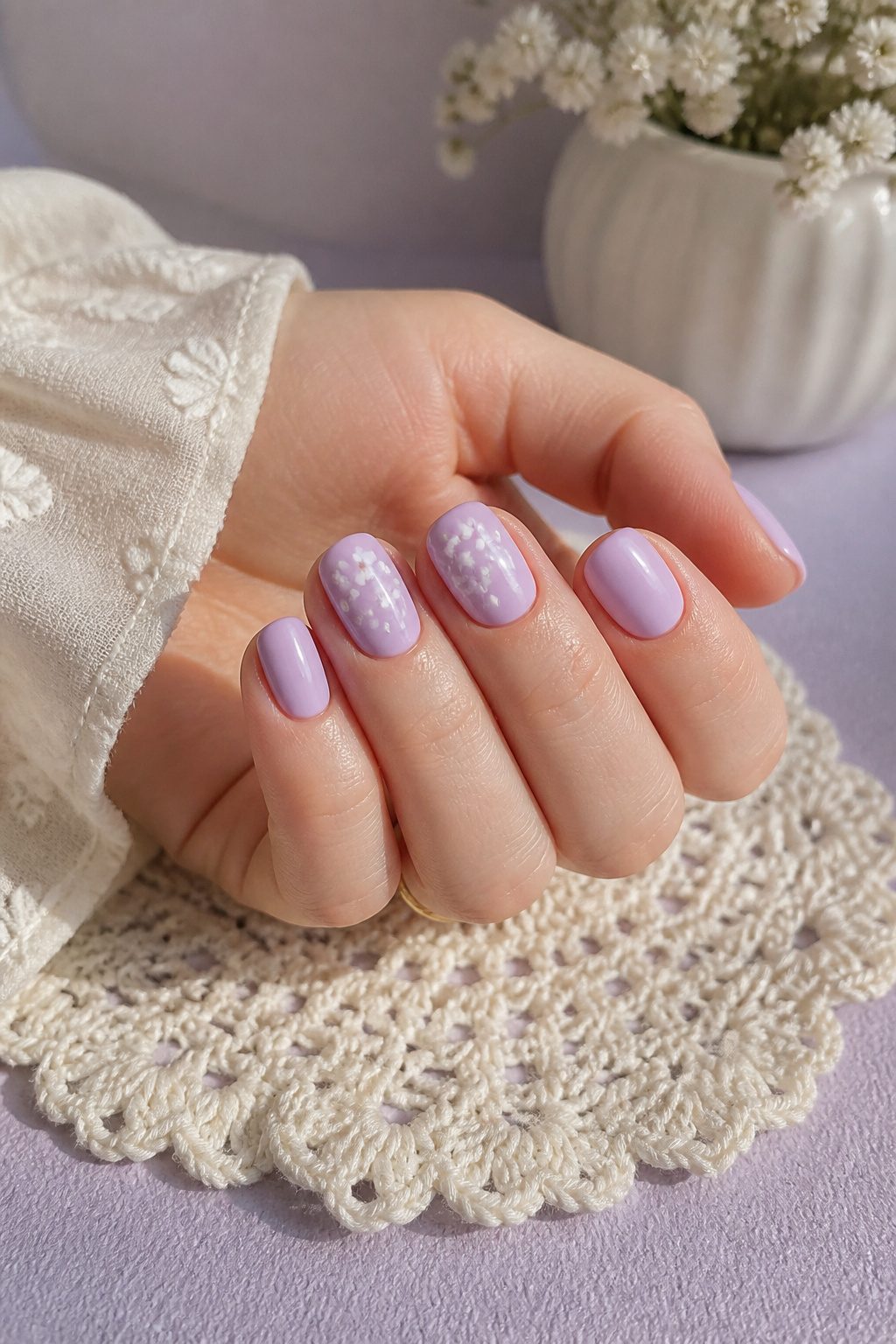
Lavender milk keeps showing up as the pastel shade people actually ask for by name. The color sits in that narrow space between purple and gray, muted enough to read as neutral but still unmistakably feminine.
What saves it from looking juvenile is the milkiness, that slightly cloudy quality that softens the pigment into something more sophisticated than straight lavender.
A solid lavender milk manicure works on its own, though it also pairs cleanly into a pastel French tip where the dreamy tone replaces traditional white.
The shade reads particularly well against cooler skin tones, but the gray undertone keeps it from clashing with warmer complexions the way bluer pastels sometimes do.
If you are color-shy and usually default to nudes, this is the gentlest step toward actual color without the commitment of something brighter.
3. Classic Pastel Pink
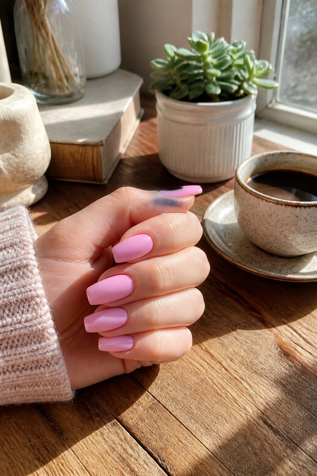
Classic pastel pink sits at the center of any conversation about trendy pastel nails for a reason.
It reads as polished in a boardroom and soft enough for weekend errands, which makes it the safest first purchase if you are new to pastels and unsure where to start.
The shade flatters most skin tones without the chalky washout that plagues cooler pastels, and nail technicians reach for it more often than any other color in the pastel family because clients rarely reject it.
What separates a good pastel pink from a forgettable one is the undertone.
A drop too much yellow turns it bubblegum, which fights the muted quality that makes pastels feel current. A drop too much blue drifts into ballet territory, which is its own look but not this one.
The sweet spot sits right in the middle: warm enough to look clean against the nail, neutral enough to pair with whatever you are wearing.
I have watched friends try lilac or mint first, then retreat to this shade when the bolder color clashed with half their wardrobe. Pastel pink does not demand that you plan your outfit around it.
For application, two thin coats give better results than one thick one, which is true of most pastels but especially here because the color shows streaking immediately.
A glossy top coat keeps it from reading too bridal; matte tips it toward editorial. Either finish works, which is the whole point of starting here before you branch out.
4. French Butter
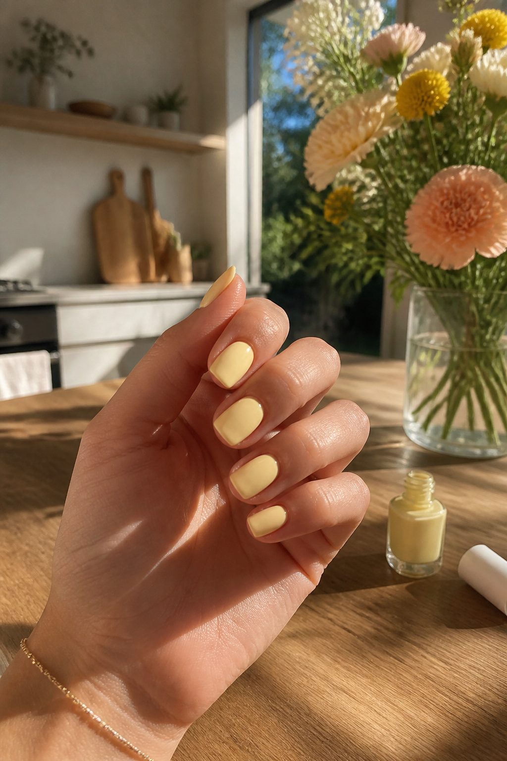
French butter reads as a warm, creamy pastel yellow that sidesteps the chalky, school-bus quality that can make yellow nails look immediately dated.
What convinced me, looking through dozens of swatches, was how this particular shade keeps enough cream in the mix to sit softly against skin tones rather than fighting them.
The warmth matters more than the exact hue.
A yellow pulled too far toward lemon or too close to neon starts to look like a caution sign; French butter stays in the narrow zone where it feels edible and lived-in, like actual butter left out on a counter.
On nails, that translates to a color that reads intentional rather than accidental.
For wearability, this shade works best with a glossy finish. Matte pastels of any kind flatten toward chalk, and French butter has enough yellow in it to risk that slide.
A high-shine top coat keeps the cream quality active and the overall effect expensive rather than elementary. Skip matte here unless you want a retro 1960s look on purpose.
5. Lilac
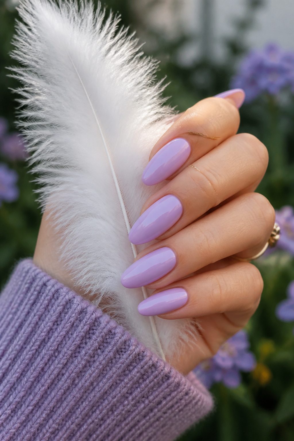
Lilac carries a slightly cooler, more blue-based tone than its softer cousin lavender milk, and that distinction matters when you are building a palette.
Where lavender milk reads almost pink-leaning and milky, lilac sits firmly in the purple family with a crisp edge that comes through in three-source lighting: natural window light, warm indoor bulbs, and the flash of a phone camera.
Under all three, the blue base keeps it from drifting into mauve or grey.
That stability makes lilac the safer bet for nail art that will photograph true to color.
I learned this the hard way with a lavender milk set that looked exquisite in my bathroom mirror and washed out to near-white in every photo I took by the window. Lilac held its own in the same spot.
For 2026, the shade works best as a full-coverage base rather than an accent.
Pair it with silver micro-glitter at the cuticle line, or leave it unadorned and let the color do the work. The mistake is overloading it with competing pastels; lilac needs breathing room to read as intentional rather than Easter-egg accidental.
6. Pistachio Cream
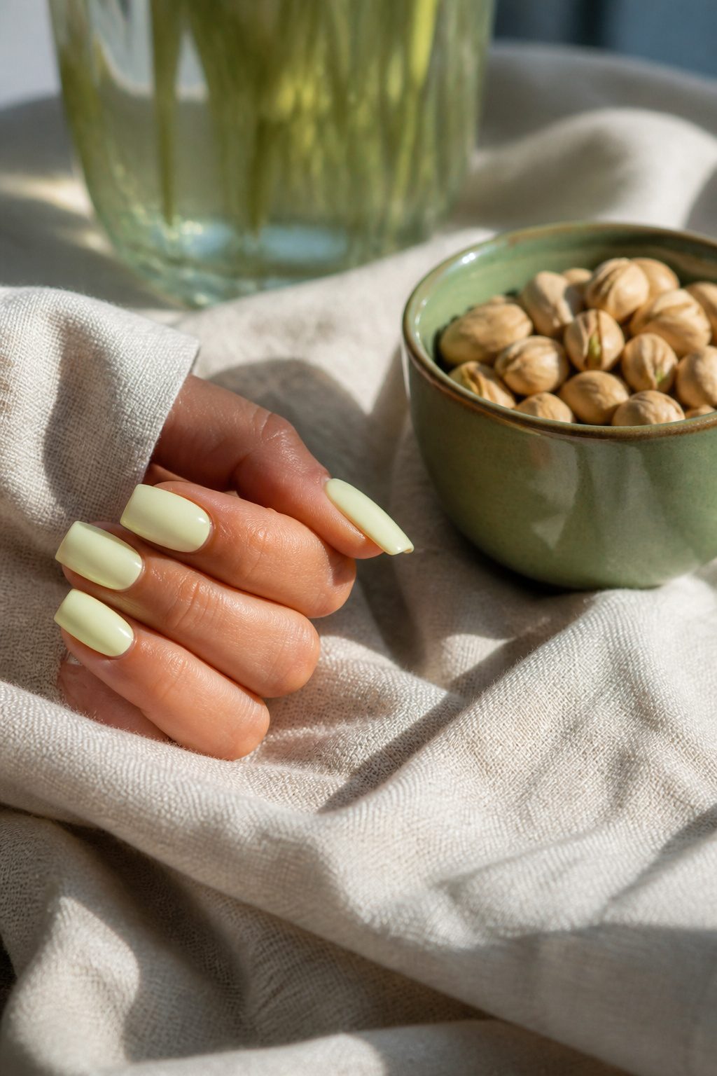
Pistachio cream sits closer to yellow than mint on the green spectrum, and that warmth keeps it from reading clinical or seasonal the way cooler pastels can.
The name comes from two places: the actual nut, which skews beige-green rather than vivid, and the dessert filling, where cream and sugar push the color toward something soft enough to function as a neutral.
On nails, that neutrality means pistachio cream pairs with almost anything, including colors that would fight a sharper green.
I noticed this most when comparing it to mint, which demands either commitment to a full pastel look or careful color blocking to avoid looking like toothpaste.
Pistachio cream needs no such negotiation. It works against denim, against camel, against black, against white, without the wearer having to think about temperature matching.
The yellow base also keeps it from going gray in low light, a common failure point for sage and other muted greens.
Under office fluorescents or evening lamplight, pistachio cream keeps its identity. For someone building a pastel wardrobe who wants one green that will not sit in the drawer six months of the year, this is the practical choice.
7. Ballet Pink
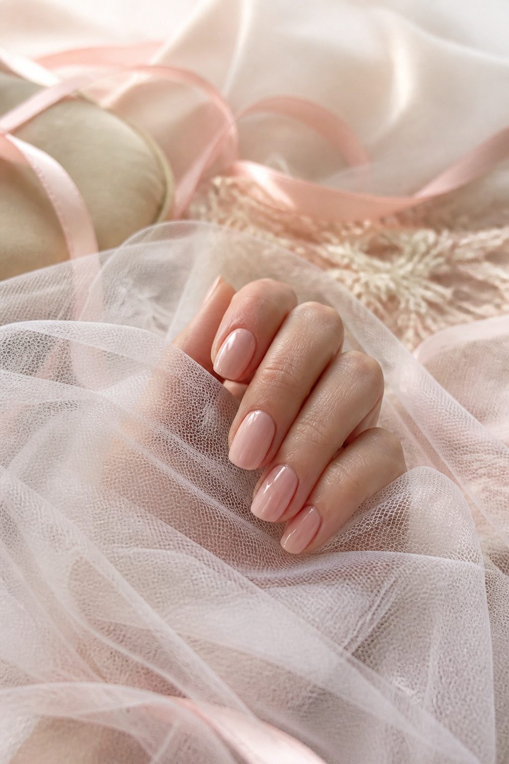
Ballet pink carries a warmth that keeps it from looking like a flat Easter egg on the nail.
The shade pulls from two places at once: the satin of actual ballet slippers and the inside of a seashell, which is why it sits slightly deeper and more flesh-adjacent than the classic pastel pink most people picture.
That extra depth matters on hands with medium or olive undertones, where a cooler pastel can read chalky or artificial.
What convinced me, reading through a dozen of these 2026 trend roundups, is that the flesh-adjacent quality is the whole point.
Designers are using it to create the illusion of longer, more elegant fingers without the stark contrast of a true nude.
The slipper reference is literal, not decorative: the color is meant to look like something worn against skin for hours, softened by use and body heat.
A glossy top coat deepens it further; a matte finish pulls it back toward the pastel family. Either works, but the choice changes which version of the trend you’re actually wearing.
8. Powder Blue
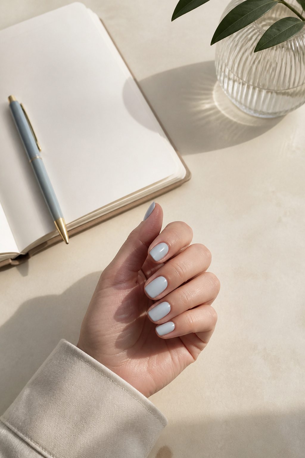
Powder blue sits closer to gray than sky blue does, and that distance is what makes it wearable past a single weekend.
The muted quality keeps it from reading as costume or nursery; in fluorescent office light, it softens toward a neutral, and in natural daylight it still carries enough pigment to look intentional.
Three separate color forecasts for 2026 have flagged this exact grayed-out shade as the pastel direction to watch, which surprised me since bolder baby blues dominated the previous cycle.
Two thin coats over a blurring base coat keep the finish from going chalky, which is where powder blue fails most often. The gray undertone can turn flat or dirty against warm skin if the application is streaky or thick.
I have seen this color work on almond shapes and short squared-off nails equally, though the shorter the nail, the more the gray base risks looking like a faded white.
A glossy top coat is non-negotiable here; matte powder blue drifts too close to hospital scrubs.
For pairing, it handles silver foil better than gold, and a single stripe of chocolate brown at the tip, barely there, gives it enough grounding for a Monday morning meeting without losing the softness that drew you to it.
9. Mint
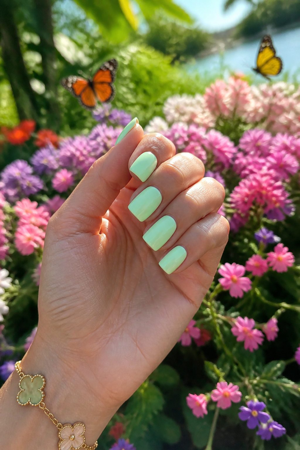
Mint sits closer to true green than the yellow-leaning softness of pistachio cream, and that single step toward the cool side changes what it can handle.
A mint manicure works best when it carries enough white to stay airy without tipping into the blue territory that reads clinical.
Spring associations come built in: the shade shows up reliably in March editorials and Easter displays, which makes it predictable if you wear it straight, but gives it immediate seasonal logic if you lean in with a matte topcoat or a barely-there tonal stripe.
The real risk is toothpaste. A mint with too much saturation or too glossy a finish looks like you dipped your fingers in a tube of the stuff, and the mistake is hard to undo without starting over.
What saves it is pairing: against a warm nude or a soft peach accent, mint reads intentional and fresh.
Alone and at full strength, it can feel like a novelty color, which is fine for a weekend but less so if you need the manicure to carry through two weeks of meetings.
I tend to reach for mint when I want something that feels clean without the sterility of a true pastel blue, though I always test the exact bottle against my skin in daylight before committing; the wrong undertone turns cheerful into clinical faster than you’d think.
10. Pastel Rainbow
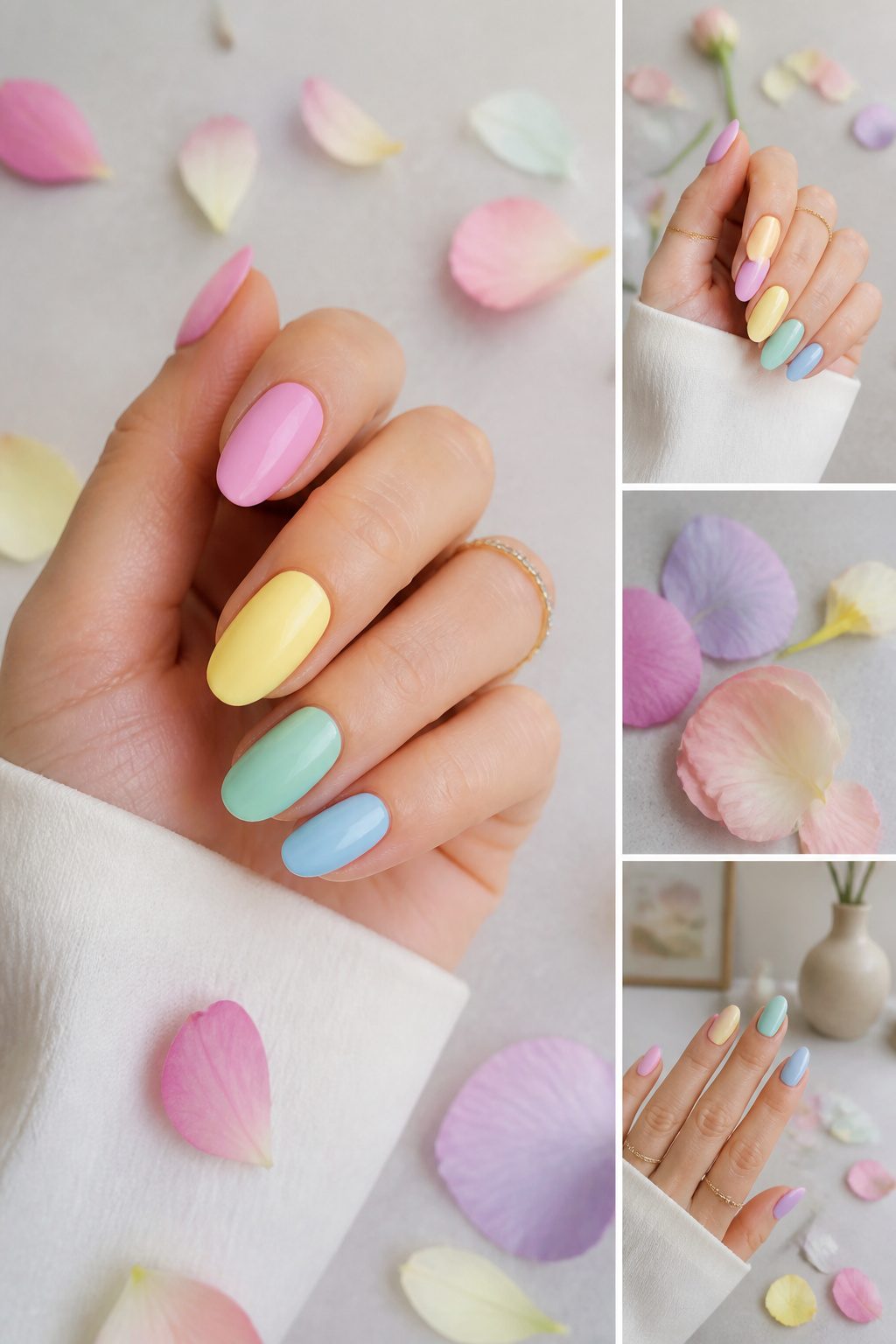
A pastel rainbow manicure spreads several soft shades across your nails at once, which reads very differently from a single pastel all over.
The eye travels, so the look feels busier and more playful than a one-color set, but the low saturation keeps it from tipping into circus territory.
Two main arrangements dominate right now. A gradient fade across each nail, lilac melting into soft blue or peachy pink into lemon yellow, keeps the colors blended and ethereal.
The alternative is assigning one solid pastel per nail, a mismatched approach that turns the whole hand into the rainbow instead of each individual nail.
French tips adapt easily here: swap the white edge for pistachio green on one finger, powder blue on the next, lilac on the third.
The double-line French variation, with a bold stripe beneath the tip, sharpens the effect if you want the colors to pop rather than whisper.
Single-color pastels feel polished and quiet; the multi-shade versions sacrifice some of that restraint for personality.
What convinced me, looking through the current sets, is that the rainbow approach works best when the colors stay in the same temperature family, all cool or all warm, rather than mixing both.
A cool hand of powder blue, lilac, and mint holds together; throw peach into that set and the eye starts to fight for a focal point.
11. Pastel French Tips
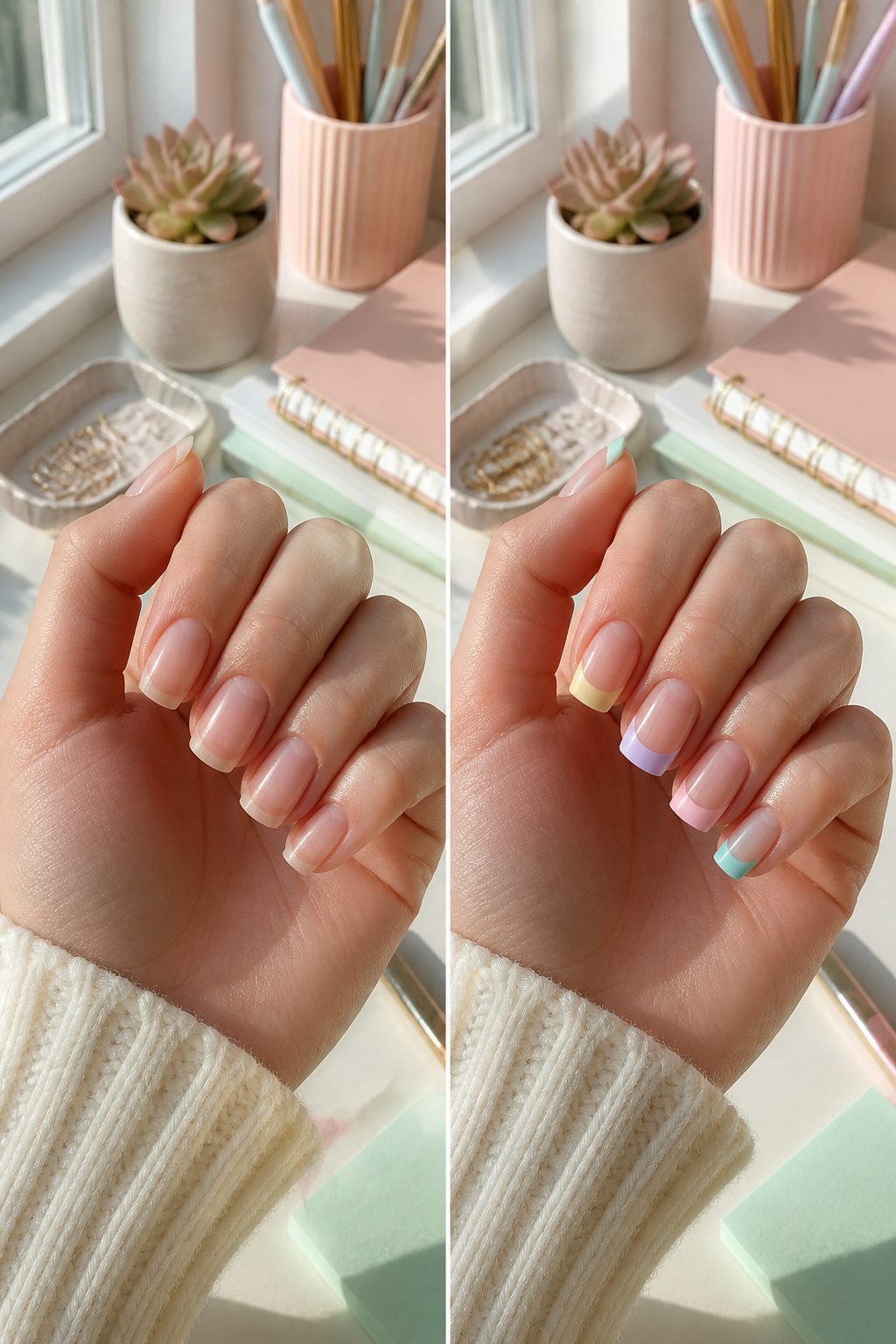
The French manicure has shifted from its rigid white-tip formula into something softer and far more forgiving.
Pastel French tips swap that stark edge for shades like pistachio green, powder blue, or lilac, and the change reads as polished without feeling corporate.
A uniform pastel across all ten nails keeps the look sleek for everyday wear, but the mismatch option is where this style gets interesting: each nail carries a different pastel tip, so one hand might run through peach, baby blue, baby pink, and yellow without ever clashing.
Celebrity nail artist Yoko Sakakura has pushed this further by mixing those same pastel French tips with stripes and polka dots on the same hand, which sounds chaotic until you see how the shared pastel palette holds it together.
For a simpler entry point, pastel peach tips with a glazed top coat give that same updated silhouette with just enough shimmer to catch light without looking juvenile.
The real advantage here is versatility; these tones work against a nude or clear base the way white always has, but they coordinate with actual outfits instead of fighting them.
12. Ombre Pastel Nails
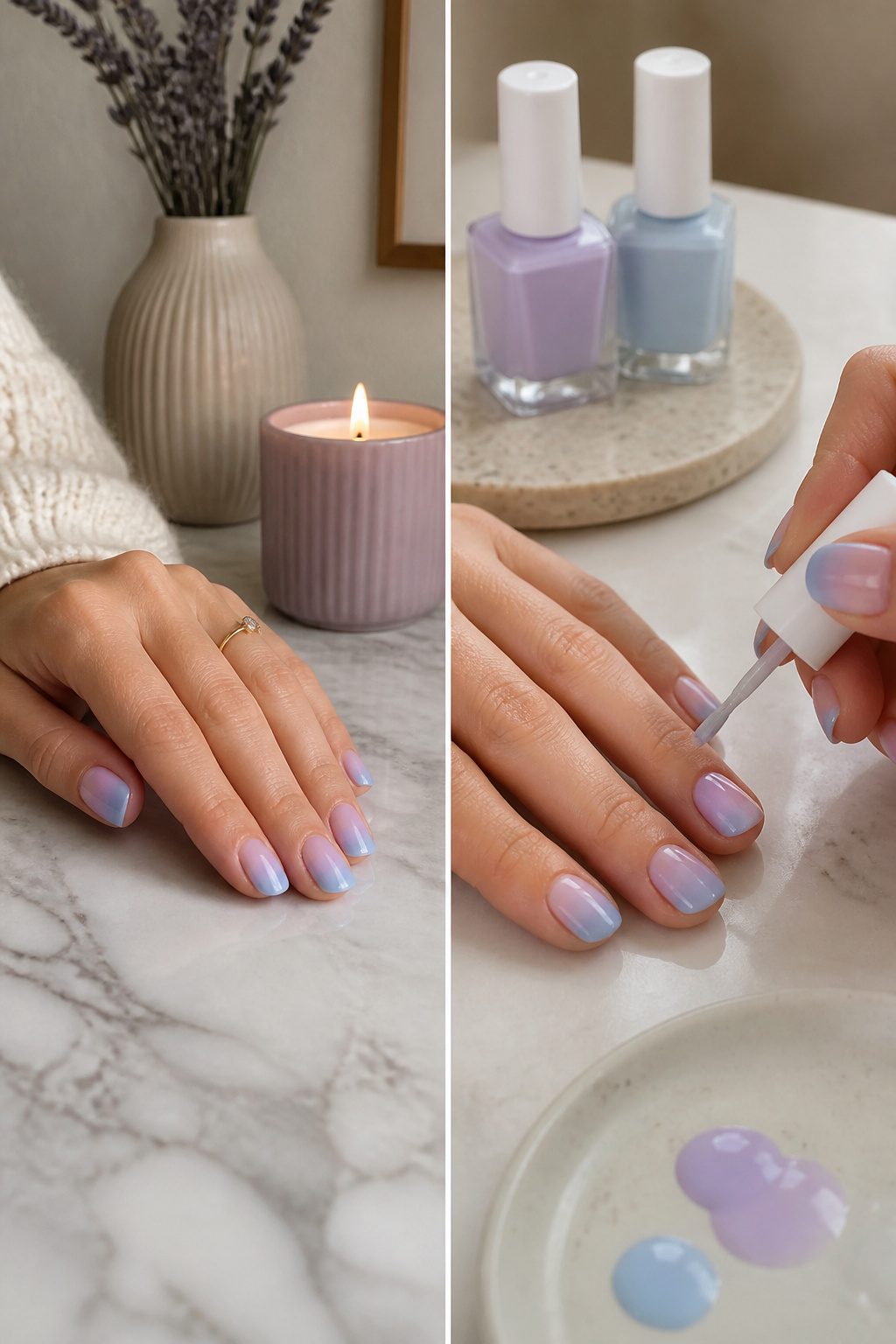
Smooth blends of lilac into soft blue, or peachy pink melting into lemon yellow, give pastel ombre its staying power.
The look works two ways: a subtle fade across each nail, or a full set where color travels from thumb to pinky. Either approach keeps multiple shades in play without tipping into full rainbow territory.
The sponge method is what gets that transition smooth rather than streaky. A makeup sponge dabbed with overlapping polishes presses the gradient directly onto the nail, and the porous texture does the blending work that a brush fights against.
Two or three light passes beat one heavy coat that pools at the cuticle or free edge.
Blended pastels read modern and ethereal, but the effect still needs a steady hand with placement. A subtle fade reads more wearable for everyday; the thumb-to-pinky shift makes more sense for an occasion where the full set gets seen together.
13. Floral Pastel Nail Art
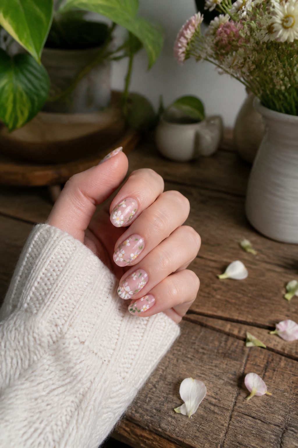
Pastel bases and florals belong together the way butter belongs on toast.
The soft tones let you build in real detail without the design shouting over your outfit. Little daisies, pressed-flower layering, or loose brushstrokes and dots all read as intentional rather than loud.
Nail stickers drop the skill barrier to almost nothing. I watched a friend lay down a neutral pastel base, press on floral decals for the daisy centers, and seal the whole thing with a single topcoat.
The result looked like she had spent an hour with a dotting tool. Stickers for hibiscus and tropical blooms work the same way if you want vacation nails without the vacation time investment.
14. Glazed Pastel Nails
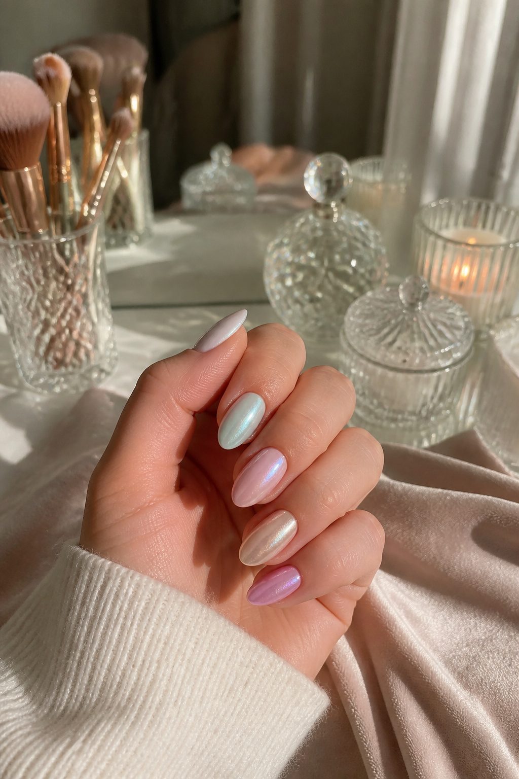
A pearlescent top coat over a pastel base does something regular gloss cannot: it turns the color into a veil rather than a wall.
The same baby pink that reads flat and Easter-egg under standard polish becomes luminous, almost backlit, when you layer that shimmer on top.
The light does not bounce off the surface; it sinks in, picks up the pearl, and returns softened.
Celebrity manicurist Michelle Class calls this the pearlized glazed effect, and she pairs it with sleek almond or short squoval shapes to keep the look modern rather than dated.
The glaze works especially well on the less expected pastels, the dusty pinks and denim-toned blues that avoid that seasonal craft-fair association.
You can build it two ways. For gel, a pearlescent nail powder burnished over each coat gives the deepest glass.
For regular polish, a dedicated glazed top coat saves the powder step and still delivers that translucent depth. Either approach, the finish reads expensive because the color stays visible but never shouts.
15. Cute Pastel Daisy Nail Art
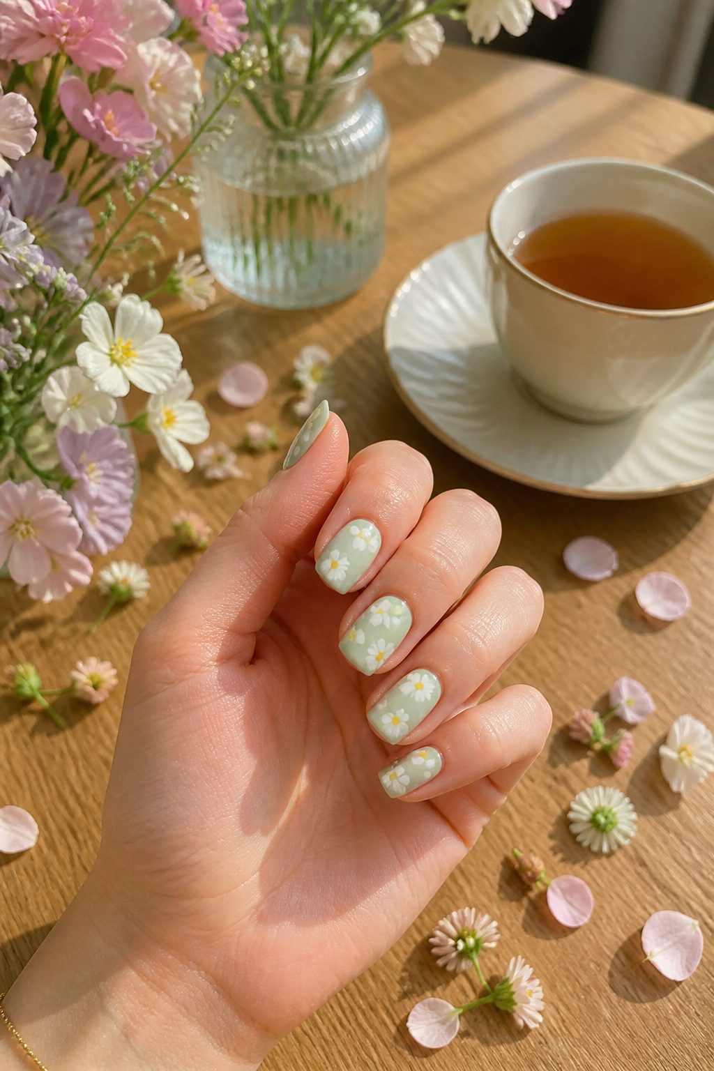
The daisy motif on pastel bases is the most approachable entry point into floral nail art because the contrast stays soft.
A mint, butter, or powder backdrop reads as the main color, while tiny white petals with a yellow center sit on top like pressed flowers rather than loud decals.
What convinced me, reading through a dozen of these designs, is that the look works precisely because pastels give you room to play with shapes without going over the top.
For anyone who does not trust a steady hand with a dotting tool, floral nail stickers over a classic neutral polish will get you there in one step.
The stickers carry the detail; you just need the right base tone. Instant payoff, no dry-time layering, and the serotonin hit every time you glance down still counts.
16. Shimmery Holographic Pastel Nails
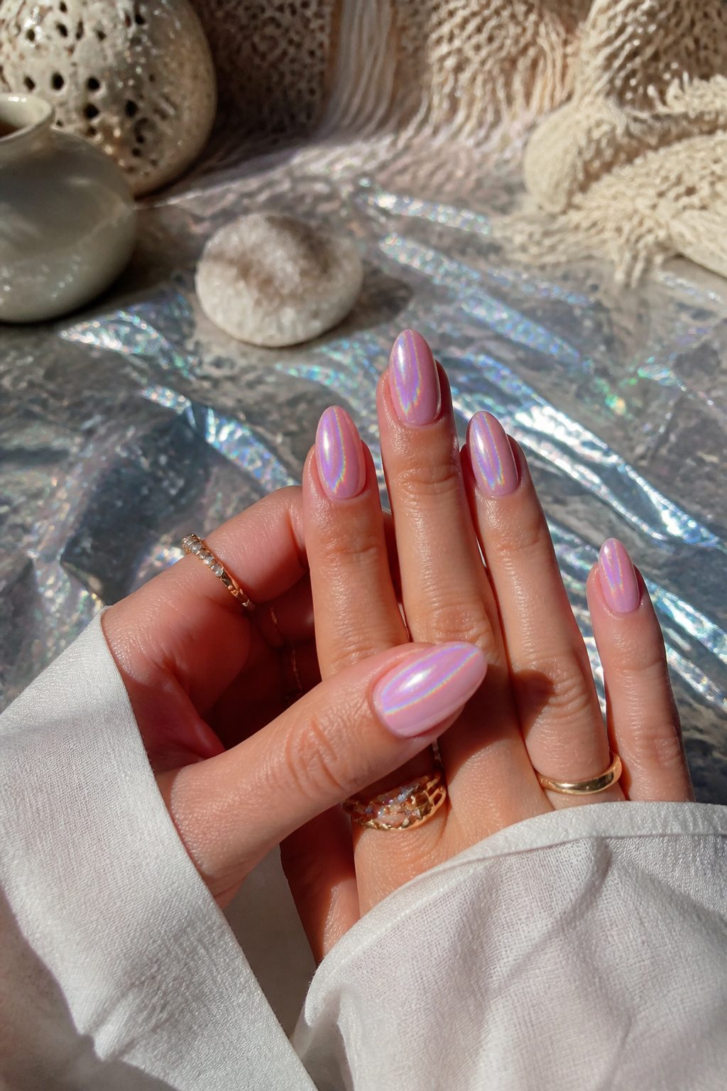
A holographic topcoat over a pastel base keeps the color soft while adding light-catching depth, the kind of dimension that reads as ethereal rather than loud.
The magnetic particles in some shimmery gel polishes create that cat-eye shift without muting the underlying pink or blue into something metallic.
Two approaches sit at opposite ends of the same idea: one uses the holographic layer as a uniform veil across the whole nail, the other swirls pearlescent polishes together so the shimmer moves like the inside of a seashell, catching differently at every angle.
The first reads cleaner for everyday; the second leans into mermaid territory and needs a thin brush plus patience.
Either way, the pastel stays the point. The shimmer is just what makes someone lean in to look closer.
17. Pastel Lightning Bolts
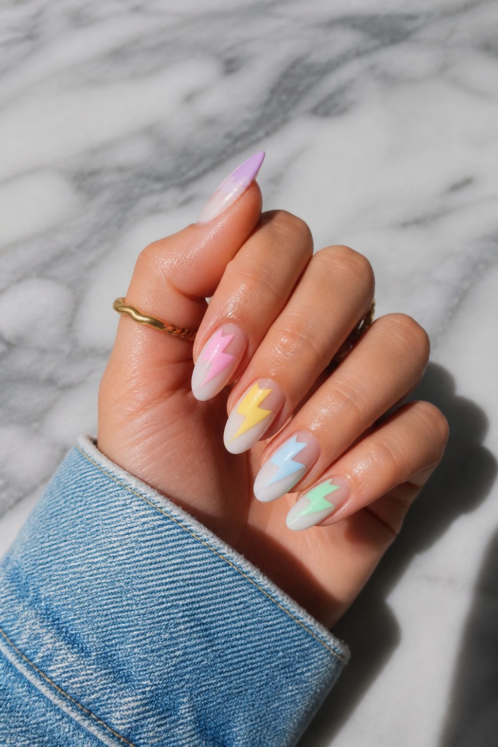
Pastel lightning bolts trade the usual hearts and stars for something with actual voltage.
The jagged geometry cuts across a milky base in colors like Kiara Sky’s High Maintenance or Skies The Limit, and that sharp angle against a soft wash is what keeps the look from feeling like nursery decor.
Unlike more traditional pastels, modern iterations can actually be fun, especially when paired with square or squoval nail shapes or a sharp almond edge to offset their softness.
— Vogue
The contrast matters more than the colors themselves.
A creamy lilac like D’Lilac or a muted pink like Pink Tutu reads as gentle until the bolt slices through it, and the squoval or almond shape extends that tension rather than rounding it off.
Freehanding the bolt takes a steady hand and a striper brush; nail vinyls work if your lines wobble.
Either way, keep the base opaque and the bolt matte or glossy in the opposite finish so the shape pops without competing for attention.
18. Pastel Spaceships
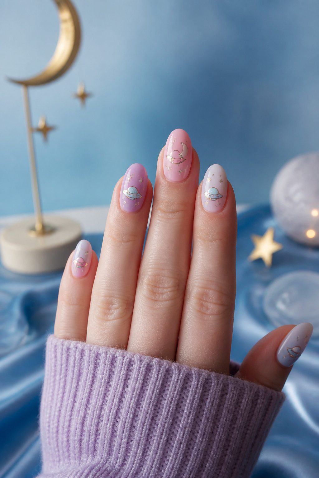
Tiny pastel spaceships on a nail bed keep the look from drifting into nursery territory.
The subject matter is unexpected enough that baby pinks and soft lavenders read as playful rather than precious, which is exactly what makes the trend stick.
I kept seeing this pairing pop up as a deliberate move against the usual spring clichés, and it works because the contrast is built right in: something mechanical and slightly retro-futuristic rendered in the same muted hues you’d expect on an Easter egg.
The result feels low-key luxe without the sweetness that can make pastels feel like a default choice. Pale or deep skin tone, long or short nail, the balance holds.
What convinced me was noticing how the spaceship motif acts as a filter: it lets you wear mint greens and powder blues without the color doing all the emotional labor.
If you are someone who wants color but not the full pastel personality, this is the shortcut.
19. Pastel Flames
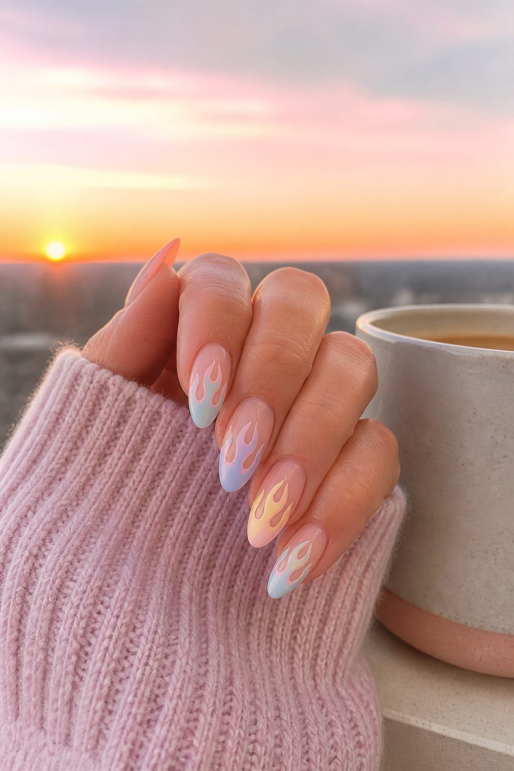
Flame graphics usually read as aggressive, all sharp angles and high-contrast heat. Swapping the palette to pastels turns the whole mood around.
A manicure built on High Maintenance pink, Skies The Limit blue, Main Squeeze yellow, and Chatterbox coral laid over a Pure White base keeps the shape of fire without the hostility.
The same design in just D’Lilac and white goes even quieter, almost like watercolor smoke drifting up the nail.
What surprised me, looking through the versions that actually get worn, is how the gradient matters more than the color choice.
When the pastels blend into each other rather than sitting as hard stripes, the flame stops looking like a warning sign and starts looking like something you’d see on a birthday candle.
The ombre effect, that soft fade from one milky shade to another, does the heavy lifting here.
For someone who wants the shape without the statement, this is the move. The graphic still reads as modern, not sweet, but nobody’s going to ask if you’re in a mood.
20. Tie-Dye Pastel Nails
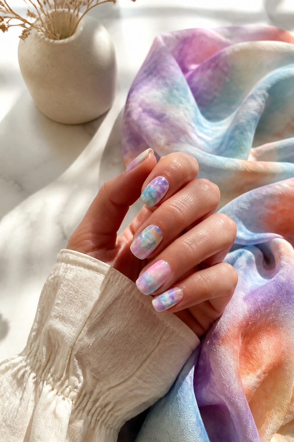
Tie-dye pastel nails borrow the swirling, unpredictable look of fabric dyeing and translate it onto a tiny canvas where no two results ever match.
The technique works best with three to four pastel polishes thinned slightly so they bleed into one another without turning muddy.
A nail tech or patient DIYer drops the colors in puddles onto a wet clear base, then uses a fine dotting tool or the tip of a pin to drag the polish into loose spirals or waves before the layers set.
What sells the look is the randomness: each nail carries its own pattern, so the set reads as collected rather than copied.
The pastels keep it from looking like a 1970s throwback; mint bleeding into lavender and butter yellow feels current, not costume.
Cleanup matters more here than with most nail art, since the marbled edges can wander onto skin if the dragging motion is too enthusiastic.
A silicone tool or a flat brush dipped in remover saves the finish. Wear time runs about the same as any regular polish manicure, though the busier pattern hides chips better than a solid color would.
21. Garden-Inspired Pastel Nail Designs
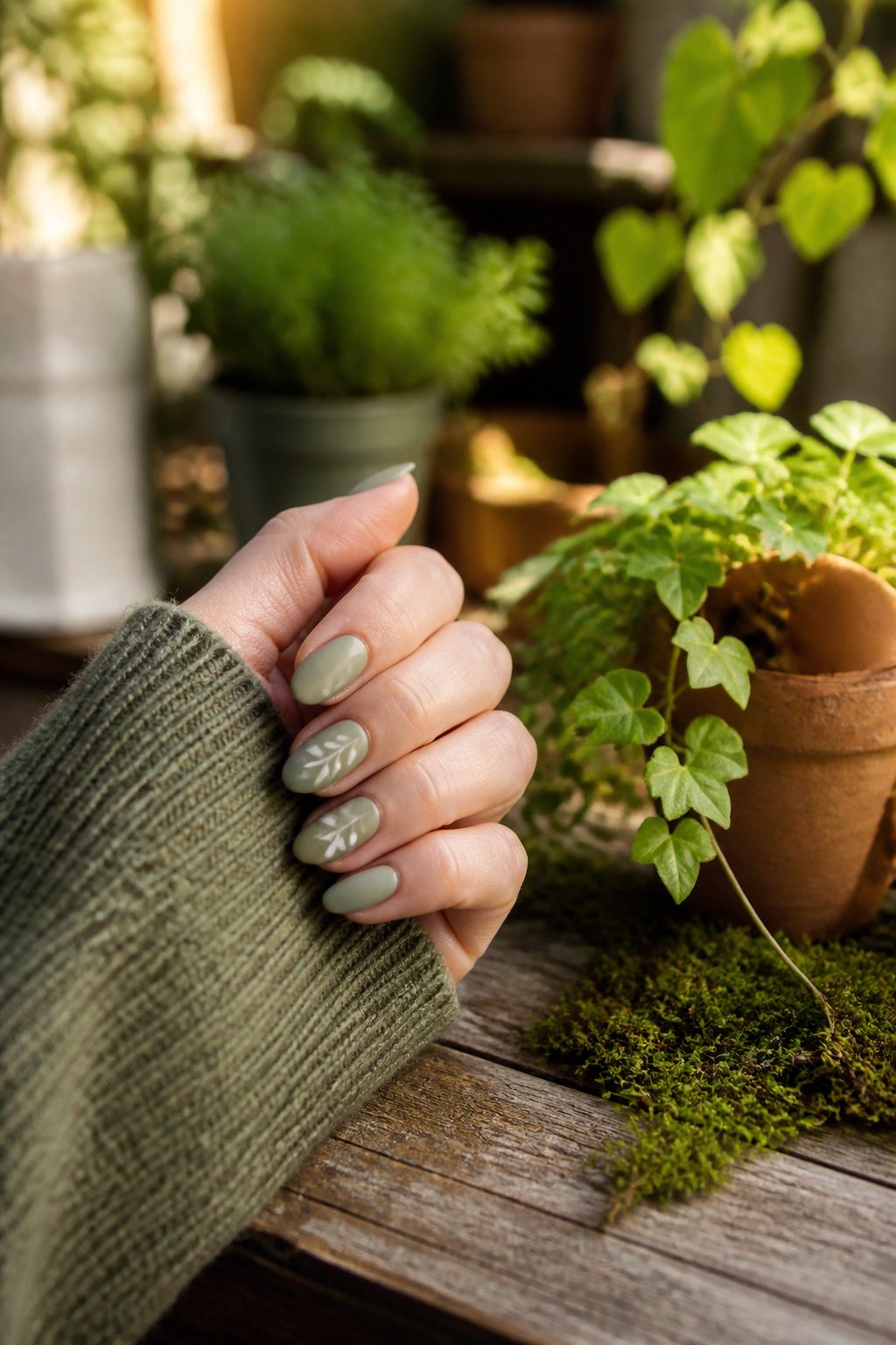
Pressed leaves and trailing vines translate surprisingly well onto a nail when you keep the palette muted. A matte sage base with a single fern frond in slightly deeper green reads as botanical without sliding into craft-fair territory.
The velvety finish softens the color just enough to feel chic but still fresh, and it pairs well with minimal outfits if you want the mani to quietly steal the show.
For something less literal, abstract brushstrokes in mixed pastel shades can suggest garden beds without naming them.
Blobs and waves in French butter and powder blue, layered thin enough to let the nail show through, give the impression of morning light on leaves.
Square or squoval shapes help offset the softness so the overall effect stays modern rather than Easter-egg sweet.
22. Dreamy 3D Pastel Nails
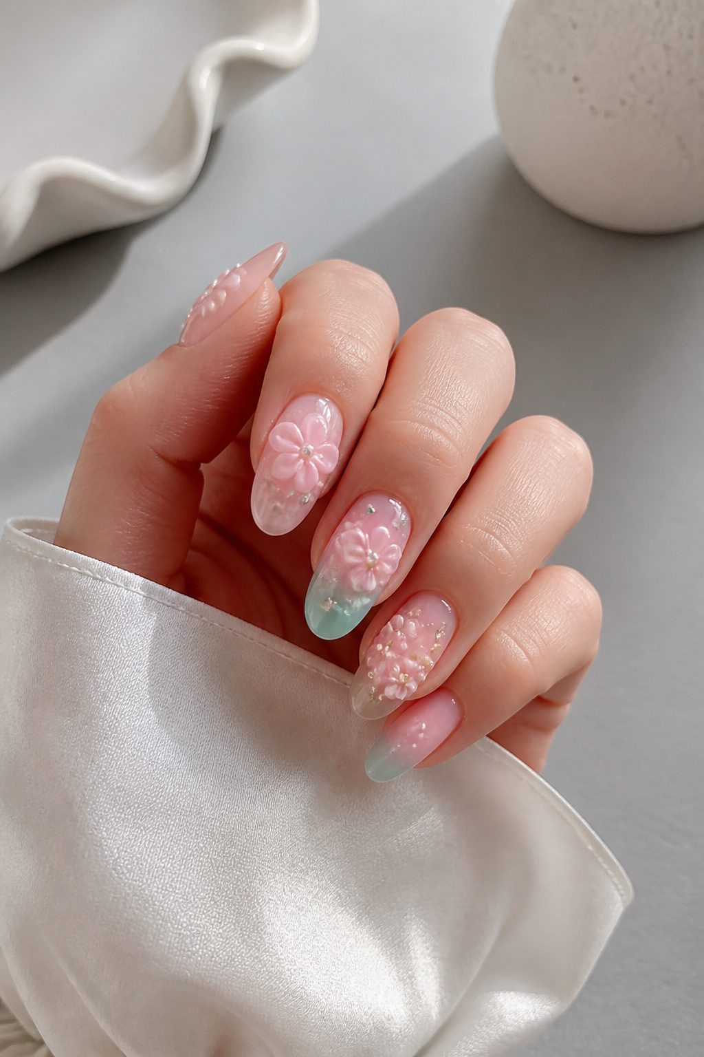
Pastel polish on its own can feel a little flat, which is why 3D sculpting gel and tiny charms are turning soft manicures into something you actually want to examine up close.
Layering dimensional elements over a pastel green-to-pink ombre base gives you that maximalist energy without abandoning the gentle palette entirely.
The trick is restraint: one or two sculpted flowers, or a single cluster of micro-gems, keeps the look deliberate rather than cluttered.
If you are doing this at home, a clear sculpting gel cures hard enough to hold its shape but stays workable long enough to place with a dotting tool.
Flower nail charms pressed in while the gel is still tacky save the step of hand-sculpting entirely.
Either way, the contrast between the soft color story and the raised texture is what makes the combination feel current for 2026 rather than a throwback to nineties acrylic excess.
23. Watercolor Pastel Nail Designs
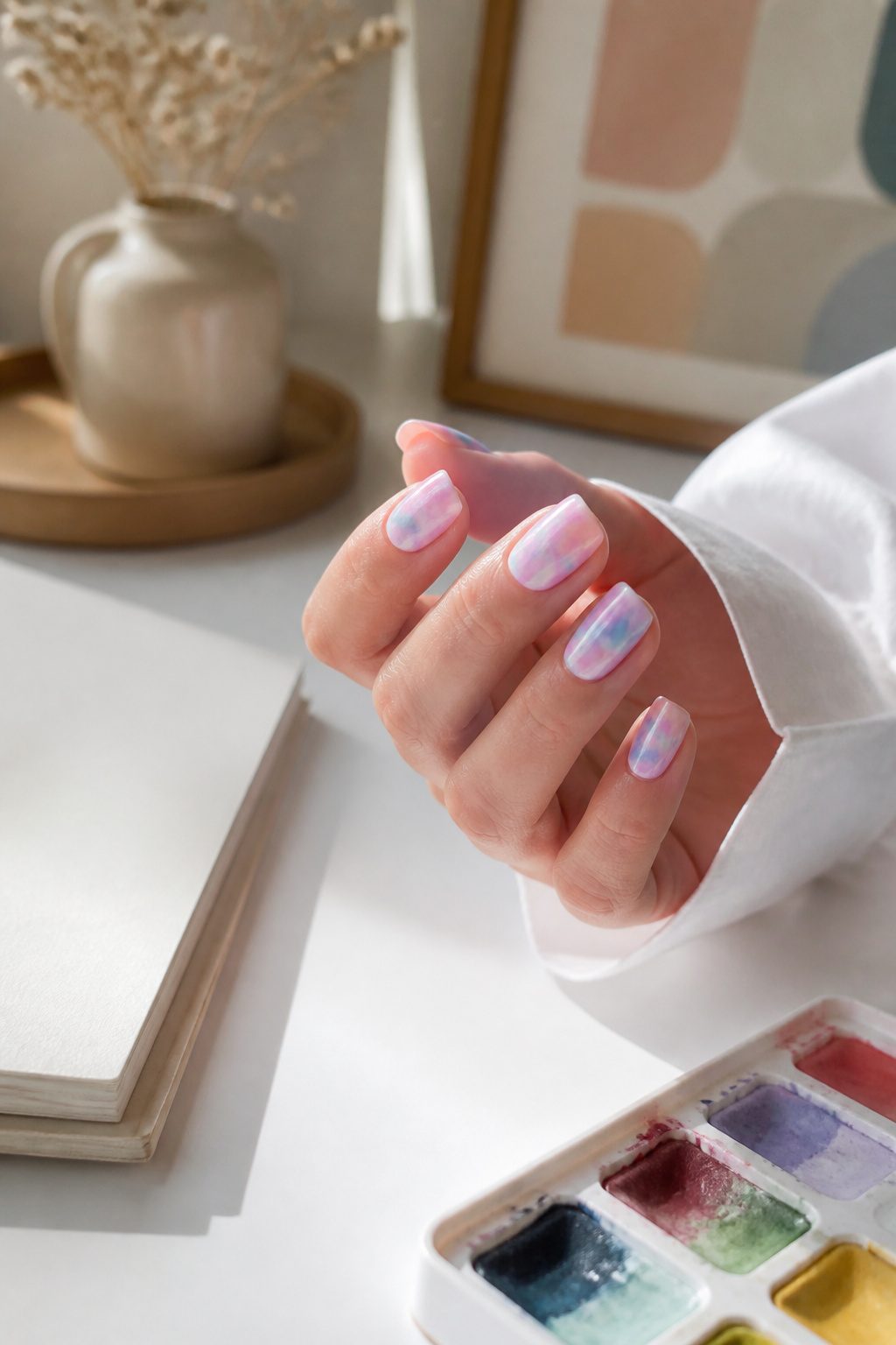
A nail art sponge is the tool that turns a standard pastel manicure into something that looks hand-painted.
Pressing the sponge onto the nail dabs on thin, overlapping layers so the colors sit translucent and feathered at the edges instead of meeting in crisp lines.
Pink can fade into purple and then into yellow without any one band reading as a stripe. The effect is closer to a watercolor wash on paper than to the sharp blocking you see in traditional ombre or French designs.
What convinced me, reading through the techniques that actually get shared, is that the sponge does the blending work your brush would otherwise fight to achieve.
A few dabs per color, letting each layer stay slightly wet, and the tones melt together on their own.
The result feels accidental in the right way: soft, hazy, a little different on every nail. That painterly variation is the point.
If you wanted identical nails, you would reach for stickers or stamps. The watercolor pastel look wins when each nail looks like its own small study in color.
24. Mismatched Pastel Ombre Nails
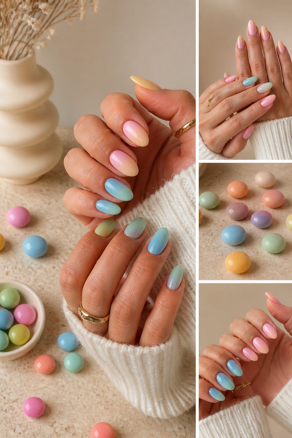
Mismatched pastel ombre nails let you wear two trends at once without either one overwhelming the other. Each nail carries its own gradient, so the look stays soft even when every finger shifts color.
One hand might fade from pastel pink to peachy orange while the other blends pastel blue into mint green, giving you the full range without the clash of a single bold shade across all ten nails.
The technique works because ombre itself is already having a serious moment, and pastels keep the fade from reading as too loud.
You can run a subtle fade across each individual nail, or let the color transition from thumb to pinky so the whole hand becomes one slow shift.
Either way, the key is keeping the tones in the same family: lilac into soft blue, or peachy pink melting into lemon yellow.
Pairing a warm gradient on one hand with a cool one on the other gives the mismatched feel without the chaos of five random colors fighting on the same hand.
Spring is when this style shines, since the soft blends match the season’s mood without the full statement of a rainbow set.
If you already own a handful of pastel polishes, you are most of the way there; the sponge for the ombre is the only extra tool, and even a clumsy first attempt still reads as intentional because the colors stay whisper-light.
25. Cute Plaid Pastel Nail Design
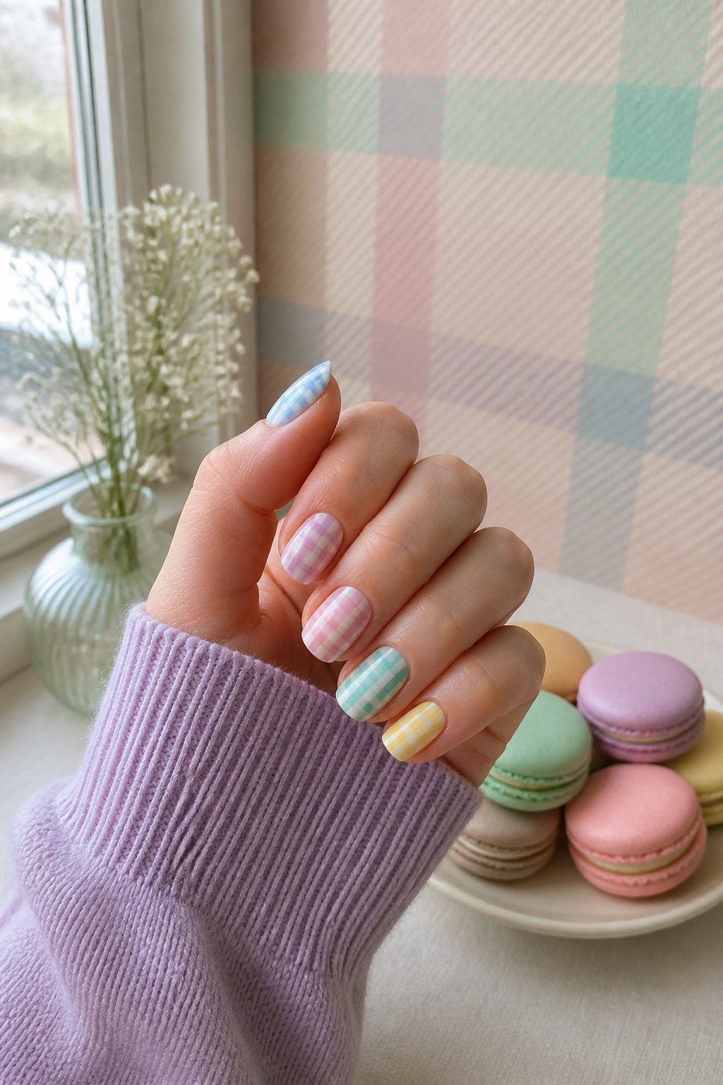
Plaid on nails usually reads as a fall statement, all burgundy and forest green, but intersecting pastel lines flip that expectation entirely.
The crossing bands of soft color keep the grid structure intact while stripping away the weight; what remains feels closer to a spring sundress than a wool scarf.
I like that the pattern still carries the energy of a print, yet the muted tones let it sit quietly against whatever else you’re wearing.
For anyone without steady freehand skills, plaid nail strips exist now, and they remove the tape-measure precision that hand-drawn lines demand.
The result is a manicure that references tradition without committing to its heaviness, which is exactly what makes it work for warm weather.
26. Maximalist Metallic Plus Pastel French Tip Nails
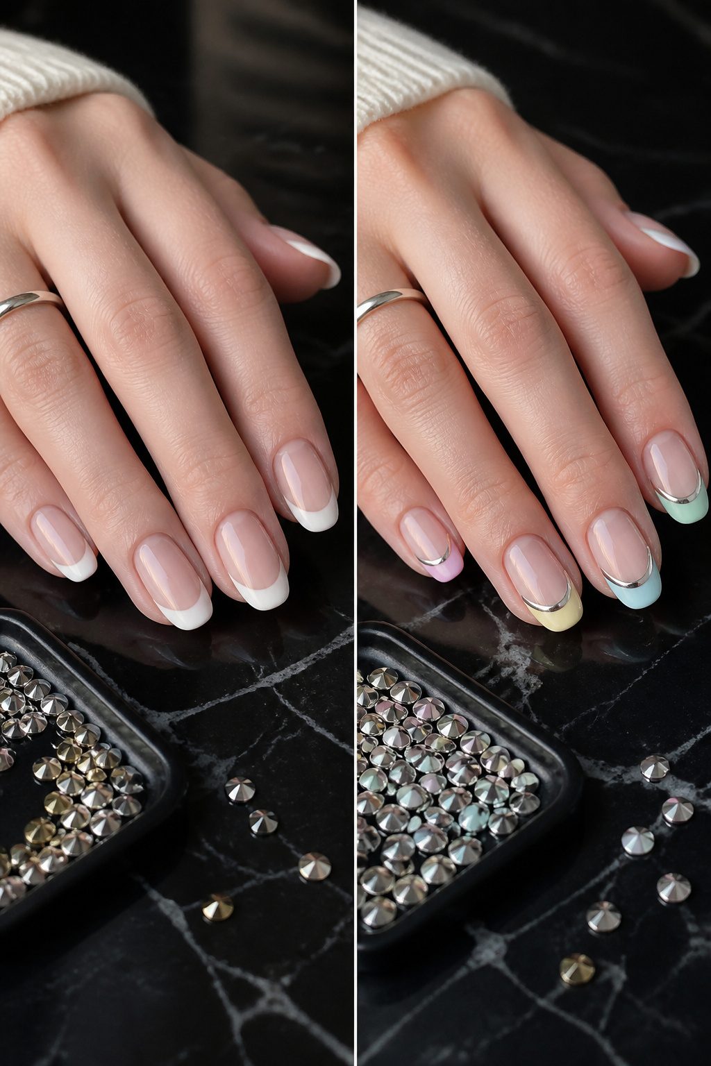
Metallic silver accents against pastel micro-French tips turn the whole idea of "subtle" French manicure on its head.
The contrast between warm or cool pastel shades and a reflective metallic line, dot, or geometric accent gives short nails a deliberate, maximalist energy without requiring extra length.
The sweet pastel base keeps the look wearable for everyday, while the metallic element, placed deliberately rather than scattered, keeps it from reading as too young.
What convinced me, looking through the variations that worked, was how the metallic functions as an anchor: it gives the eye somewhere specific to land so the multicolor tips don’t blur into Easter-egg territory.
Celebrity nail artist Yoko Sakakura has pushed this even further, mixing pastel yellow, baby blue, and baby pink French tips with stripes and polka dots for clients.
The lesson there is that the metallic accent can serve the same visual purpose as a graphic pattern, pulling together mismatched colors into one coherent statement.
On my own nails, I’d keep it to one metallic placement per nail. Two, and the finish competition starts to look accidental rather than designed.
27. Pastel Assortment
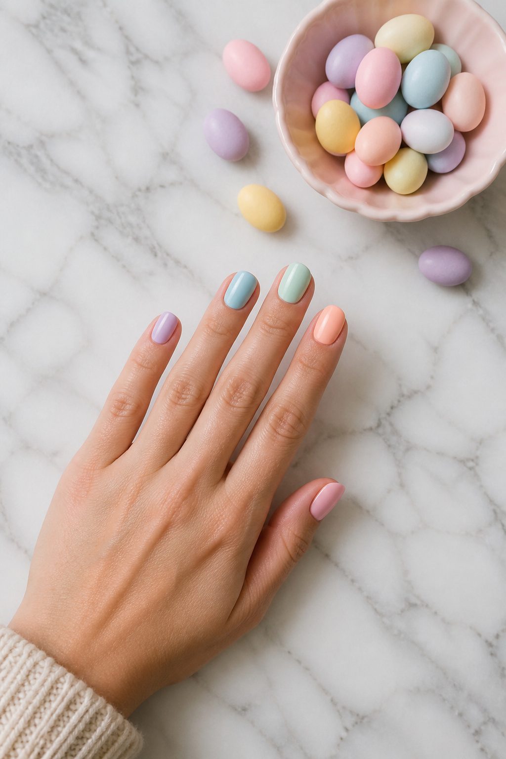
A pastel assortment keeps the palette tight rather than letting every shade compete.
Think lilac melting into soft blue, or peachy pink fading into lemon yellow, but stopped before the full rainbow takes over. The difference from the louder rainbow trend is editing: you are choosing cousins, not strangers.
A subtle fade across each nail works, or you can let the color drift from thumb to pinky so the hand reads as one gradient rather than five separate statements.
Abstract swirls and brushstrokes in mixed pastel shades play here too, since the soft tones keep even busy shapes from feeling overdone.
What convinced me, reading through the options, is that restraint with pastels actually gives you more freedom than restraint with brights; the colors already whisper, so the design can afford to talk a little.
28. Eclectic Mix
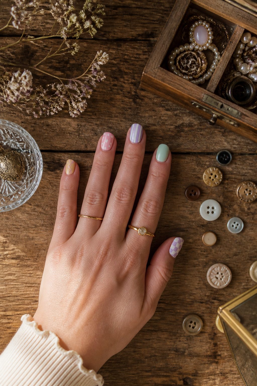
An eclectic mix is what happens when you stop treating pastels as a single color story and start treating them as materials to layer.
Celebrity nail artist Yoko Sakakura has shown how this works in practice: pastel yellow, baby blue, and baby pink French tips share space with stripes and polka dots on the same hand.
The result is not the clean mismatch of five different solid colors, which has its own cheerful appeal for spring. It is busier, more deliberate, and harder to pull off without looking like you emptied a drawer of leftover stickers.
The difference from a simple pastel assortment comes down to finish and pattern working against each other.
A matte pastel base, which carries that velvety softness that reads more modern than gloss, gives the eye somewhere to rest when the next nail over is carrying dots or stripes.
Without that contrast in texture, the patterns compete instead of coordinate.
I would keep at least two nails in a quiet finish, even if the other eight are doing something loud. Matte against glossy, or solid against patterned, is what keeps the eclectic look intentional rather than accidental.
29. Abstract Rainbow French Tips
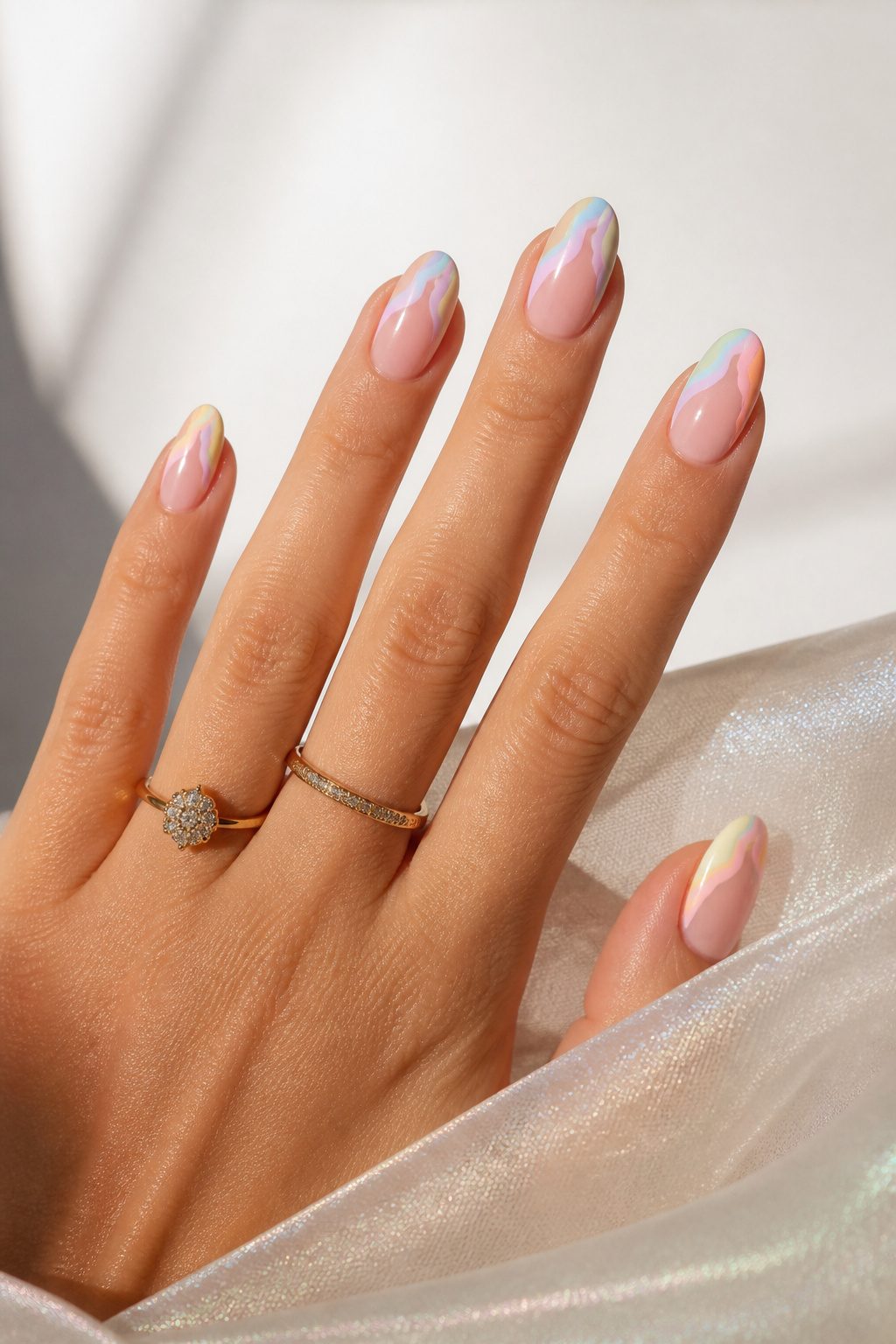
The classic French manicure gets its update from curved, non-linear pastel lines that replace the straight white edge with something looser.
Yoko Sakakura’s version mixes bright magenta with muted butter yellow, cool-toned orange, and lavender, then adds abstract swirls across the nail rather than confining color to the tip.
A thin multicolored line still traces the border, but it follows the irregular shape of the swirl instead of creating one.
What works here is the balance between bright and muted. The magenta keeps the palette from feeling too soft, while the butter yellow and lavender keep the magenta from reading loud.
You get the reference to a French mani, the structure of a light base with a darker edge, without the formality of the original.
Sakakura’s approach also solves the problem of the French tip looking too uniform on shorter or more squared-off nails.
The curved lines draw the eye across the nail rather than straight across the free edge, which flatters shapes that a traditional white tip can make look blunt.
If you are already comfortable with a thin brush, this is a forgiving place to start with color mixing; the abstract shape hides wobbles that a crisp line would expose.
30. Pastel Summer Stripes
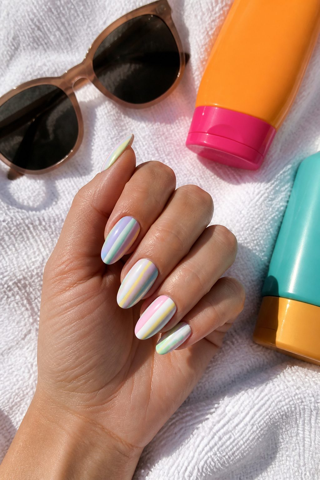
Linear stripes in soft pastels feel like the summer version of a Breton shirt: clean, a little retro, and surprisingly adaptable.
The direction of the stripe changes the whole mood. Vertical lines draw the eye up the nail, which makes short or square shapes look a touch longer.
Horizontal bands sit more casually, almost like a beach umbrella or deck chair, and they work best on slightly longer nails where the line has room to breathe.
Stripe width is the detail that separates subtle from graphic. Hair-thin lines, maybe two or three per nail, read as texture rather than pattern; they pair well with a single accent nail in solid pistachio or lavender.
Wider bands, say one or two stripes per nail in alternating colors, become the whole statement and need nothing else.
I have seen the thick-stripe manicure chip faster at the edges where the tape lift happens, so a slightly thicker top coat on those free edges helps.
If your hands are unsteady, striping tape from the craft drawer works better than freehand for keeping edges crisp, though peeling it off before the polish fully sets takes some timing.
31. Pastel Aura Manicure
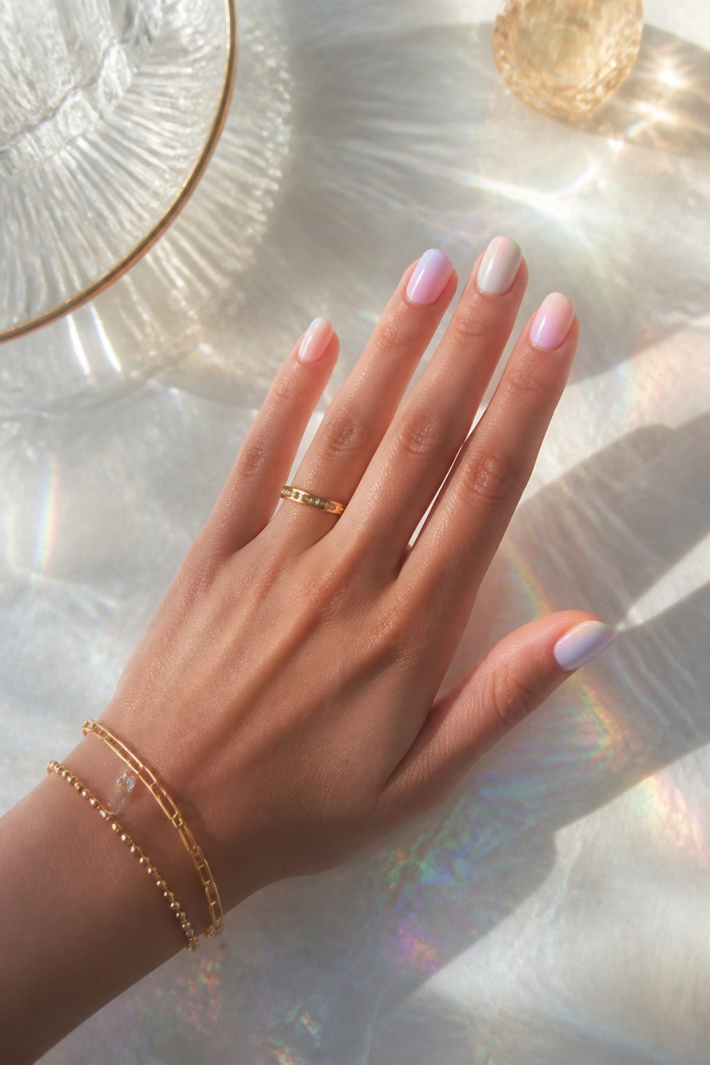
The aura manicure keeps its momentum into 2026, and the pastel version is the one worth trying if you want something that reads as glow rather than gradient.
Each nail carries a soft ombre in a different pastel shade, with the color concentrated at the center or base and fading outward so the nail looks lit from within.
That radiating effect is what separates it from a standard fade; the color sits where a highlighter would on your face, not where shadow would fall.
For a DIY take, an eyeshadow applicator does the blending work better than most nail brushes. Press the pigment into the middle of the nail and work it outward in thin layers until the edge goes sheer.
A top coat seals the soft edges without dragging the color back to the cuticle. The trick is stopping before the blend looks perfect; the best ones keep a little blur.
What Pastel Nails Actually Are
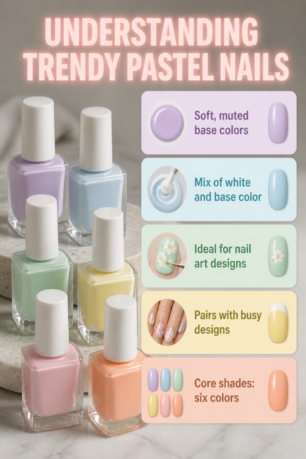
Trendy pastel nails get their look from one simple trick: mixing white into any base color until it turns soft and muted.
That added white gives the polish a slightly milky, almost dreamy quality that separates pastels from bright neons or deep winter shades.
The core palette most nail artists reach for includes lavender, powder blue, mint green, pale yellow, blush pink, and peachy orange.
These six shades work beautifully as solid colors across all ten nails, but they also serve as forgiving bases for nail art.
A pastel base keeps French tips, ombré fades, or small floral details from looking too loud. The same softness that makes them feel minimal is what lets them pair with busier designs without clashing.
Modern Pastel Shapes and Finishes
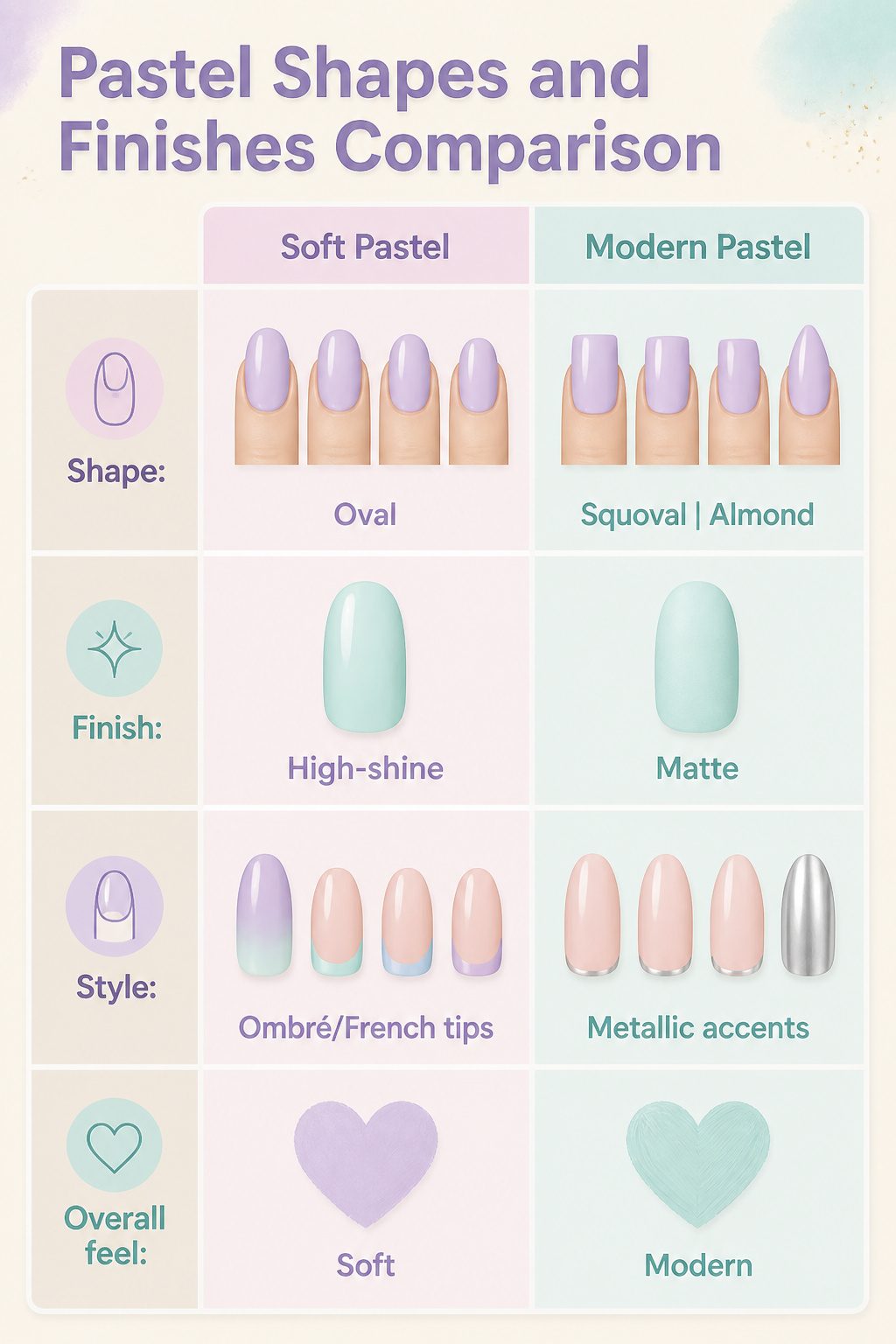
Pastel polish alone can read Easter-egg sweet, but the shape underneath changes the whole message. Squoval and sharp almond edges, rather than rounded ones, give those soft shades a deliberate, current feel.
I noticed this shift most clearly after switching from my usual oval to a squared-off tip with a lavender coat; the color stayed gentle, but the silhouette looked grown-up.
High-shine finishes keep pastels from sliding into chalky territory.
A glossy top coat reflects light and adds depth that flat color lacks. For something quieter, a matte pastel has a velvety quality that reads modern against minimal outfits, though it softens the tone more than gloss does.
Ombré and French tips are where pastels earn their place in 2026. Swapping the classic white French edge for pistachio, powder blue, or lilac updates the manicure without abandoning its structure.
Micro French tips on shorter nails, with metallic silver accents balancing the sweetness, prove you do not need length to make the look work. Chrome finishes layered over pastel bases create a cooler, less predictable effect than either choice alone.
Thin Coats and Dry Time
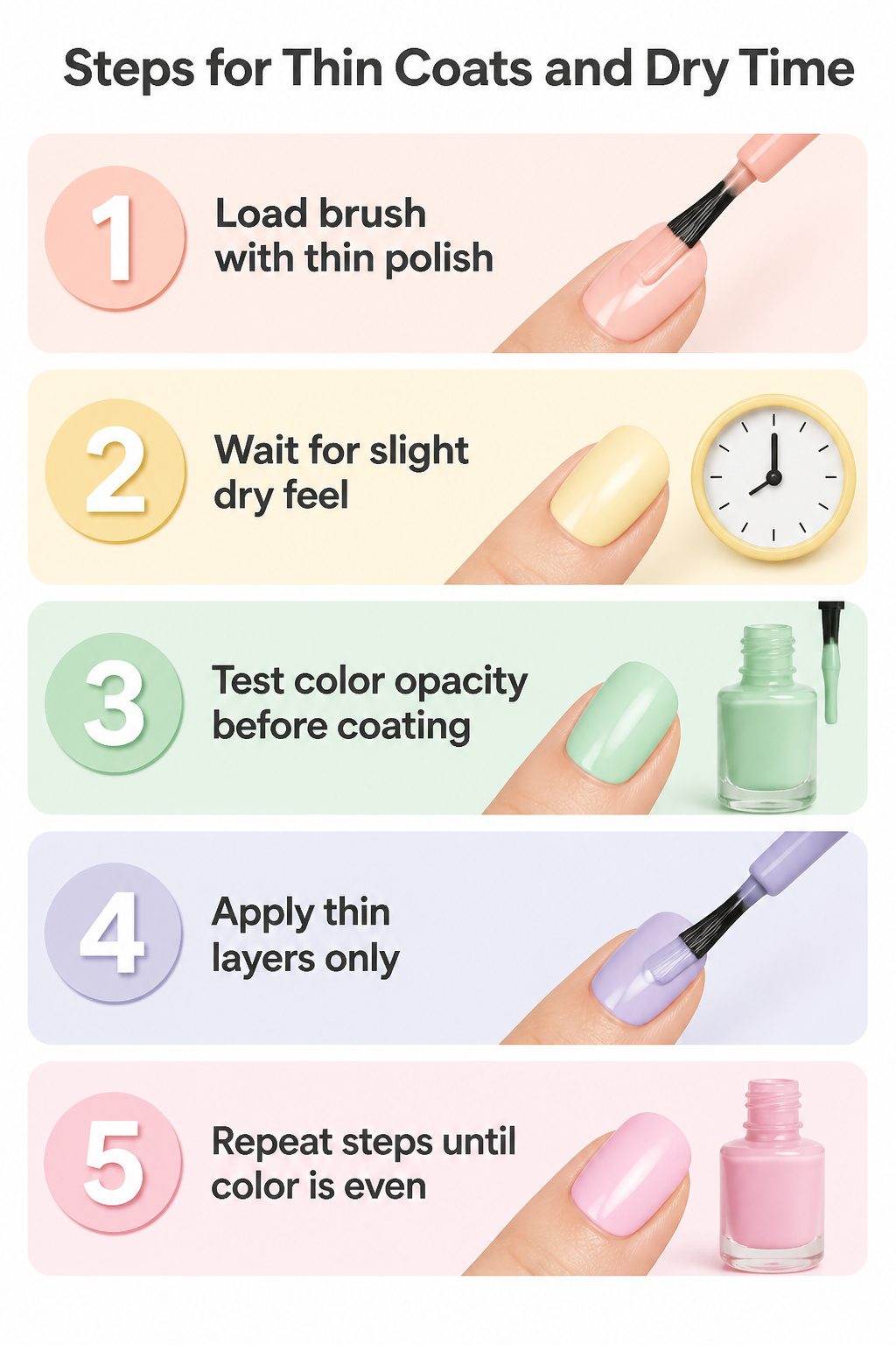
- Load the brush with just enough polish to cover the nail in one thin sweep, not a puddle that pools near the cuticle. Two or three of these barely-there layers build the color evenly; one thick coat sits on top and takes forever to set.
- Wait until the surface loses its wet shine and feels dry to a light touch before brushing on the next coat. Rushing this is where streaks come from, the still-soft layer underneath dragging and leaving tracks you will not fix with more polish on top.
- If the third coat still looks patchy, the color is too sheer for your nail or the coats were not thin enough. Either switch to a more opaque base or accept that some pastels need that extra layer, but only after the one before it is fully set.
Sponge Ombre and Sticker Shortcuts
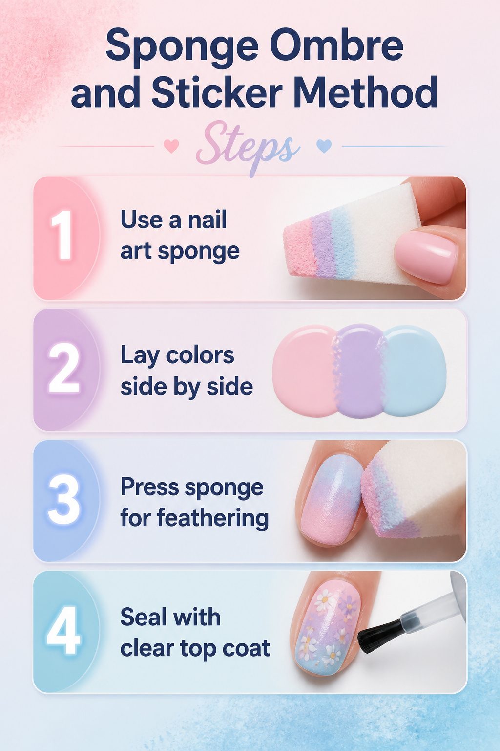
- A nail art sponge does the blending work your brush cannot. Lay down two or three pastel polishes side by side on a flat surface, barely touching, then press the corner of a clean makeup sponge into the wet line and roll it once onto the nail. The pigment transfers in a feathered band; repeat with a fresh sponge edge for each nail so the colors stay distinct rather than muddying into one murky tone.
- Stickers handle the details your hand will not steady. Tiny daisy decals or pressed-flower transfers in pastel yellows and lilacs sit cleanly over a dry base coat; seal them with a thin clear top layer so the edges do not catch. Abstract swirls and dots in mixed shades work the same way, though I would skip the blob stickers that read as random paint splatter and choose shapes with at least one clean edge that relates to the cuticle line or nail tip.
Color Pairings That Work
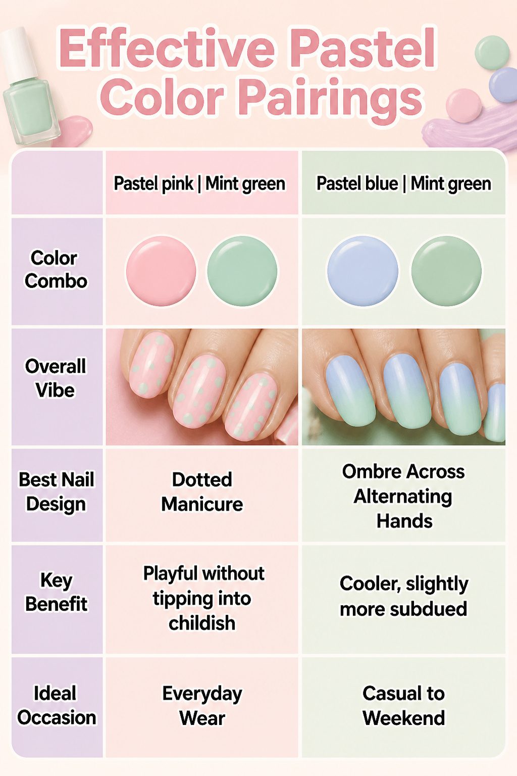
Pastel pink and mint green sit opposite enough on the color wheel to read as intentional rather than accidental. The matcha-toned green keeps the pairing from feeling too nursery-soft; on nails, it registers as playful without tipping into childish.
I have seen this work best as a dotted manicure, with one color serving as the base and the other picking out the spots.
A few other combinations that hold up in practice:
- Pastel blue with mint green gives a cooler, slightly more subdued take. One nail artist faded the two together in an ombre across alternating hands, which keeps the look from going flat.
- Pastel pink to peachy orange warms the whole palette. It reads more sunset than spring, which extends the wearability into late summer.
- Buttery yellow, soft sage, and periwinkle worn across five different nails. The mismatched approach works because all three stay in the same low saturation range; nothing shouts.
For French tips, swapping the white edge for pistachio green, powder blue, or lilac keeps the structure familiar while the color does the trend work.
Uniform tips look polished; mismatched ones add personality. Either way, the pastel edge is subtle enough for an office, but it still registers as current.
Frequently Asked Questions
What are pastel nail colors?
Pastel nail colors are soft, light versions of any shade created by mixing white into the base pigment, giving them that creamy, milky quality that separates them from brighter or darker tones.
They carry a spring-like feel and range from sheer to opaque depending on the formula.
Celebrity nail artist Naomi Yasuda notes that almost any color can become a pastel with enough white pigment, though dark colors take more work to lighten.
How can you make pastel nails modern?
Keep the shape sleek and the finish flawless: a soft almond or short squoval nail shape reads elegant, while a high-shine or pearlized glazed effect feels current rather than dated.
Celebrity manicurist Michelle Class points to that combination as the key to a luxe, modern pastel look.
For designs, ombré effects and pastel French tips move the look beyond basic solid color, and choosing muted or dusty versions of pastels avoids the Easter-egg trap.
How do you apply polish without streaks?
Apply two to three very thin coats rather than one thick layer, letting each coat dry before adding the next. This rule matters especially with pastels because their lighter pigments show streaking immediately.
For powder blues and similar gray-leaning shades, a blurring base coat underneath also helps the finish stay even and prevents a chalky or dirty look against the nail.