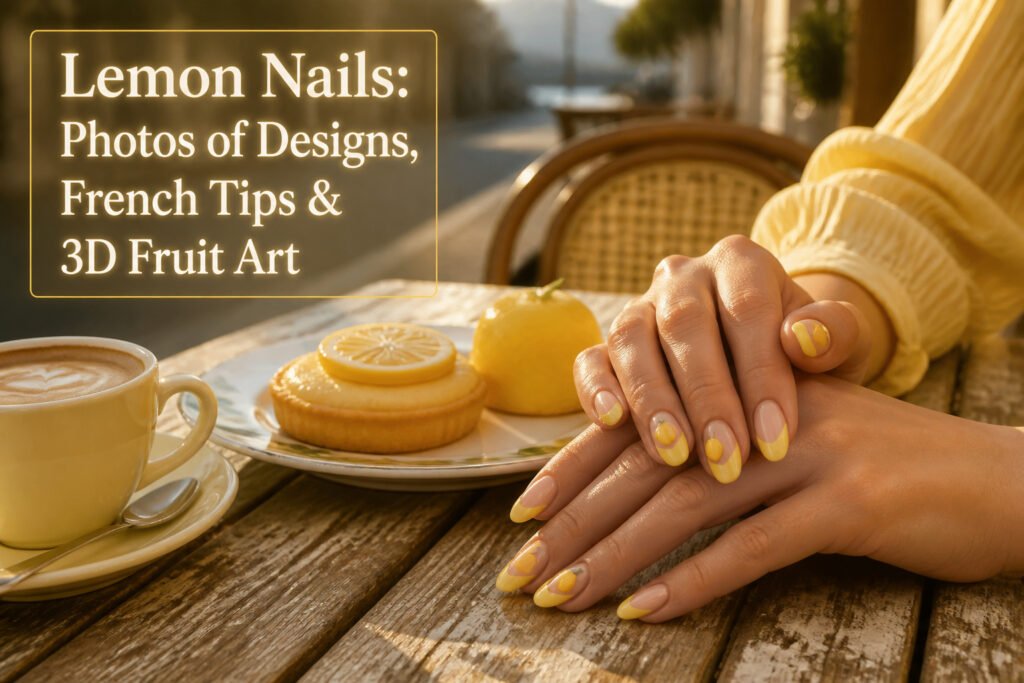
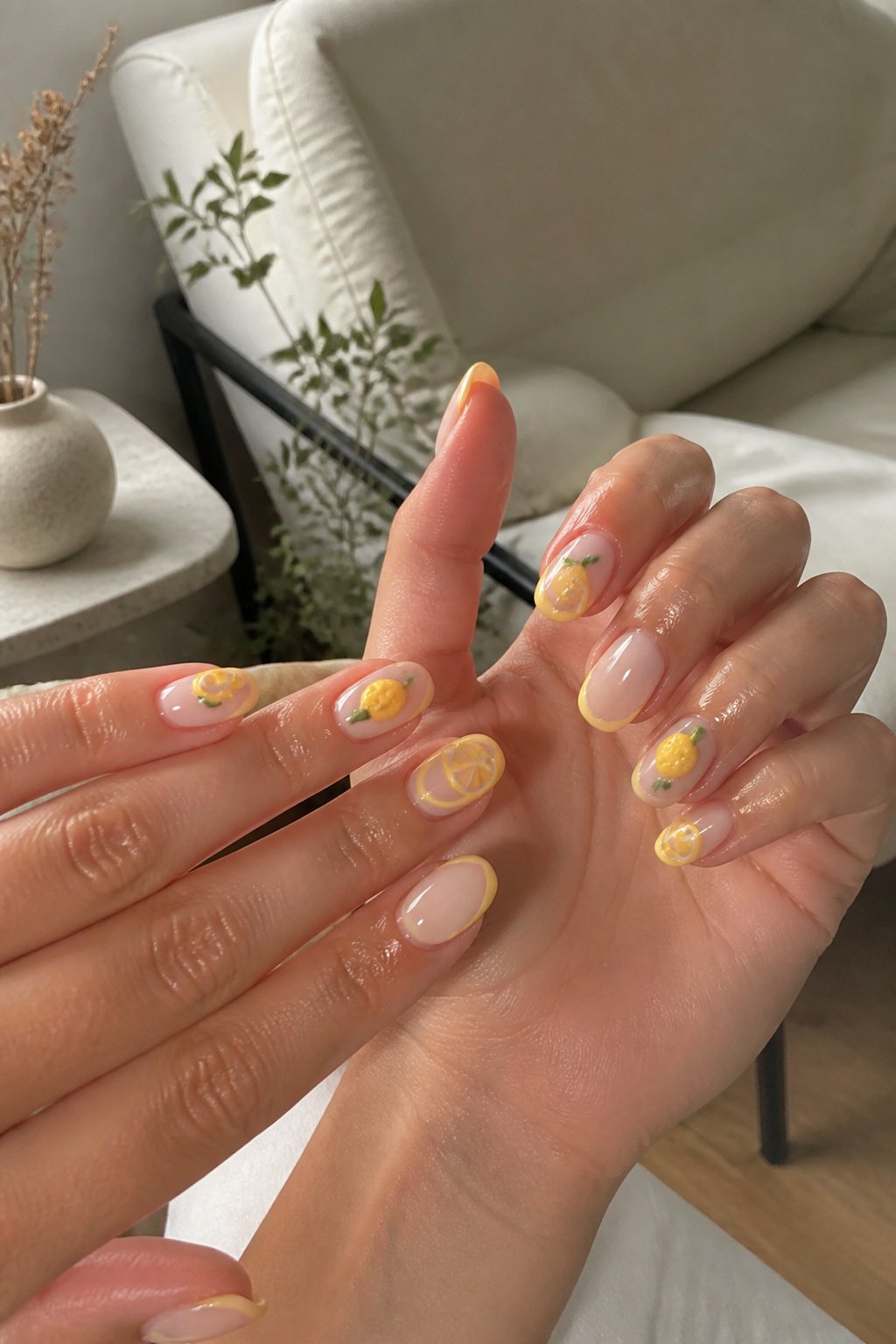
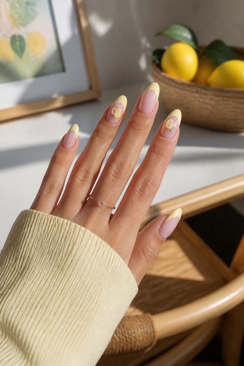
Lemon nails are manicure designs that use yellow, rind-green, or literal citrus imagery as the central motif, ranging from French outline tips to full 3D fruit sculpted in gel. The color shifts dramatically between salon LEDs and daylight, which is why the butter yellow versions survive office-to-evening transitions better than brighter neons that can turn almost neon. A set from @nailsbykarenm_ pairs almond-shaped French tips in that muted tone with tiny lemon accents on the cuticle, proving the quieter base lets the fruit motif read as deliberate rather than costume.
Hot Pink Tips
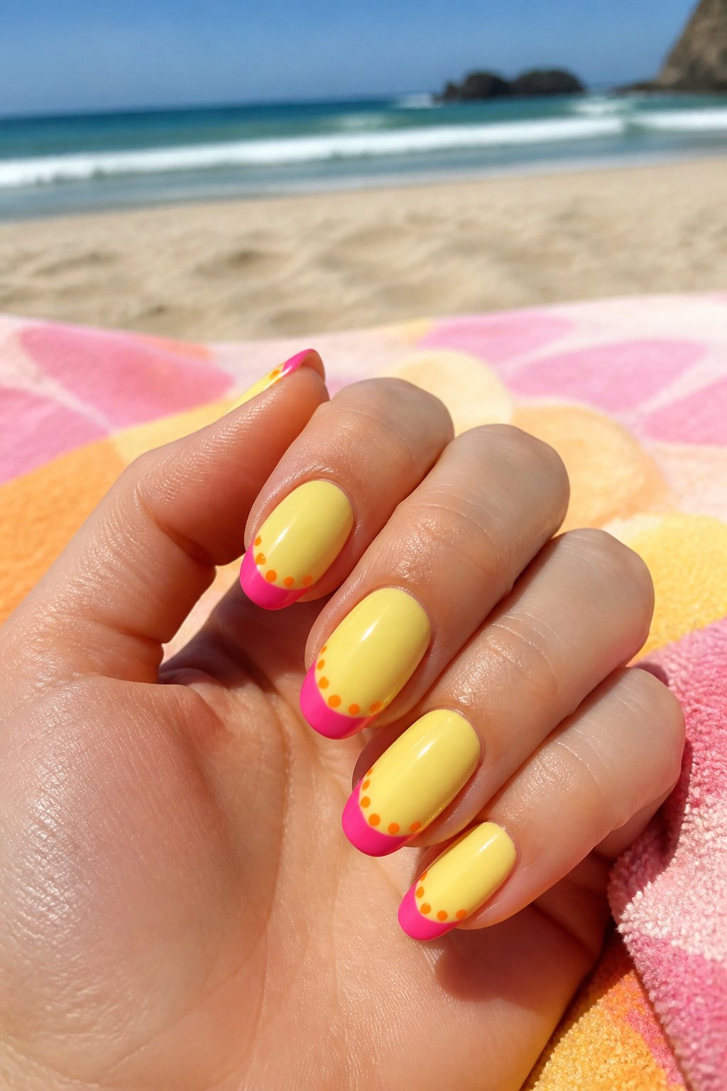
A set from @nailsbykate.cle pairs lemon yellow with hot pink tips for a playful summer look that reads louder than a standard French manicure without feeling overdone. The pink polka dots sit across the nail bed, while smaller orange dots trace the outline of each tip, adding a citrus-adjacent accent that ties back to the lemon theme without spelling it out literally. The orange placement matters: hugging the tip edge rather than floating in the center keeps the eye moving upward and makes the pink feel intentional rather than random. For someone building a vacation nail mood board, this design lands in the sweet spot between nail art and wearable color. The hot pink carries enough weight to compete with a tan or a white sundress, and the dots give you something to look at during a two-week grow-out.
Tiny Details
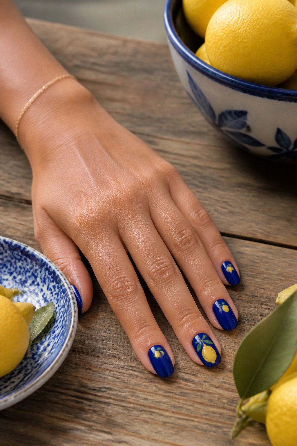
A bright cobalt base makes lemon details feel like punctuation rather than clutter. I learned this after trying a pale yellow background that turned the whole hand into a fruit salad. The blue gives the eye somewhere to rest, so a single tiny lemon on the ring finger, or a pair at the base of the middle and pinky nails, reads as a deliberate choice. Three lemons across one nail is already pushing toward busy unless the fruit is barely larger than a sesame seed.
Placement matters more than count. The cuticle area, the outer corner, or a thin stripe down one side each anchor the design to a specific spot rather than letting it float. Keep the lemon details under a quarter of the nail’s surface and they stay crisp; go larger and the blue starts looking like leftover background instead of the main event. A matte topcoat over the base with glossy lemons adds another layer of intention that a single finish doesn’t quite manage.
Summer Vacay Vibes
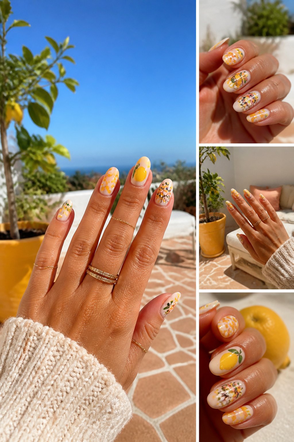
Retro flowers read as nostalgic rather than dated when the petals stay rounded and the colors stay saturated, not muted into that sepia drift that makes a design look like a faded postcard. A bright sun and a single lemon work with them by keeping the same energy: the sun as a simple circle with clean rays, the lemon small enough to feel like a found object rather than the whole point. The full vacation narrative builds across multiple nails by giving each element its own finger rather than crowding every image onto one nail. One hand might carry the retro bouquet, the other the sun and the lemon, so the story moves back and forth like packing a bag and then arriving. Checkerboard can ground the set the way a tiled floor grounds a patio scene, though it works best on one accent nail so the eye has somewhere to rest. The mashup wins when the colors stay in the same family of warm yellows and punchy pinks, so the lemon does not look pasted in from a different design. Keep the retro flowers bold and the lemon solitary, and the set reads like a planned trip rather than a pile of summer stickers.
3D Lemons
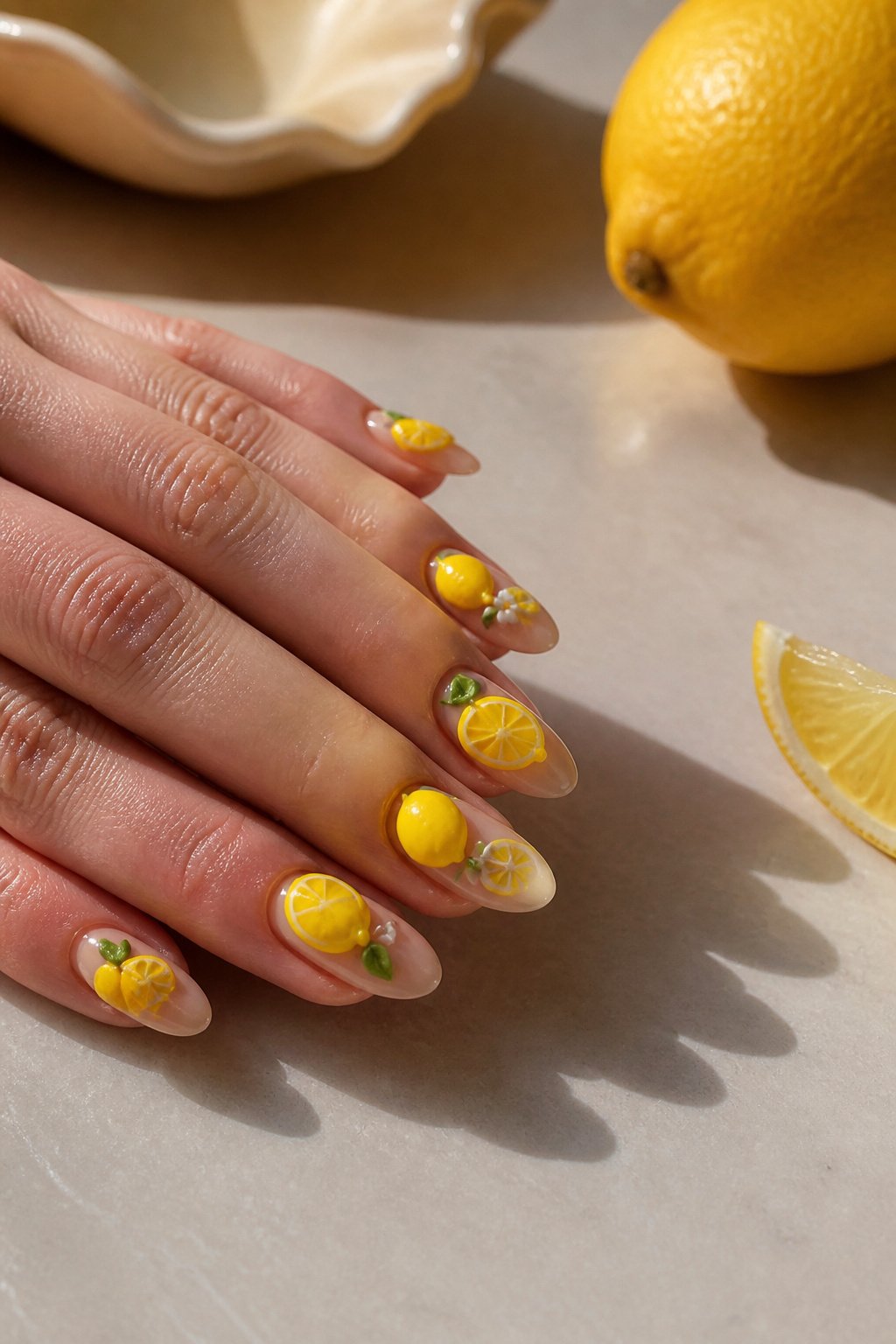
3D lemons and lemon slices sit right on top of the nail surface, not painted into it, and that literal depth changes how the design catches light and casts tiny shadows as you move your hands. The effect comes from sculpting gel or acrylic, sometimes pre-molded charms, that gets cured and then painted to match the rest of the set. I have watched enough of these sets go from fresh to grown-out to know the raised pieces are the first thing to snag: a whole lemon on the cuticle edge will catch on hair, purse linings, and keyboard edges if it sits too high. Lower-profile slices, especially ones that lie flatter across the nail bed, survive daily wear better. If you type all day or handle kids, ask your tech to keep the 3D elements under about two millimeters in height, or save the full lemons for accent nails only. The tradeoff is real: the more dramatic the pop, the more careful you have to be.
Lemon Frenchies
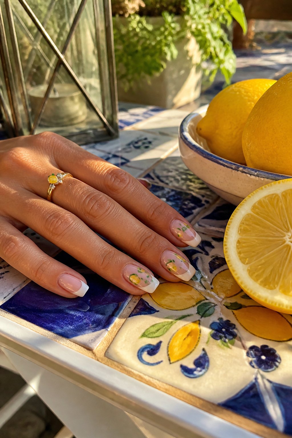
The traditional French structure, with its clean pink base and crisp white free edge, gives lemon art something to push against. Without that restraint, a tiny yellow fruit risks looking like a sticker floating on bare nail. The white band acts as a frame, and the lemon sits inside it like a still life.
What makes the lemon read as real rather than cartoonish comes down to color handling. A flat, uniform yellow flattens everything. The better versions layer a pale, almost milky yellow first, then add a brighter, slightly orange-tinged yellow in the center where the fruit catches light, with a whisper of soft green at the stem end. The rind gets a second, thinner white outline inside the French tip edge, so the fruit has actual thickness, not just shape.
I have seen this done with the lemon placed off-center, overlapping the smile line, and centered like a crest. The off-center placement usually wins; it breaks the symmetry just enough to look observed rather than stamped. A thin shadow line, barely darker than the base pink, tucked under the rind’s lower edge, is the detail that sells the roundness when someone is looking at your hands across a table. Skip that shadow and the lemon reads as a flat decal no matter how good the color mixing was.
Butter Yellow
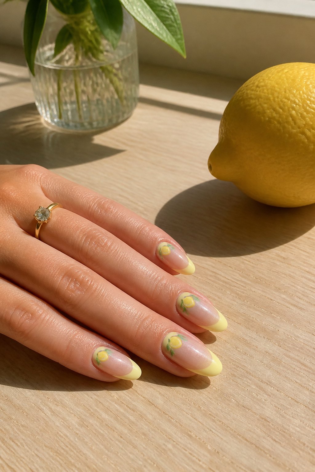
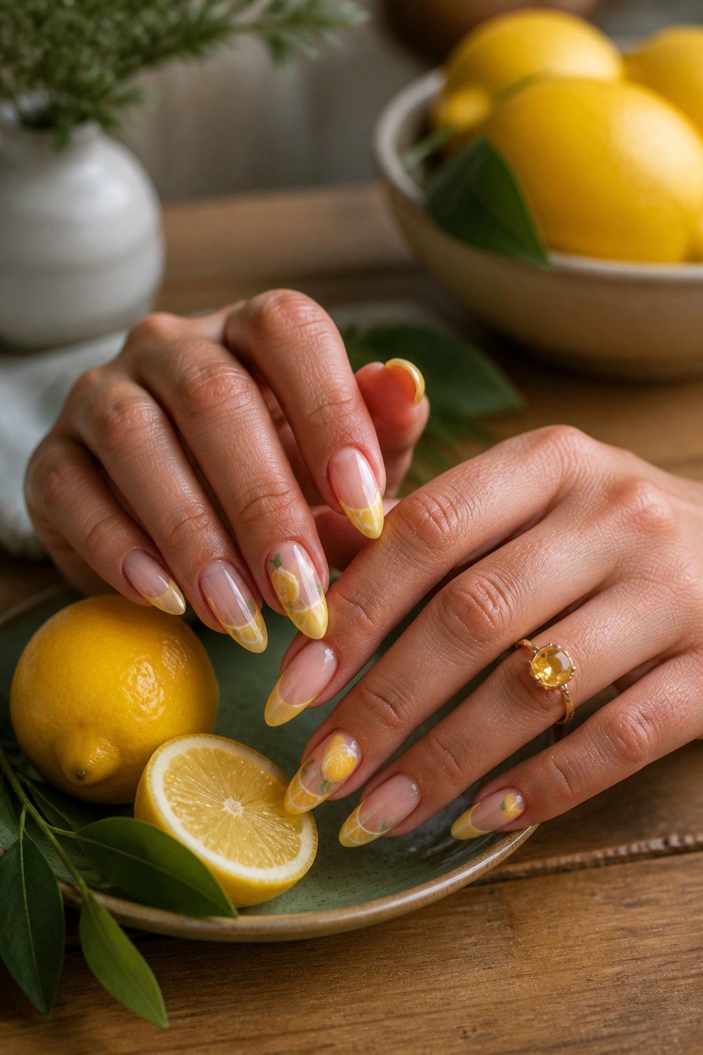
Almond-shaped French tips carry the butter yellow tone better than squarer cuts because the soft curve echoes the roundness of actual fruit. A set from @nailsbykarenm_ pairs that almond silhouette with lemon designs in the paler yellow, and the combination reads as intentional rather than loud.
The brighter lemon yellows can turn almost neon under salon lighting and clash with warm skin tones by midday. Butter yellow sits lower on the saturation scale, so it shifts less dramatically between indoor LEDs and natural light. For someone building a manicure that needs to last through both office hours and evening plans, the muted shade forgives the transition.
The fun lemon designs work specifically because the base color stays quiet. Tiny citrus accents on the tip or cuticle area draw the eye without demanding it, which is the balance most wearable nail art aims for.
Textured Lemon Yellow
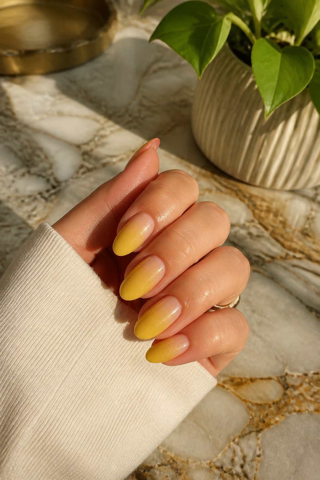
Aura designs and chrome effects change how lemon yellow reads on a nail more than a flat polish ever could. An aura manicure keeps the center soft, almost washed out, while the lemon yellow pools heavier at the edges and cuticle line. That gradient means the texture catches light at two depths, not one. Chrome layered over the same yellow shifts it cooler, toward something closer to a highlighter tint, because the metallic reflects ambient light rather than absorbing it. The set from @bees.knees.nails that pulled all three together, aura plus chrome plus textured 3D details, is the example worth studying: the lemon yellow stays bright without turning flat, because each finish handles the light differently. If you are choosing between them, aura gives the most wearable everyday version, chrome reads more deliberate, and the textured route asks for a steady hand or a technician who builds 3D gel without overbuilding.
Lobster Lemons
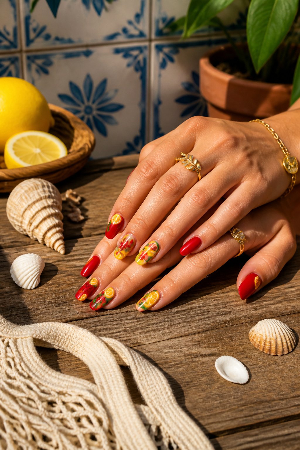
The red against yellow in this pairing reads like a New England seafood shack on a July afternoon, where the lobsters come off the boat and the lemonade sits in a sweating pitcher. That clash of warm red and cooler yellow is what makes the eye stop instead of sliding past; neither color lets the other fade into background.
The coastal reference lands hard for anyone who has spent a summer north of Boston. Lobsters belong to that specific stretch of Atlantic coastline, and pairing them with lemons nods to the drawn butter and the lemon wedges that come with the meal. It is not generic beach; it is Maine, Massachusetts, the rocky shore where the water runs cold.
3D lemons and tiny lobsters work because both shapes read instantly even at nail scale. A lemon slice is a circle with texture. A lobster, boiled red and simplified, keeps its claws and antennae recognizable. The tile pattern some artists lay underneath, white and blue, grounds the whole thing in a patio or kitchen table setting. Without that background, the two motifs might float. With it, they tell a single story about where you would rather be.
Citrus Shorties
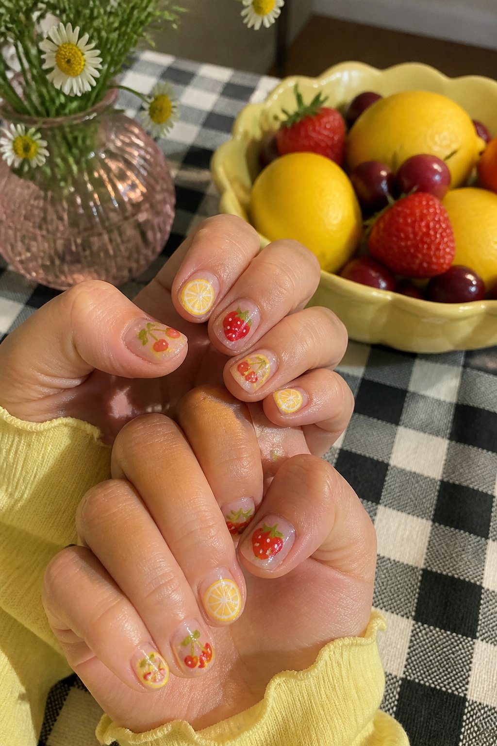
Short nails force a designer to work smarter, which is why a sparkly short citrus set lands harder than it sounds. The glitter catches light on a smaller canvas and gives the eye something to linger on without demanding the real estate of a stiletto. For women who type all day or cook with their hands in water, the length is the practical choice; the sparkle is what keeps the look from feeling apologetic.
The fruit does not stop at lemon. Cherries, peaches, strawberries, and oranges all show up in these mixed sets, so the manicure reads as a full fruit bowl rather than a single slice. That variety matters if you want mileage out of the design before summer ends.
Lemons and Oranges
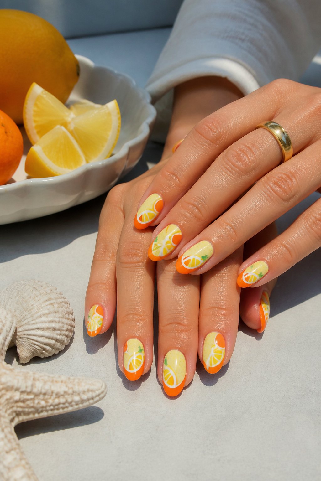
The orange stripes run along the nail bed where the lemon design sits, not across the tip where the blue lands. That separation keeps the three colors from fighting each other; the warm orange and soft yellow share a family, while the bright blue cools the whole thing down so it reads as citrus-fresh rather than citrus-overload. The blue tips act like a shadow on snow, giving the eye somewhere to rest.
I kept staring at this set from @natalie_thedollshouse trying to figure out why it worked when so many multi-color manicures look like a fruit salad exploded. The pale pink base helps, but the real structure is that stripe placement: orange marks the territory of the lemon motif, blue claims its own zone at the free edge, and the two never overlap. The soft yellow nails that carry the actual lemon art sit between them as a neutral ground.
Temperature matters more than people think with nail color. Warm on warm can go murky; that shot of cool blue keeps the orange and yellow from flattening each other into one hot smear.
Tile French Tips
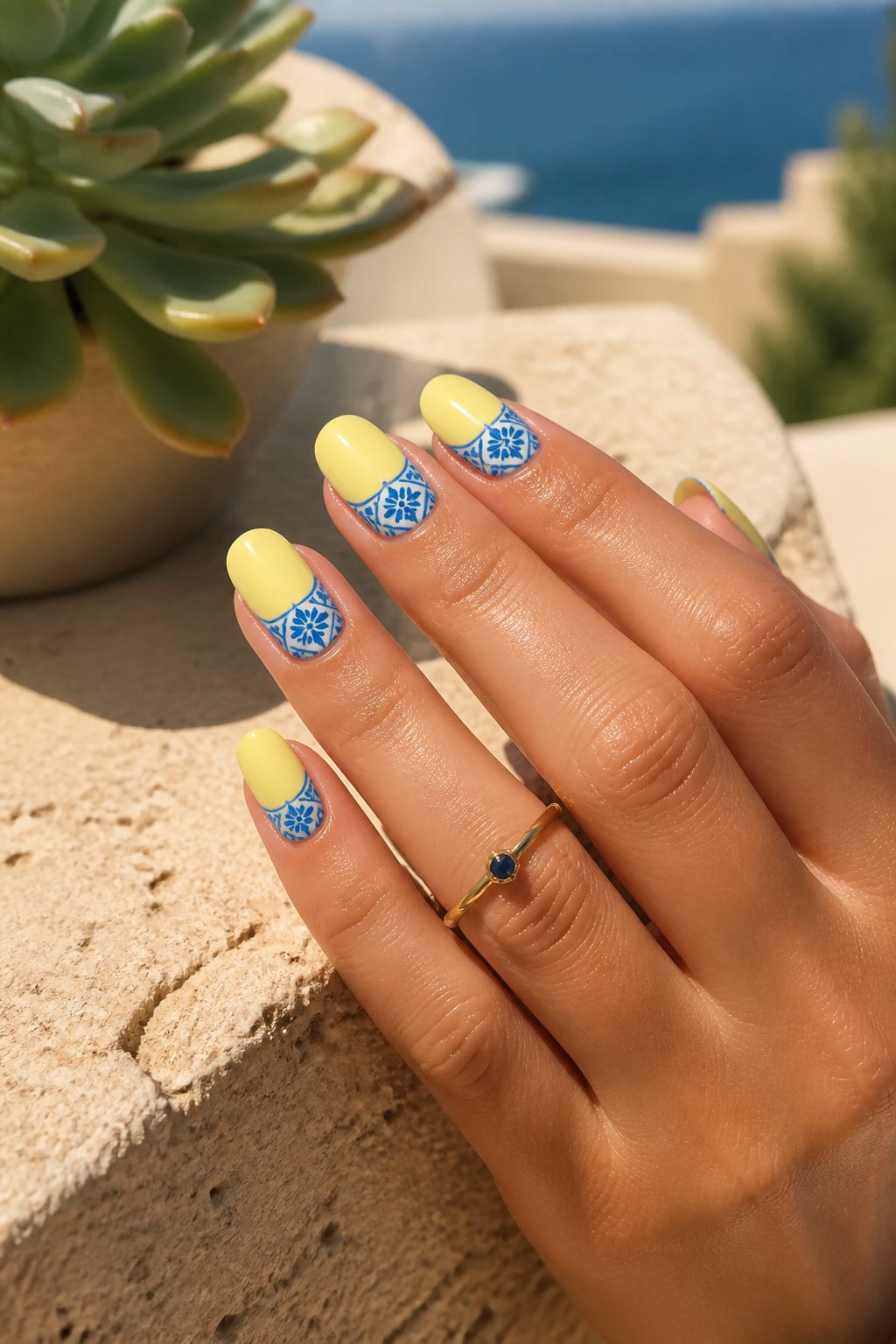
Blue tile French tips carry a Mediterranean reference point that reads as sophisticated against playful fruit, and the contrast is what makes the set work. A design from @kenzonailstudio either adds those blue tile patterns to the tips or places lemons on the base of the nail, and the two approaches feel like different moods rather than different themes. Tile patterns belong on the nail you want to keep formal; lemons belong where you want the eye to rest. The Italian tile inspiration, like the layered French tips with blue floral designs from @spring.naileducator, borrows from floors you see in Capri or Positano, so the reference lands even if the viewer does not name it. In practice, that means tile on the index and middle fingers where the hand reads as polished, lemon on the ring or pinky where the gesture softens. The transparent base keeps either motif from looking heavy, which matters more than the choice between them.
Lemon Yellow French Outline
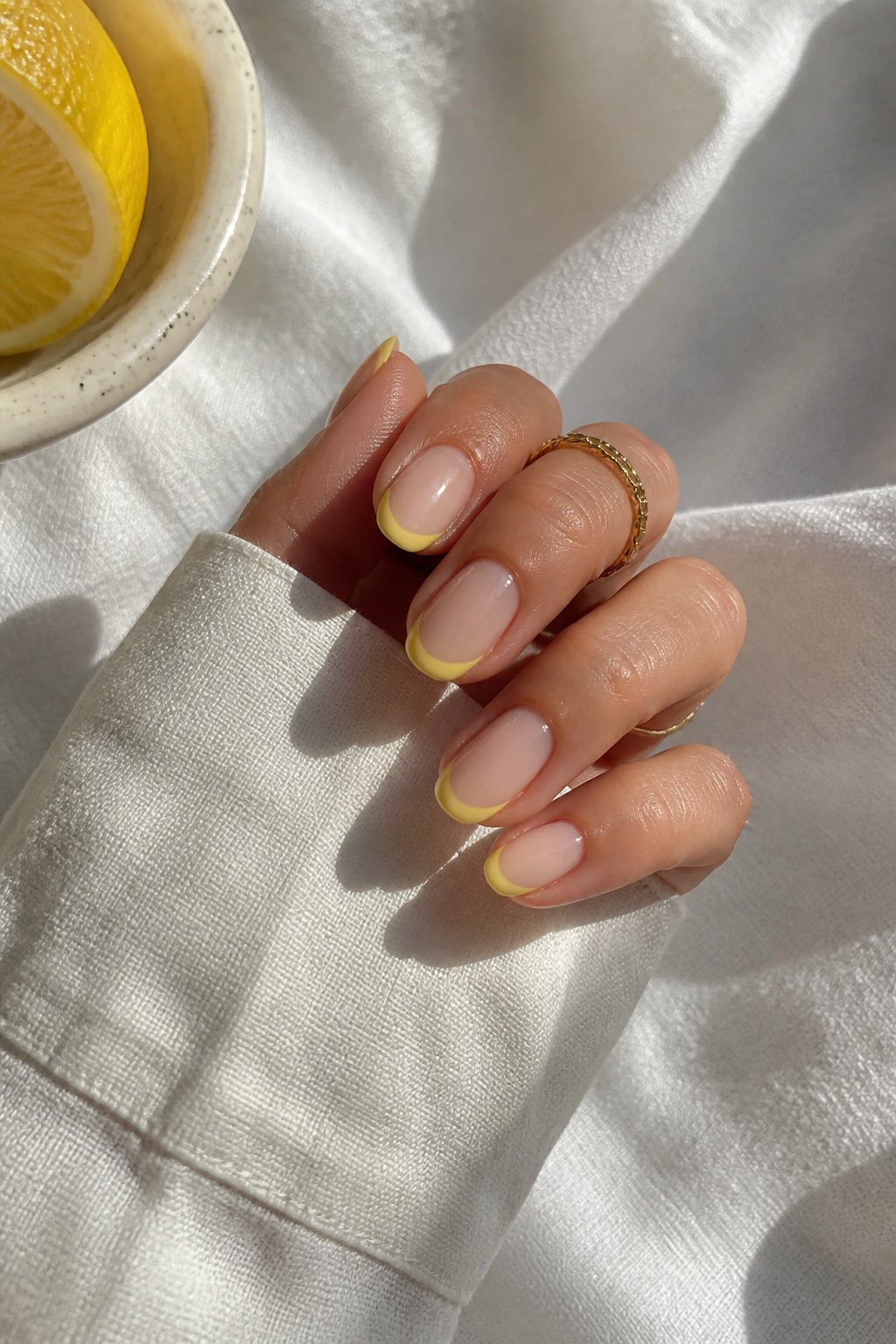
A lemon yellow French outline keeps the nail bed bare or nude while a thin, bright line traces the free edge. That line sits where a solid tip would go, but it reads as border rather than block. The eye travels to the contour instead of stopping on a mass of color, so the shape of the nail itself gets the attention.
Outlining adds visual weight without bulk. A filled tip shortens the look of the nail; a line defines it. On wider nail beds, that slim curve can pull the eye lengthwise where a solid square of yellow would only emphasize width. The outline also forgives a free edge that isn’t perfectly even, since the line can be drawn to correct the silhouette rather than tracing every flaw.
The shape of the outline matters more than the color choice here. A slightly rounded arc softens a squared nail; a crisp, shallow curve sharpens a round one. What convinced me, looking through dozens of these sets, is how often the outline fails when it is too thick. Two millimeters of yellow looks like a band, not a detail; one millimeter reads as intentional architecture.
Yellow and Pink
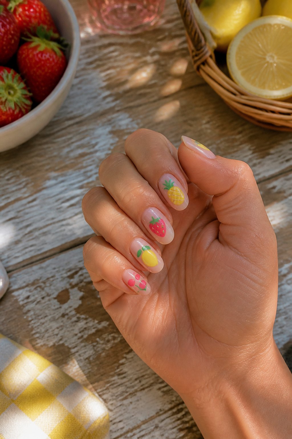
A full fruit salad manicure only works if one nail carries each fruit rather than crowding them together. I like lemon on the ring finger, strawberry on the index, and pineapple on the thumb, leaving the middle and pinky in solid pink so the eye has somewhere to rest. Pink is the thread that pulls it together, warmer than red would be against yellow, soft enough to read as flesh-toned in some lights. Without it, the three fruits fight for attention; with it, they look like they were picked the same morning. The pink should sit between peach and bubblegum, not neon, not pastel, something that could plausibly be the inside of a strawberry itself.
Italy Inspired
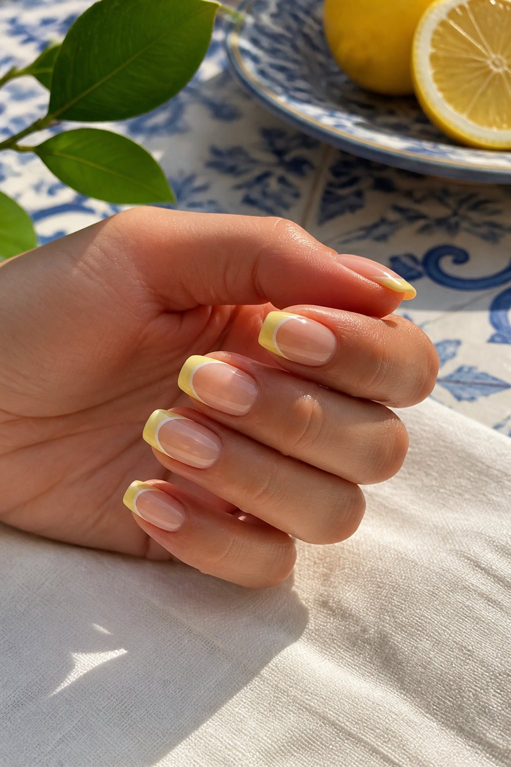
A transparent base keeps lemon nails from turning heavy under summer sun, letting the yellow read as fresh juice rather than thick paint. Layered French tips build the look in stages: a pale curve first, then a brighter second arc slightly higher, so the edge catches light like stacked gelato scoops rather than a single flat stripe. The Italian read comes from pairing those lemons with blue floral accents that echo Majolica tile, not the softer Provencal blue or the stark navy a generic European theme might borrow. That ceramic brightness, almost a cobalt, against warm yellow and clear space is what places the design specifically along the Amalfi coast. The transparency matters more here than in other fruit sets because the tile reference needs breathing room; pack the nail solid and the pattern turns souvenir-shop busy instead of villa terrace calm.
3D Slices
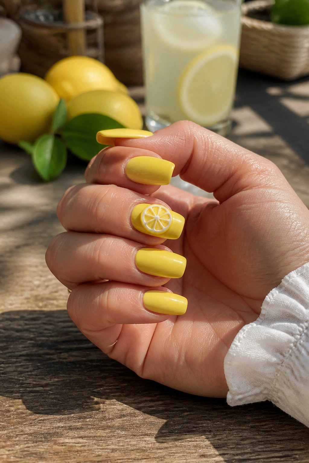
A solid yellow base reads louder than it sounds until you see it holding a 3D lemon slice. The monochrome field does the same work a bare wall does for a single painting: it gives the eye nowhere else to go. The slice itself, built up in thin layers of acrylic or gel, catches light at its rind edge and casts a tiny shadow on the nail plate that flat art never manages.
The attachment point is where most 3D nail art fails. The slice has to sit flush enough that a ponytail or a sweater sleeve won’t hook underneath. A slightly curved underside, matched to the nail’s own arch, fixes this better than a flat-backed piece ever will. The builder still needs to seal the circumference with a flexible top coat, not a flood of glue that turns brittle by day three. Done right, the piece stays through two weeks of ordinary use; done wrong, you feel the snag before you see the gap.
3D Pink Slices
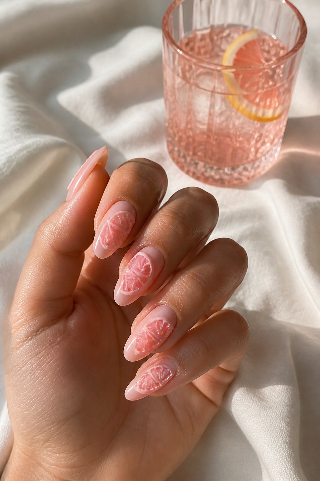
The pink shift turns a sour reference into something sweeter and more playful, which is why pink lemonade 3D nails read as a treat rather than a kitchen ingredient. Yellow lemon slices tend to aim for realism, with rind texture and pulp detail that looks almost edible; pink versions usually soften that approach. The rind might stay pale yellow or shift to white, and the flesh gets a creamy gradient rather than sharp segment lines. In my experience scrolling through salon portfolios, the pink ones also sit slightly higher off the nail bed. Technicians build them with thicker gel or acrylic because the color is softer and needs more dimension to catch light, whereas yellow reads bright even when flat. The mood ends up closer to bubblegum or rosé than to anything you’d squeeze over fish. If you want the 3D effect without looking like you dipped your fingers in frosting, keep the pink muted, almost milky, and let the shape do the work.
Lemon Yellow and Leaves
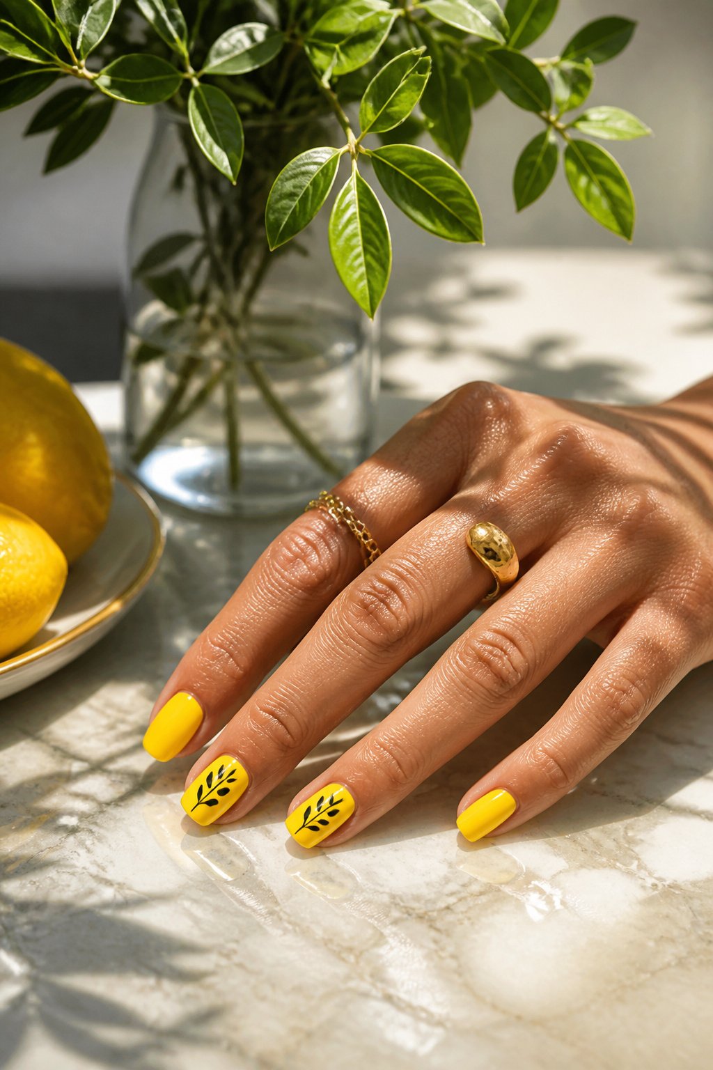
A bright lemon yellow set from @bees.knees.nails shows how the leaf element keeps this look from tipping into pure color-block territory. The design pairs solid yellow with French tips, then adds nude nails carrying a yellow swirl stripe and black leaf designs that read as stylized rather than botanical. That choice matters. Botanical leaves would fight the graphic punch of the yellow; these simplified shapes echo it instead.
The same balance shows up in an almond-shaped French tip set from @nailsbykarenm_ done in butter yellow with lemon designs. Softening the yellow to that paler tone lets the leaf detail feel minimal even when the fruit motif is present. Either way, the green (or black) leaf acts as a visual brake. Without it, the yellow runs loud. With it, the eye has somewhere to rest.
What I notice comparing the two is how the leaf bridges approaches. A solid yellow nail with one small black leaf reads restrained. The same leaf multiplied across a swirl stripe turns decorative. The element scales without changing character, which is rarer than it sounds in nail art. Most motifs flip from minimal to maximal just by adding more of them. These leaves stay coherent.
Zesty Set
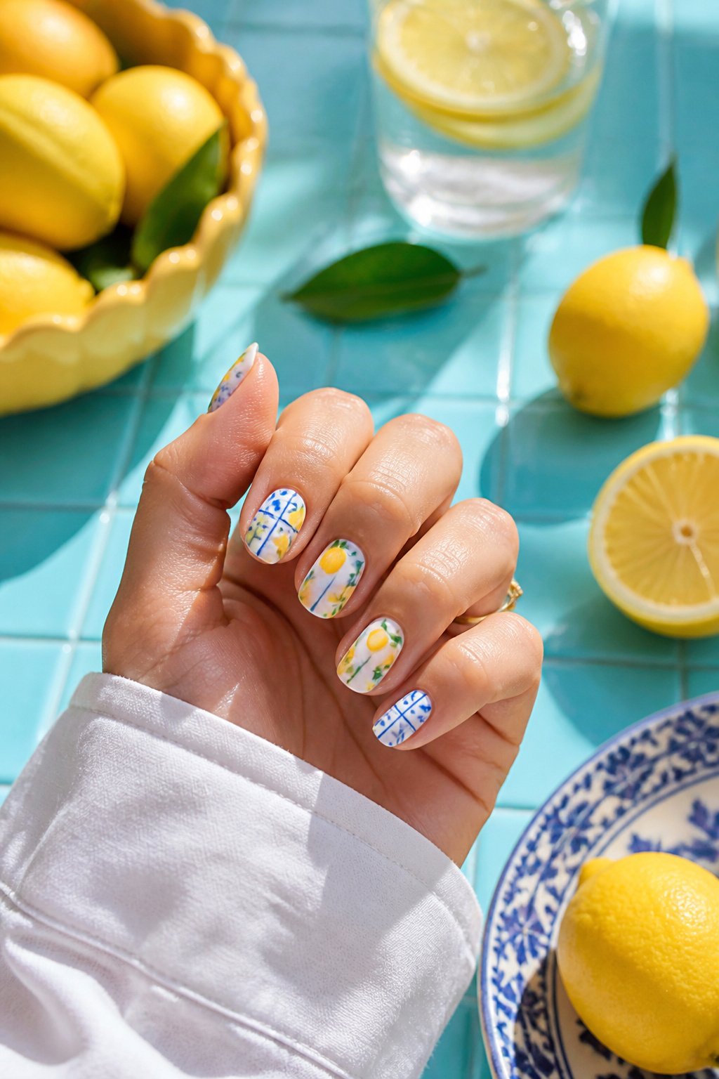
The blue and white tile in this set reads as a full nail pattern rather than the narrow tip band used in the earlier French variation. That larger scale gives the lemon something to compete with, and the designer at @nails_by_3llie handles it by keeping the fruit small and placing it off-center so the eye lands on the yellow first, then travels the grid. The tile needs to stay under a half-centimeter repeat or the nails turn into kitchen backsplash; here the squares are tight enough to read as texture from arm’s length while still looking deliberate up close. The lemon itself is painted with a thin white highlight on the upper curve, which separates it from the pale blue behind it. Without that highlight, yellow on blue-white would sink in and disappear.
Fruit Stripes
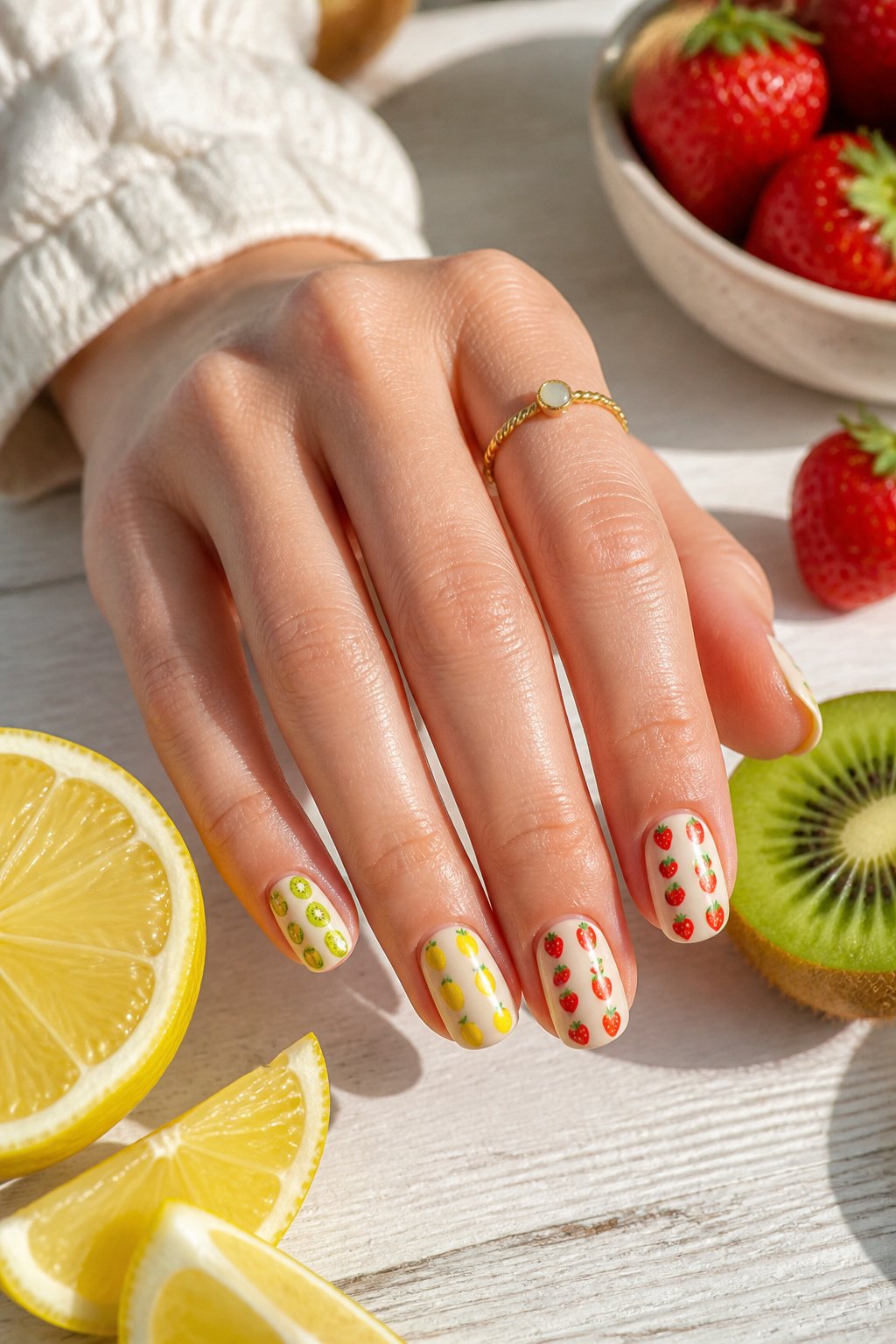
Horizontal stripes give scattered fruit something to line up against, which is why vertical bands read as calmer than diagonal ones when lemons, strawberries, and kiwis all share one nail. I noticed the busiest designs keep stripes thin, two to three millimeters, so the fruit still registers as the main event rather than decoration on a circus tent. Direction matters more than I expected: stripes running parallel to the finger elongate, while horizontal ones break the nail into color blocks that can handle larger fruit motifs without looking crowded. Beyond lemon, the combinations that keep working are cherry and lime on a cream base, or watermelon wedges spaced along a pale pink stripe. The risk is turning the nail into a fruit salad, which happens fast when every stripe gets its own fruit. What saved the designs I liked best was keeping one stripe plain, usually the center or the outer edge, so the eye has a place to rest.
Juicy Grapefruit
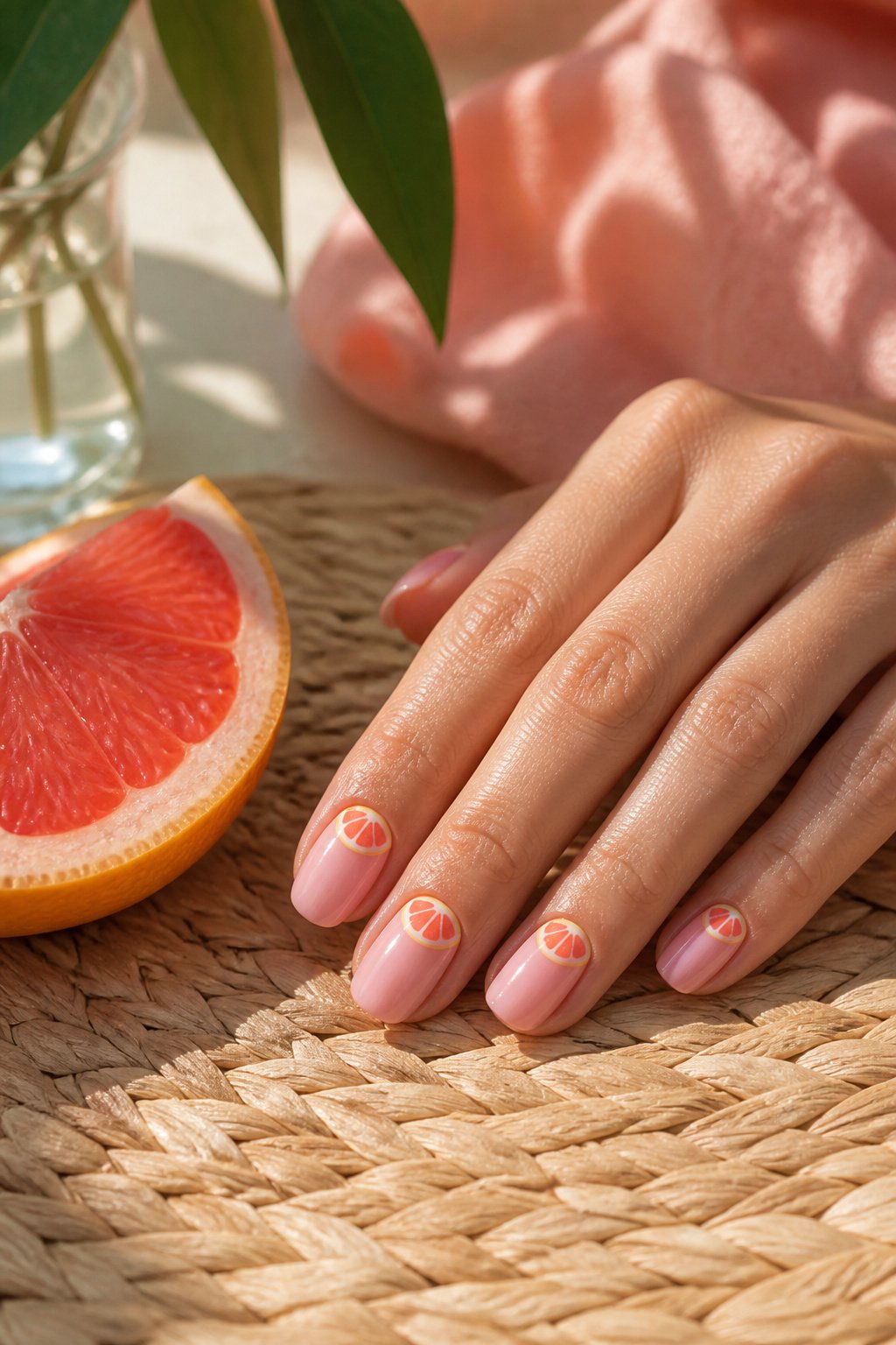
Pink grapefruit nails pull the same sunny energy as lemon designs, but the color shift changes everything about how the set reads on your hand. Where lemon yellow runs sharp and acidic, grapefruit leans into a warmer, rosier base that flatters more skin tones without losing that citrus punch someone searching "lemon nails" is after.
The difference sits in the undertone. Lemon designs often pair white or pale yellow with a bright, almost neon rind; grapefruit swaps in coral-pink flesh and a blush-orange rim. That swap softens the contrast against your skin rather than popping against it, which makes the manicure feel less like a statement piece and more like a natural glow.
I reach for grapefruit when lemon feels too literal, too summer-camp. The pink keeps the fruit theme alive while reading slightly more grown-up, slightly more brunch than picnic. If you already own a lemon print dress or yellow sandals, grapefruit nails bridge the gap without matching too hard.
For execution, a sheer pink base with hand-painted grapefruit segments at the cuticle works cleaner than a full-coverage fruit pattern. The negative space lets the color breathe, and the smaller motif keeps short nails in play. Skip the green leaf detail that lemon sets often carry; grapefruit looks fresher with just the fruit and maybe a thin gold outline on one nail to pick up the warmth.
Lemon Blueberry
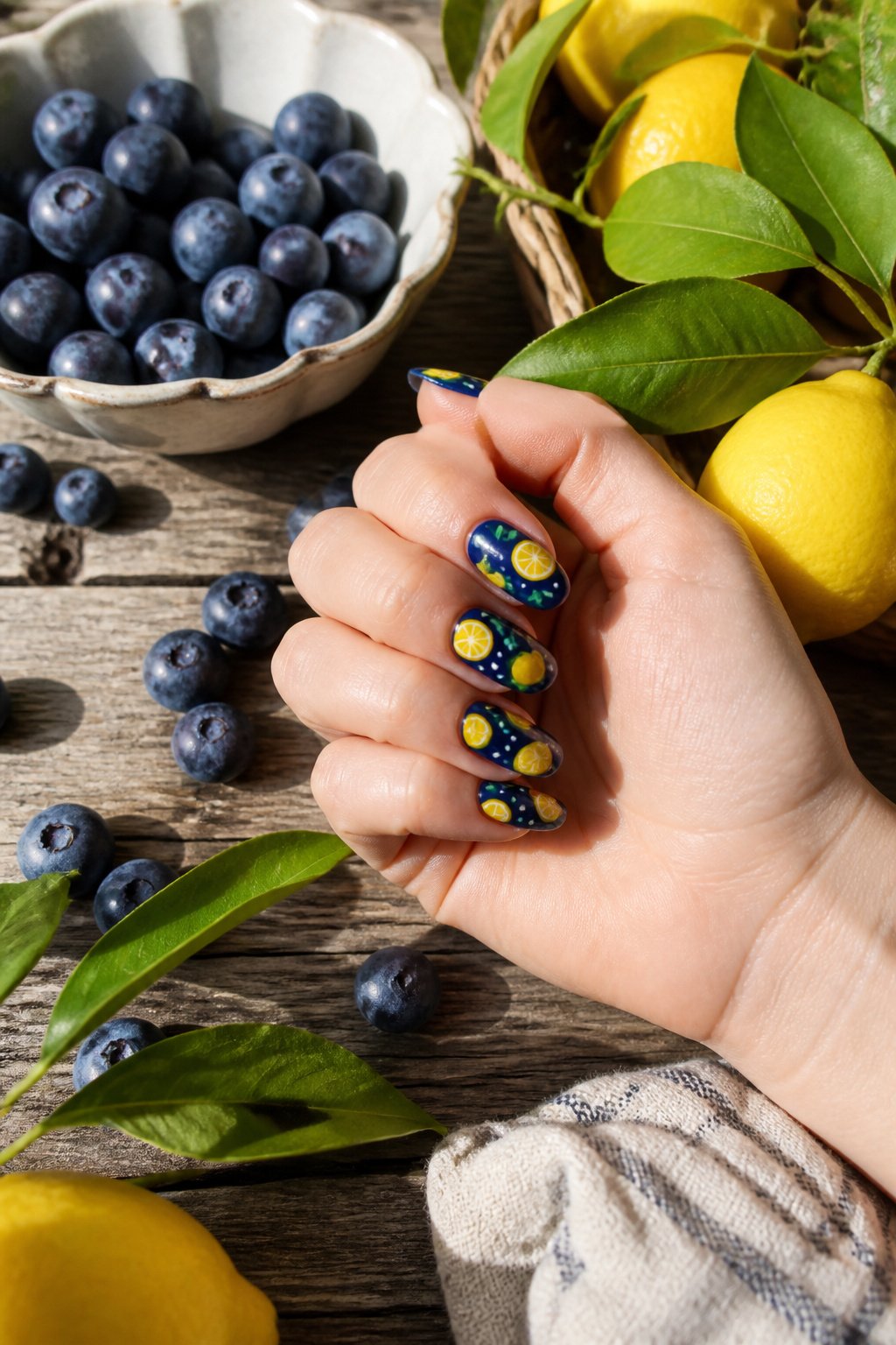
Blue and yellow sit opposite each other on the color wheel, which is exactly why the purple-blue of a ripe blueberry reads so crisp against lemon yellow on a nail. The pairing from @nailsby._itzel builds the design on a yellow base, then adds stripes and gingham tips alongside both whole and sliced lemon designs, with blueberries scattered across the set. The stripe pattern here is not random; it anchors the eye so the fruit motifs do not float in empty space, and the gingham keeps the look grounded in a picnic-table familiarity rather than resort-wear flash. What makes this feel American rather than tropical is the blueberry itself, a fruit native to North American thickets and farm stands, not a mango or passionfruit that signals vacation airfare. The combination reads like summer in the Northeast or Midwest: something you picked yourself, not something that arrived on a hotel welcome tray.
Capri Style
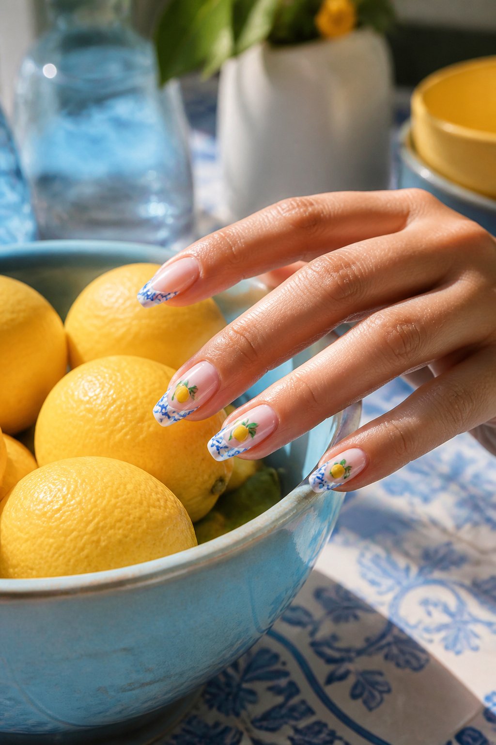
Negative space keeps a manicure from feeling crowded, and the Capri style uses that breathing room deliberately. The unpainted nail shows through in strips or half-moons while hand-painted lemons and that iconic white-and-bright-blue tile pattern sit on the painted portions. The contrast makes the yellow fruit read brighter without piling on more polish.
The Italian island reference comes from the color pairing itself. Capri’s famous ceramics and coastal buildings share that same crisp blue against white, and the lemon motif nods to the limoncello the region is known for. Wearing it feels like a vacation detail rather than full costume. The negative space is what saves it from looking like a souvenir shop purchase; your own nail acts as the neutral background so the design stays light enough for everyday wear.
Citrus Slices
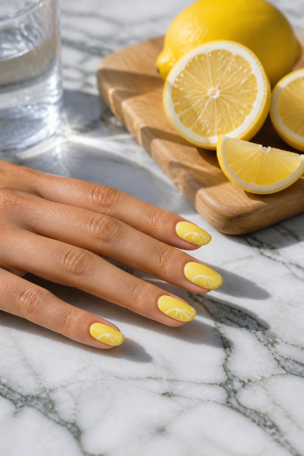
Matte nude gel polish does the quiet work here, sinking back so the citrus can read from across a room. I have seen this base paired with blood orange, lime, and grapefruit rounds alongside the lemon, and the mix keeps the eye moving without crowding the nail. The flat finish matters more than most people expect. Glossy nude would catch light at every curve and compete with the fruit; matte reads as skin-tone texture, almost like bare nail, which lets the painted slices feel stamped on rather than floating above. That drop in shine shifts the whole set from party-ready to something you could wear into a Monday morning meeting. Matte nude is the reason these designs stay wearable instead of costume. If you are ordering polishes for this look, the base matters as much as the art on top.
Pink Lemons
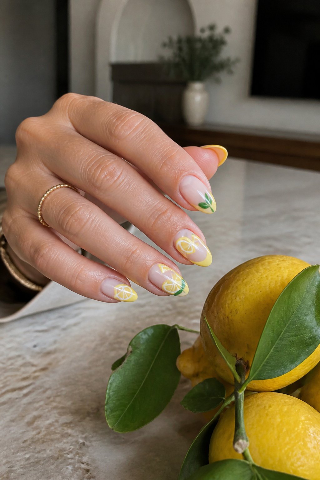
A warm pink base does something unexpected with lemon nail art: it turns the whole look from roadside-stand bright to something you could wear to a spring wedding. The pink itself stays the pink, and the lemons stay yellow, but the combination reads softer than yellow-on-white ever could. The warmth in the base flatters medium and olive skin tones most directly, though cooler complexions can pull it off if the pink leans coral rather than bubblegum. What shifts is the mood of the fruit. Against white, lemons look graphic and almost edible. Against pink, they look illustrated, like something from a vintage tablecloth. The yellow stays yellow, never shifts to match the base, and that slight clash is exactly what keeps the design from looking too matchy. I would keep the lemon details small, maybe a single fruit per accent nail, so the pink still reads as the main event. Too many lemons and you drift into fruit-salad territory, which defeats the purpose of choosing the quieter base in the first place.
Lemon Combo
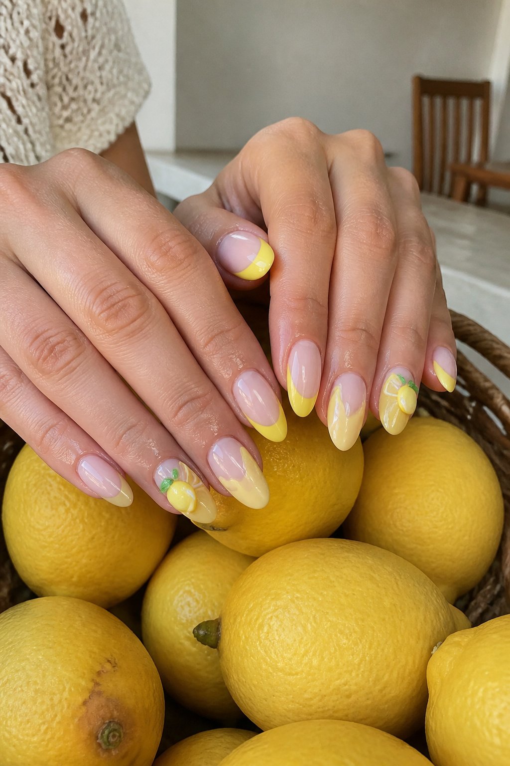
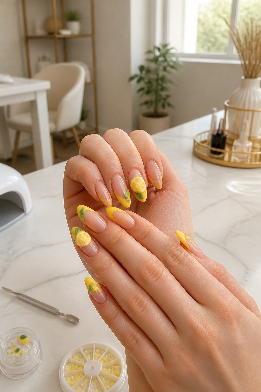
Yellow French tips with lemon slices painted right at the smile line commit fully to the theme instead of diluting it with unrelated accents. The slice sits where the white tip would normally end, so the rind curves along the free edge and the fruit body fills the tip zone. Repeating that same slice across all ten nails reads cleaner than mixing whole lemons, leaves, and flowers into one set; the eye picks up the rhythm instead of hunting for what changes. A single accent nail breaks that rhythm unless the accent is just a denser cluster of the same slice. Soft yellow bases keep the look wearable for everyday, while brighter chrome yellows push it toward vacation territory. The set from @nails_by_3llie lands in the middle: pleasing and soft because the repetition calms the novelty of the motif itself.
Realistic Lemons
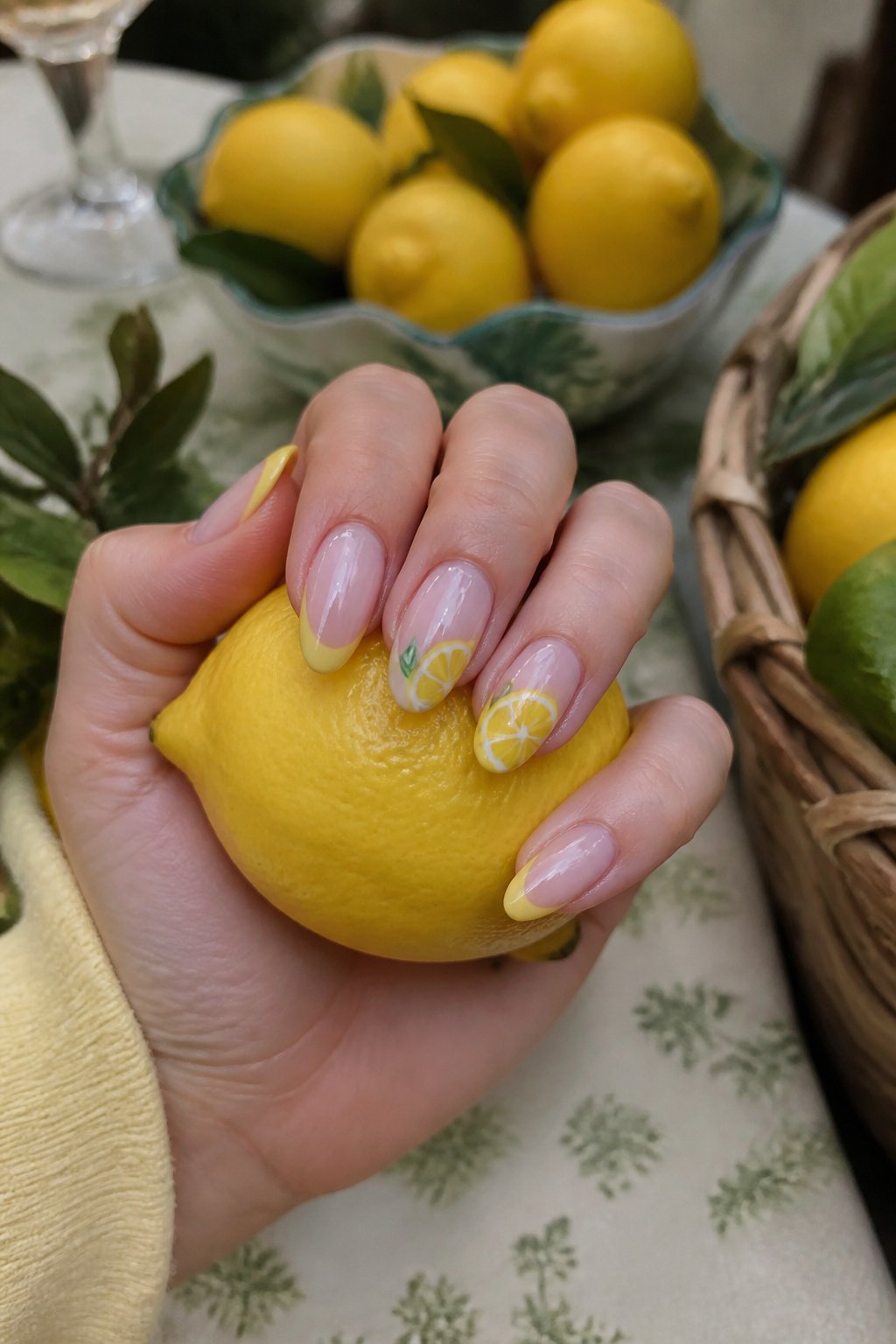
Realistic lemon nails live or die in the botanical details. The set from @le_dore.studio pairs the fruit with green leaves and white flowers, and that choice immediately separates studied nail art from the cartoonish stuff floating around Pinterest.
Those white flowers matter because they reference actual lemon tree growth, not just a generic fruit sticker look. Lemon trees produce small, fragrant white blossoms before the fruit sets, so including them signals that the artist or the wearer has actually looked at how these plants grow. The leaves carry the same weight: proper lemon foliage runs oval with a slight point, glossy dark green above and paler underneath, not the simplified teardrop shape that reads as clip art.
The overall effect is botanical illustration rather than emoji. Where cartoon lemon nails flatten everything to a yellow oval with two stubby leaves, this approach layers in the full growth cycle: flower, leaf, mature fruit. It reads as someone who spent time with the reference material, whether that was flipping through a gardening book or studying the tree in their own backyard. The realism holds up at conversation distance, which is exactly where most nail art gets judged.
Blue Leafy Lemons
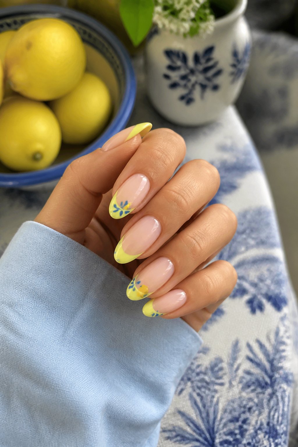
The blue in this leafy lemon set carries a depth that keeps it from reading as pastel or sky-toned. It is dark but still bright, a saturated cobalt that sits closer to navy than the lighter bases you see on typical summer manicures. That depth matters because it gives the yellow lemons something to push against.
The leaves here are small and rounded, almost cartoonishly simple, drawn in the same green as the stem rather than a separate shade. Their scale keeps the design from feeling crowded even when every nail carries both fruit and foliage.
High-contrast color pairings usually risk vibrating, that optical buzz where two hues seem to shiver at their shared edge. Blue and yellow avoid this because they sit nearly opposite on the color wheel without the harshness of a true complement like red and green. The blue cools the yellow down; the yellow warms the blue up. The result reads as energetic but not aggressive, which is why this particular pairing keeps showing up in lemon nail sets that need to feel playful without tipping into novelty.
Yellow Glitter
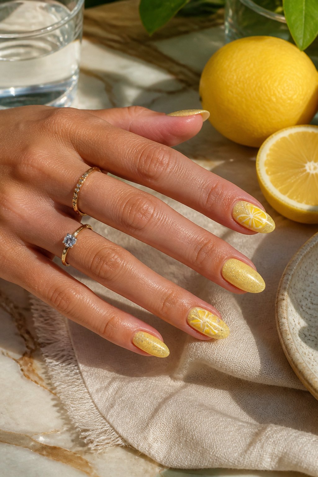
A long coffin shape gives glitter the real estate it needs to read as dimensional rather than scattered. The flat surface of a bright lemon yellow base can look almost too clean, almost plastic, but gold glitter catches light at the edges of that tapered coffin silhouette and breaks the color into something that shifts when you move your hands. The length matters here. Short nails with this much sparkle tend to look like a craft project; at coffin length, the glitter reads deliberate, dramatic, still wearable. The set from @nails_by_3llie keeps the accent to one nail, which is the move that keeps it from tipping into costume. Too much glitter across all ten and the shape fights the finish. One nail, full coverage, and the rest in solid lemon yellow lets the coffin length do what it is built for: carrying a single bold element without clutter.
Little Lemon
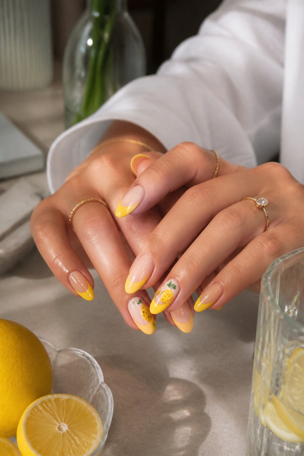
Cat eye nails with water droplet designs read as simple from a distance, but the scale is what makes them work. A single lemon accent nail keeps the look from turning into a fruit basket, and the droplets catch light in a way that reads fresh rather than busy. The effect is closer to morning dew than full-on summer theme.
For someone who wants lemon without signing up for a full set, this is the compromise that still photographs well. The water droplets add texture without dimension; you get the idea of wetness, not a 3D slice catching on your keys. Two ways to play it: keep the cat eye base neutral and let the lemon accent carry the color, or reverse it and run the yellow across most nails with droplets on the French tip. The neutral base wins if your wardrobe leans minimal; the yellow-forward version reads better against a tan. Either way, the droplets are the detail that separates this from a basic yellow manicure, and they cost nothing extra in chair time.
Pink Fruits
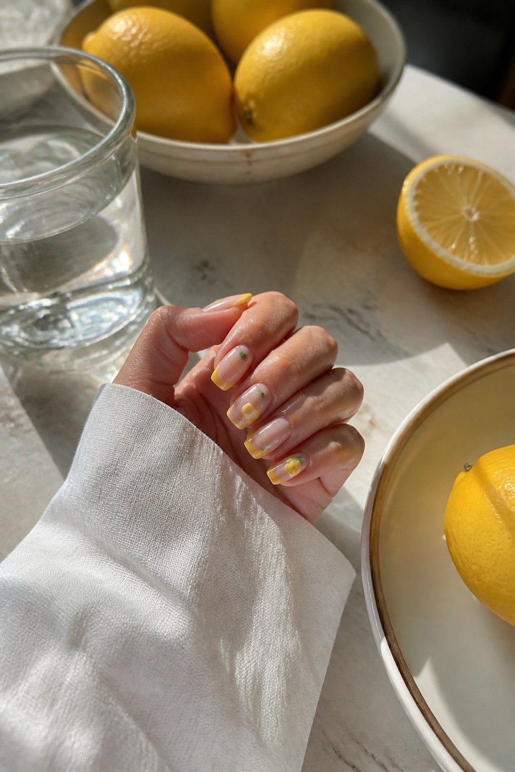
Most lemon nail sets let yellow run the show, but flipping that script changes the whole mood. A pink base with lemons as the accent keeps the design girly without tipping into candy-sweet territory. The fruit set from @le_dore.studio shows how this works: cherries, peaches, strawberries, and oranges share the nail with the lemons, so no single color shouts louder than the rest. Pink becomes the wall color; the fruits hang on it like framed prints. The usual formula, yellow everywhere with maybe a green leaf or two, reads cheerful but flat. This inversion gives the eye somewhere to rest. Hot pink tips with lemon art, like the set @nailsbykate.cle posted, push even further by adding orange dots and pink polka dots around the free edge. The extra colors keep the pink from feeling like a background afterthought. If you already own a dozen pastel polishes, this is the move that uses them without looking like Easter.
Lengthy Lemons
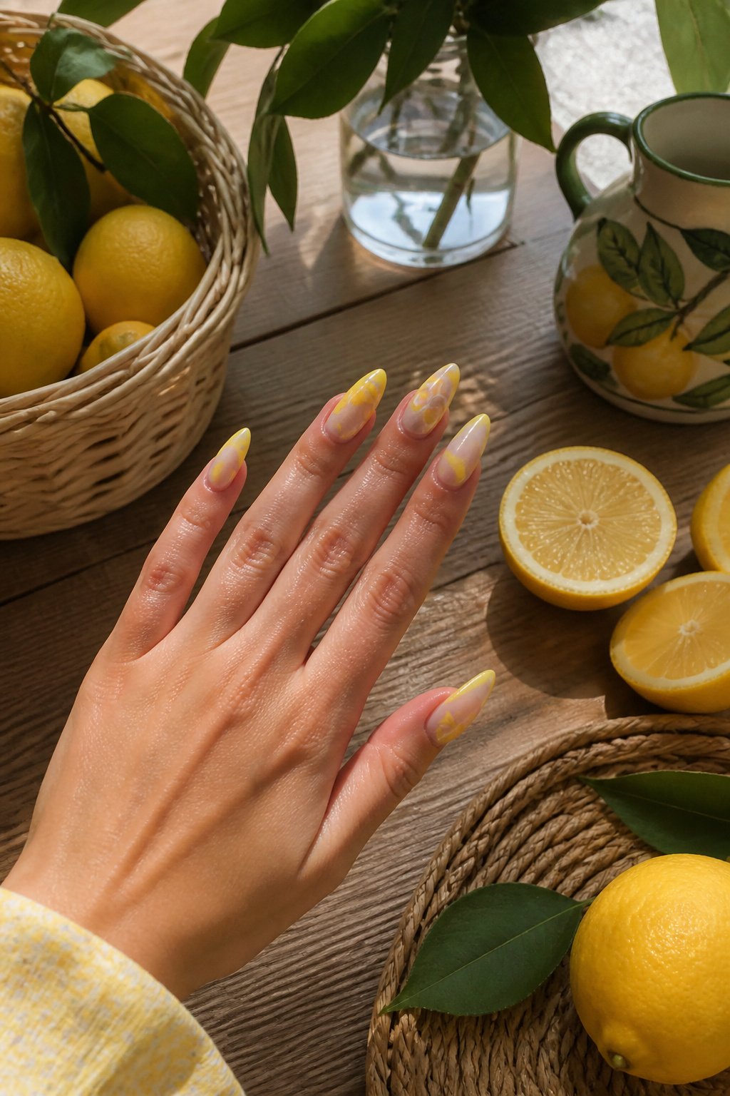
A long almond set gives the nail bed enough runway for a 3D lemon slice to sit without crowding the cuticle or overhanging the free edge. The taper of an almond shape mirrors the curve of a lemon wedge, so the slice looks like it belongs there rather than like an afterthought glued to a square tip.
Length matters more than most people expect with dimensional art. A lemon slice built from gel or acrylic needs enough surface to anchor the rind, the pith, and the segmented flesh without each layer spilling into the next. On shorter nails, the same elements stack too high and catch on hair, pockets, or keyboard edges. The weight sits at the stress point where the nail leaves the finger, which is exactly where short nails are weakest.
Almond nails shift that weight back toward the center of the nail plate. The sides narrow, but the apex, the highest point of the arch, stays over the nail bed itself. That geometry keeps the 3D piece from acting like a lever every time you tap something. I have seen long square nails with heavy fruit art crack at the sidewalls within a week; the almond clients usually come back for fill-ins, not repairs.
The limit arrives when the slice gets thick enough to read as a bead rather than a disk. Past about three millimeters of height, even long almonds start to feel like typing with pebbles. A thin slice with painted segments, maybe a drop of clear gel over the top for juice, gives the look without the liability.
Aqua Fruits
Aqua makes the single best backdrop for a multi-fruit manicure because it does two jobs at once: it reads as water and as sky, so the whole hand looks like vacation before a single fruit is painted on. Watermelon wedges, halved oranges, and scattered strawberries all sit on that base without fighting each other, since none of them carry blue-green tones that would clash. The aqua itself stays flat and cool, almost always a solid crème rather than shimmer, which keeps the eye on the fruit illustrations rather than the background.
Poolside or tropical is the only register this works in. Shift that same aqua to a kitchen context and it starts looking like a 1950s Formica table; pair it with gingham or wicker and the nails turn into a picnic basket. What saves the look is negative space and the sheer brightness of the fruit colors against that chilled-out base. A hot pink strawberry or a saturated coral orange pops harder on aqua than it would on white, and the contrast feels intentional rather than cute.
If you are adding a lemon to this mix, keep it small and place it where the curve of the nail naturally breaks the composition, not dead center where it competes with the rounder fruits. The yellow needs that aqua to keep it from tipping into school-bus territory.
Sage Lemons
Muted sage green shifts the whole mood from summer punchline to something you could wear through September without anyone blinking. The gray in that green cools the yellow down so the lemon reads as botanical illustration rather than fruit sticker. I have seen this done with the lemons painted in soft watercolor layers, no black outline at all, which is what makes them read as lifelike rather than cartoon. The rind gets two thin washes of ochre and cream, the pith stays slightly pinkish, and the segments inside are barely suggested with a pale coral. It is quiet enough that the nail still looks like a neutral from two feet away. For an office setting, that matters. The design does not announce itself across a conference table; someone notices it when you hand them a coffee, and then they lean in. Fall transition works the same way, since sage is already the color of dried stems and fading herbs. The lemon becomes a last bit of summer held in that muted frame, not a refusal to let the season go.
Abstract Art
Abstraction works on nails when the viewer still reads "lemon" without needing a literal slice. A single yellow curve against a pale base, or three spaced dots suggesting seeds, often registers faster than a tiny painted fruit because the eye fills in the rest. The elements that get simplified are the rind’s texture and the oval shape; what gets exaggerated is the color saturation, since nail space is so small.
This approach suits anyone who finds literal lemon depictions too cute or seasonal. A client once told me her abstract yellow arcs read as "fresh" at work without anyone asking about her vacation plans. The tradeoff is recognition distance: up close the design is clearly citrus, from across a room it may just read as sunny geometry. If you want the fruit to read at arm’s length, keep at least one recognizable cue, a pointed oval or a thin white rim line, and let the rest dissolve into color fields.
Bright Blues
Bright blues flip the usual lemon-nail formula so the fruit becomes the accent, not the headline. A saturated cobalt or near-navy base from @bees.knees.nails makes the yellow pop harder than it would against a neutral, and the green leaves read as fresh contrast rather than garden-party sweetness. The hierarchy shift matters for who wears it: someone who wants the summer reference without looking like she is carrying a fruit basket. I have seen the same reversal in a set from @nailsby._itzel, where blue bows and tropical flowers share space with lemon slices rendered in blue themselves, almost like citrus ghosts. That version keeps the palette unified while still giving the eye somewhere to rest. The blue star/ lemon supporting-player arrangement suits office weeks better than vacation weekends, and it pairs more naturally with denim or a crisp white shirt than all-yellow designs tend to. If your closet leans minimal, this is the lemon nail that does not fight your clothes.
Lemon Slices
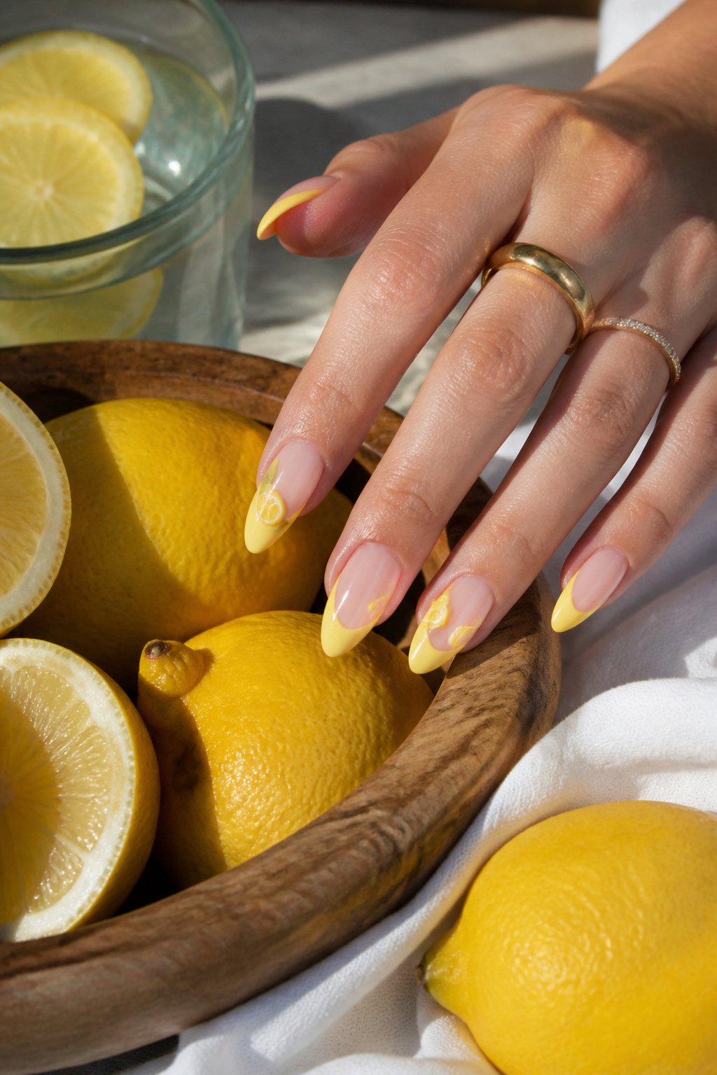
A bright yellow base with lemon slice designs across the nail reads fresher than whole-fruit illustrations because the cross-section shows what you actually want to eat. The rind gives a clean white border, the pith adds a soft pale ring, and the segmented flesh bursts with color that a simple oval lemon silhouette never delivers. Whole lemons on a nail look like stickers from a school craft bin; slices look like something just cut on a cutting board.
The interior detail is what sells the appetite appeal. Those tiny juice vesicles, painted as soft triangles radiating from the center, catch light differently than flat yellow fill. A thin line of darker yellow at each segment edge creates depth without requiring 3D gel work. The white pith ring against the nail’s base color also solves a practical problem: it frames the design so the yellow does not bleed into the background and turn the whole nail into a blur.
Placement matters more with slices than with whole lemons. Two or three small slices scattered across a nail look deliberate; one large centered slice works on an accent nail but crowds a pinky. The cut side should face outward toward the fingertip, the same way you would set a real slice on a rim. That orientation keeps the design from reading upside down to the person wearing it.
Pink Lemonade
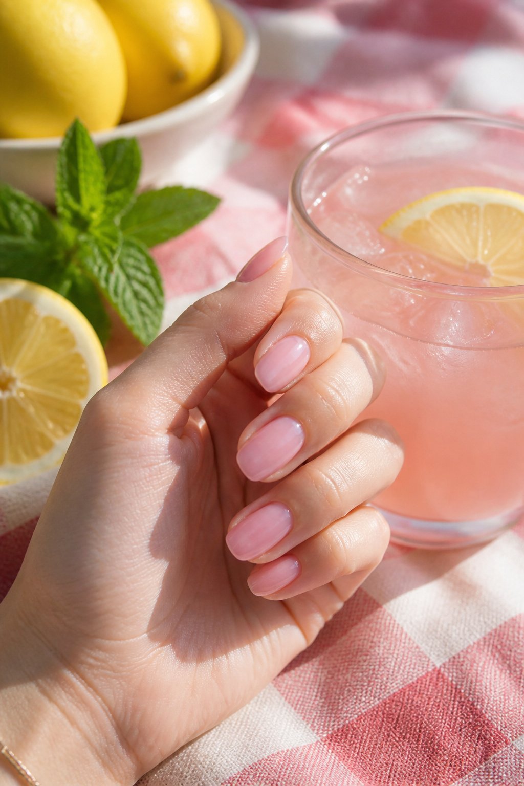
Pink lemonade nails work best when the color story stays soft enough to read as a drink rather than a traffic cone. A milky translucent base, a streak of pale coral, maybe a thin line of white where the glass would catch light. The glass itself is optional; a single vertical highlight down the nail does the same job without turning the whole hand into a novelty straw. What sells the memory is the particular washed-out pink of roadside stands, the kind that came from a powder mix and tasted faintly of metal. That flavor is the whole point. A design that goes too saturated loses the haze of heat and vinyl tablecloths, the specific afternoon boredom of being nine and waiting for the adults to finish talking. Keep the pink just shy of bubblegum and the reference lands without explanation.
Spanish Tile
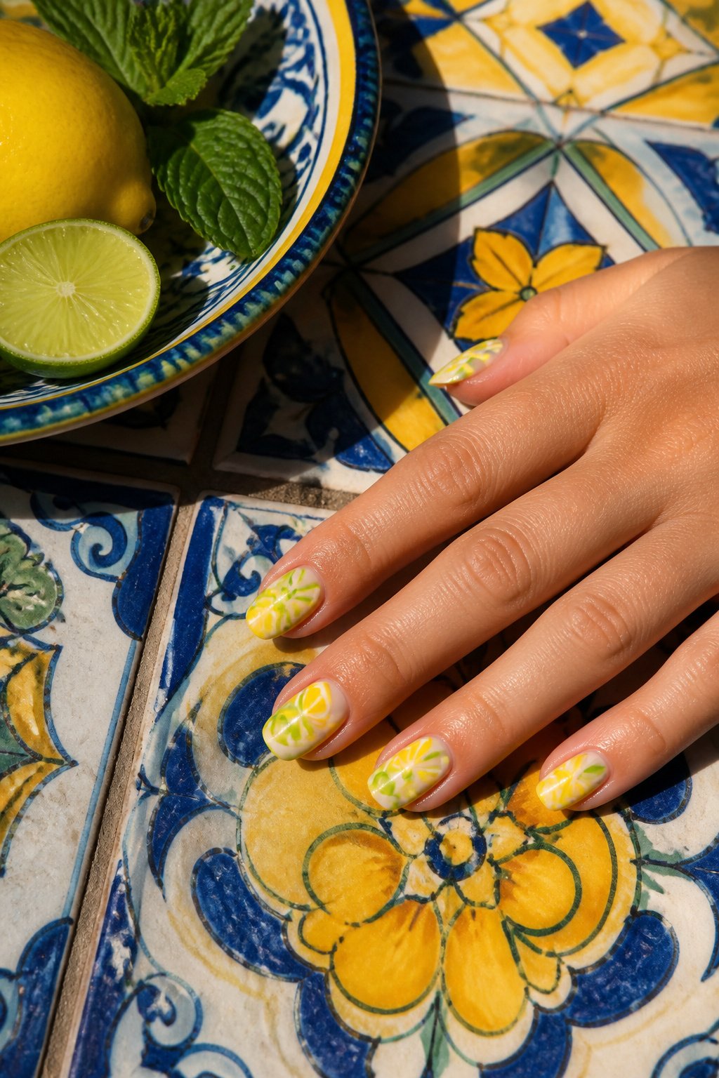
Spanish tile carries sharper geometry than the softer, rounded florals you usually see in Italian versions, and that angularity changes what a citrus motif can do on the nail. The straight edges and repeating patterns need a fruit that reads as clean lines rather than gentle curves, which is why lime replaces lemon here. Light green slices from @manis.by.katie fit the corners and crosses of the pattern without the visual weight of a rounder yellow lemon.
The color shift also moves the regional reference west. Italian tile tends toward warm terracotta backgrounds with yellow accents; Spanish tile leans cooler, often cobalt or emerald against white plaster. Lime green keeps that cooler palette intact instead of pulling the eye back toward Mediterranean warmth. If you have already tried the Italian lemon look, this is the same structural idea with the temperature turned down.
Yellow Designs
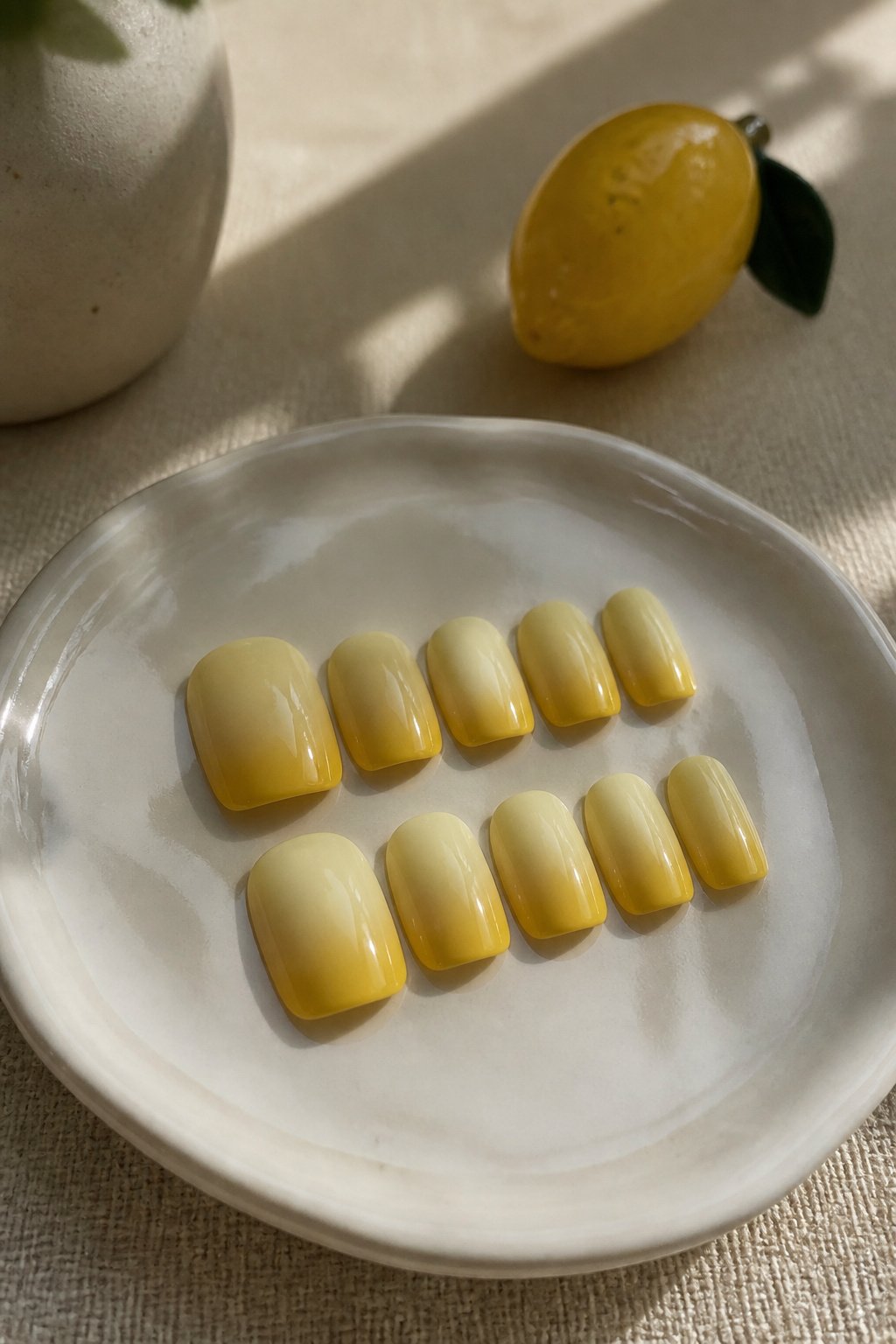
Ombre yellow French tips soften the hard white line that usually caps the nail, letting the color bleed upward like actual lemon peel fading into pith. The gradient matters because a flat yellow tip can look pasted on, while a fade that starts pale at the cuticle and deepens toward the edge makes the yellow feel lit from within. Artistic designs on these tips work best when they are not literal lemons at all: think thin black ink lines suggesting citrus segments, or a single gold foil curve that reads as rind without spelling it out. The lighter your base, the more intense the yellow reads at the tip; start the ombre too low and the whole nail goes chartreuse. Keep the gradient in the top third if you want the design to sit on a near-clear field rather than competing with yellow halfway down. A nail tech can airbrush this, or you can sponge it at home with two polishes and a steady hand, working the darker shade from the free edge inward until the meeting point disappears.
Fruit Frenzy
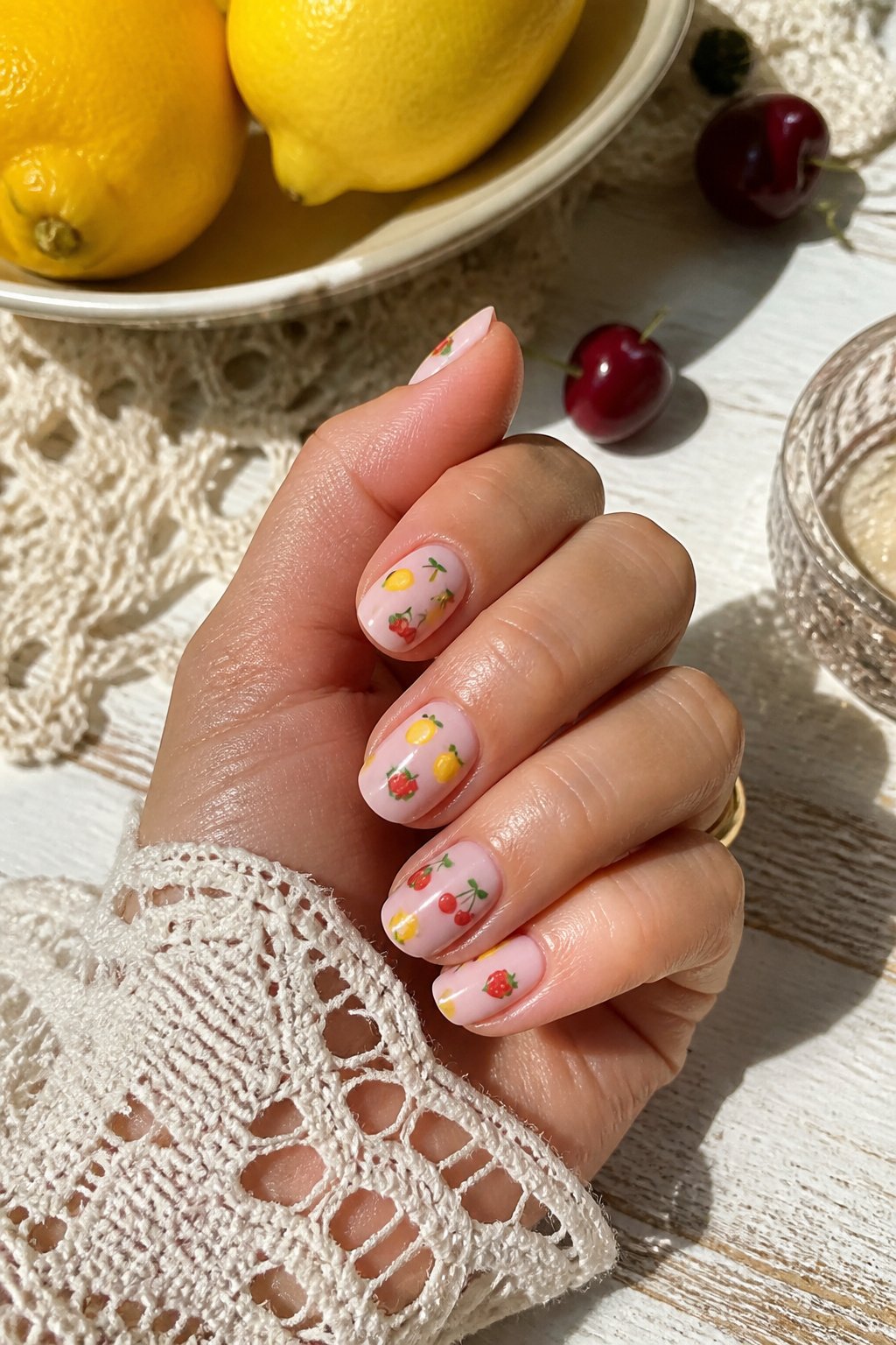
A tiny fruit design forces you to rethink every brush choice. The lemon shrinks to a speck of yellow with a hairline white highlight, not the full wedge you’d paint on a statement nail. Strawberries become pink commas. Watermelons reduce to slivers of rind in green and white, barely wider than the stripe on a toothpick. Cherries are two red dots and a thread-thin stem. The scale changes the approach because detail becomes suggestion; your eye reads the color pairing and fills in the rest.
This density of small motifs works where larger scattered ones fall flat because the eye travels across a field rather than hunting for isolated objects. A single big lemon on each nail reads as five separate pictures. Fifteen miniature fruits across the same surface reads as one continuous pattern, almost like textile print. The hand looks decorated, not illustrated. That difference matters on days when you want the nails noticed but not narrated.
Frequently Asked Questions
What are the best lemon nail designs?
The best lemon nail designs range from 3D lemons and lemon slices to French tips with tiny fruit details, butter yellow almond shapes, and Mediterranean tile accents. Hot pink tips with citrus-adjacent dots, cobalt bases with single lemon punctuation marks, and retro vacation mashups all rank high for summer wear. The strongest designs keep the lemon under a quarter of the nail surface and anchor it to a specific spot like the cuticle or outer corner rather than letting it float.
How long do lemon nails last?
Lemon nails last up to two weeks depending on the application method and how much 3D work they carry. Raised 3D elements are the first thing to snag on hair, purse linings, and keyboard edges, so lower-profile slices that lie flatter across the nail bed survive daily wear better. If you type all day, ask your tech to keep 3D elements under about two millimeters in height or save full lemons for accent nails only.
Can I apply lemon nails yourself?
Yes, many lemon nail designs can be applied at home, especially with press-on nails that hold for up to two weeks with the right patch or adhesive. Press-on sets resist daily wear and stay glossy without chipping, making them practical for solid yellow bases, French outlines, or simple lemon accents. Complex 3D gel or acrylic lemons still require a technician who can sculpt thin layers, match the nail’s arch, and seal the circumference without brittle glue.