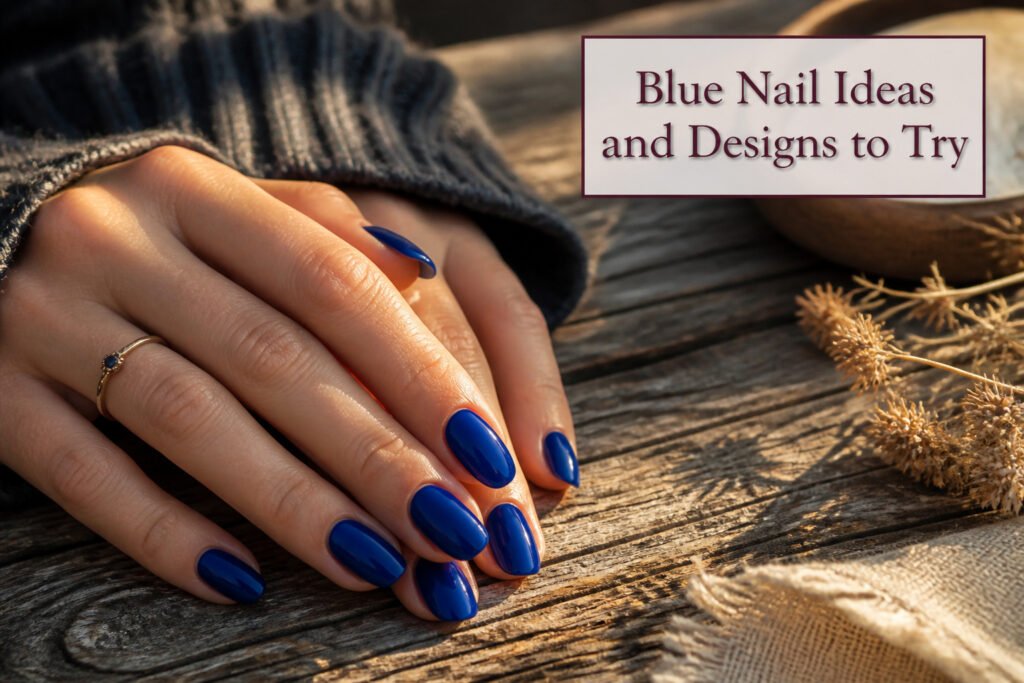
Blue nail ideas for 2026 range from cobalt statements to midnight near-blacks, but the shade that works depends on your skin tone and how much attention you want the color to draw. Cobalt has already been flagged by three separate trend reports, an unusual level of agreement in an industry that typically splits its vote. Fair complexions carry light blue most naturally, while medium and sun-kissed skin pulls ultramarine toward that Yves Klein energy without the full shout of brighter blues.
Cobalt Blue
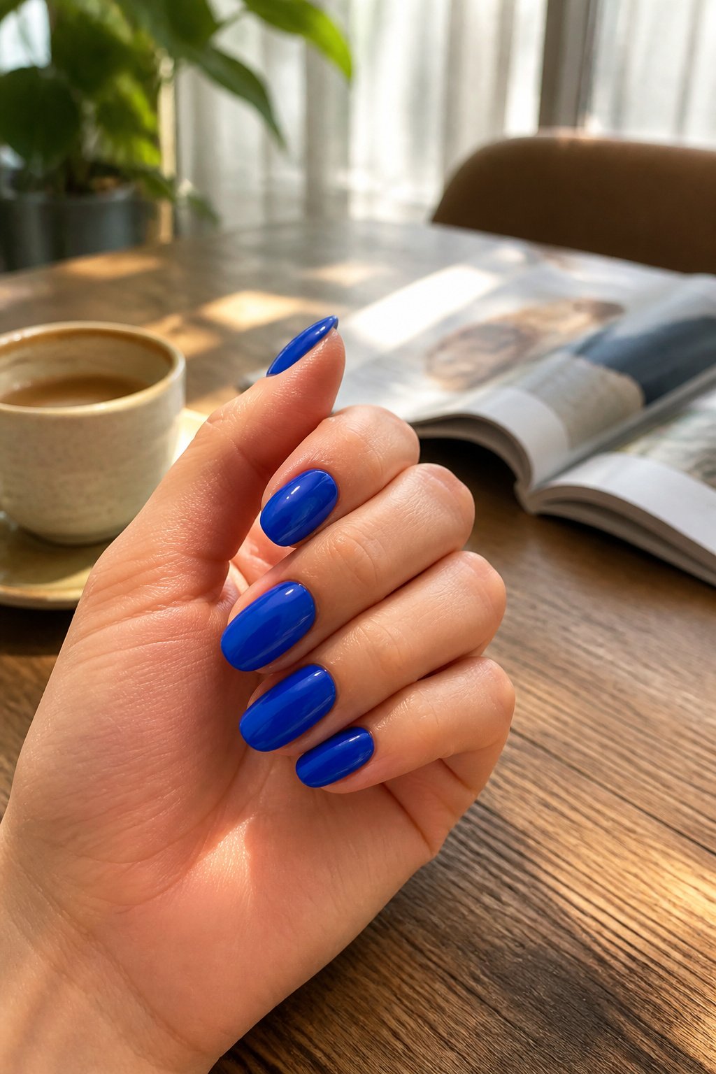
Cobalt blue nails carry that rare balance between loud and polished. Three separate trend reports from the major style outlets have flagged this shade for 2026, which is unusual agreement in an industry that usually splits its vote. The color sits between electric and refined: bright enough to read as optimism, deep enough to avoid the neon edge that can turn a manicure into a costume piece.
On the nail itself, cobalt reads as a solid statement rather than a background. It works cleanly for French tips, mismatched designs, or a single high-gloss coat without art, and it suits summer occasions where you want the color to do the work. Compared with ultramarine, which pulls toward the purple edge of blue, cobalt stays truer and warmer. Compared with navy, it refuses to recede; this is not an office-wallpaper blue.
The current styling favors subtle motifs or a bare accent nail rather than full coverage nail art. That restraint keeps the shade wearable past the first novelty week. Gel formulas hold the saturation best; regular polish can shift toward dusty if the pigment load is thin.
Light Blue
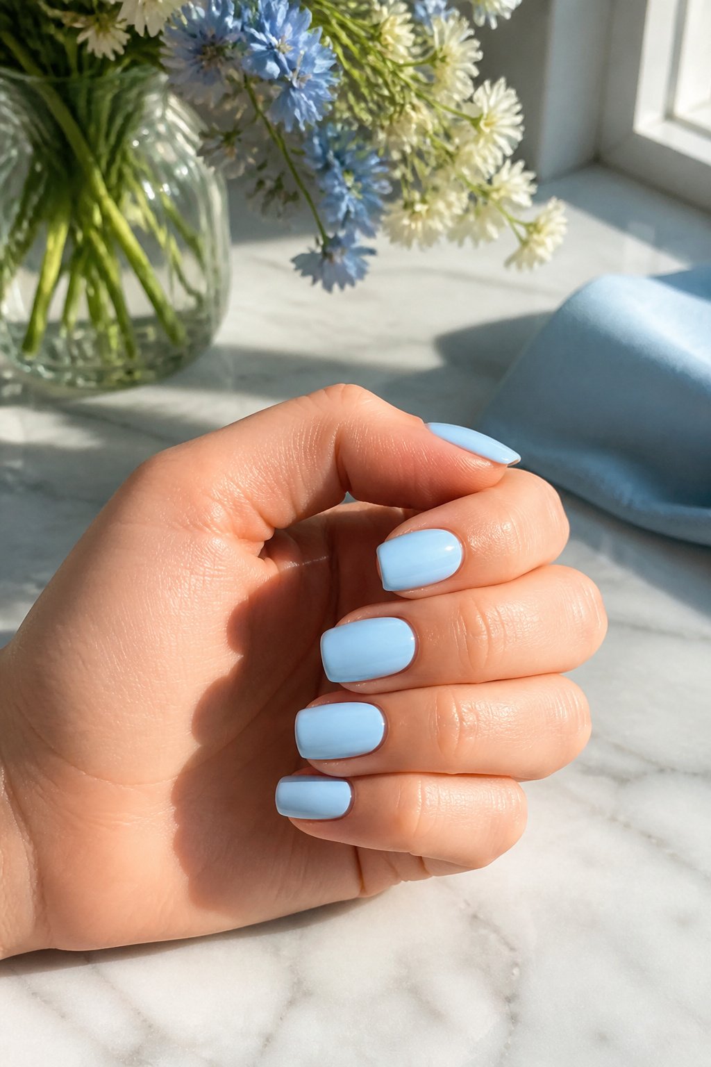
Light Blue carries that early-morning sky quality that makes it read instantly as spring. Two collections singled it out for 2026 specifically, and the choice makes sense: it brightens without competing, and it stays clean-looking longer than you’d expect from a pastel. Fair skin tones pull it off most naturally, where the contrast stays soft and luminous rather than stark. Bubble runs grayer and cooler if you want that same family with more edge, and Lilas shifts into lavender territory for something slightly more dressed-up. All three work with a bare nail or a whisper of ombré, though a full coat of Light Blue alone is what I’d default to for a manicure that needs to last through Easter brunch and into the first warm-weather work week.
Turquoise
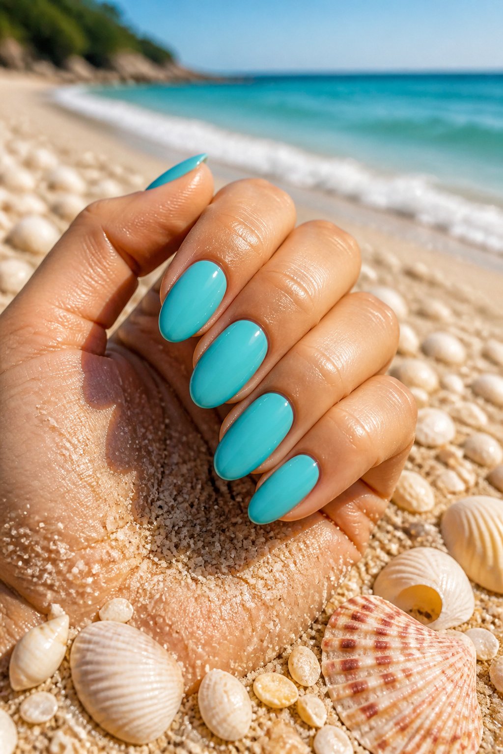
Turquoise sits in that narrow space where blue and green refuse to commit either way, and that indecision is exactly why it works for summer. In morning light it reads greener, almost sea-glass; by late afternoon it shifts toward a truer blue, like the shallow end of a pool. The Riviera shade from the Alaïa Spring-Summer show leans into this instability, catching sun on medium or sun-kissed skin in a way that flatters without trying too hard.
What separates turquoise from its neighbors is the warmth. Teal goes moody and deep; aqua runs too pastel and sweet. Turquoise carries enough yellow undertone to glow against a tan, which is why two separate summer recommendations singled it out for fair and medium complexions alike. Fair skin pulls it toward the pastel range, while deeper warmth lets the shade go electric without tipping into neon.
For wear, the color rewards simplicity. One coat all over, no art needed. The shift in light does the work.
Navy Blue
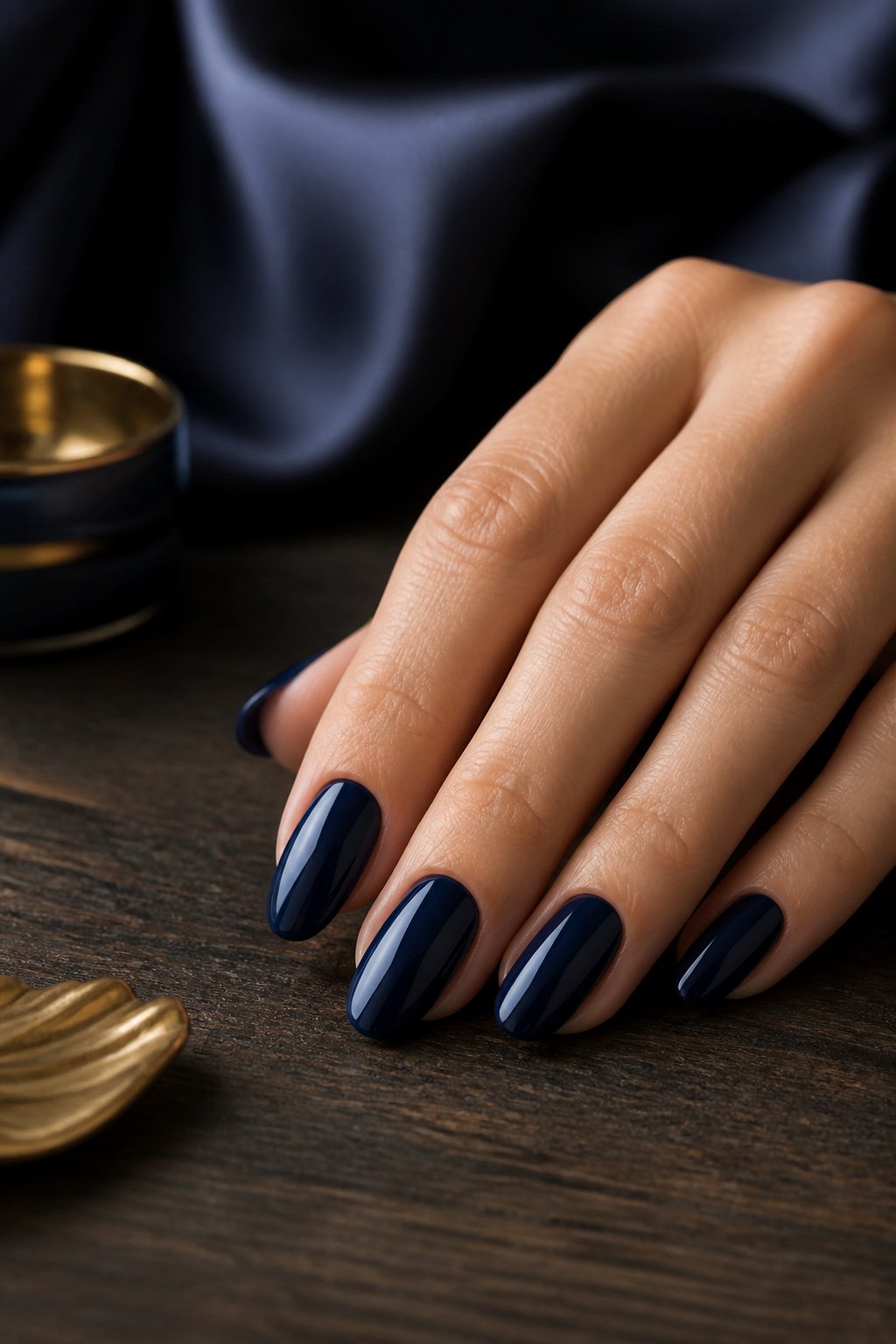
Navy blue sits at the deep end of the blue spectrum where it stops reading as color and starts reading as shadow, which is exactly why it outlasts the trendier blues that cycle through each season. Three separate shade guides call it a universal flatterer, and the logic holds up: that near-black depth pulls the eye toward the nail line instead of the skin tone beneath it, so the effect is polished rather than contrasting. Cool undertones wear it especially well, though the payoff is less about temperature matching and more about the way navy absorbs light instead of reflecting it back onto your hands.
Where this shade earns its keep is in the situations that defeat brighter blues. A navy manicure carries the same visual weight as black without the harshness, so it works for client-facing days, evening events, or any dress code that calls for "neutral" without meaning beige. Pair it with the chrome finishes that are still moving through 2026, or keep it matte against gold jewelry; either route deepens the color rather than competing with it. What has kept navy on permanent rotation while powder blue and cobalt surge and retreat is this flexibility. It reads as intentional in every season, never as a leftover from last year’s trend cycle. The manicure I keep returning to is a single coat of navy over a thin black base, which pushes the color into territory that registers as expensive rather than merely dark.
Ultramarine
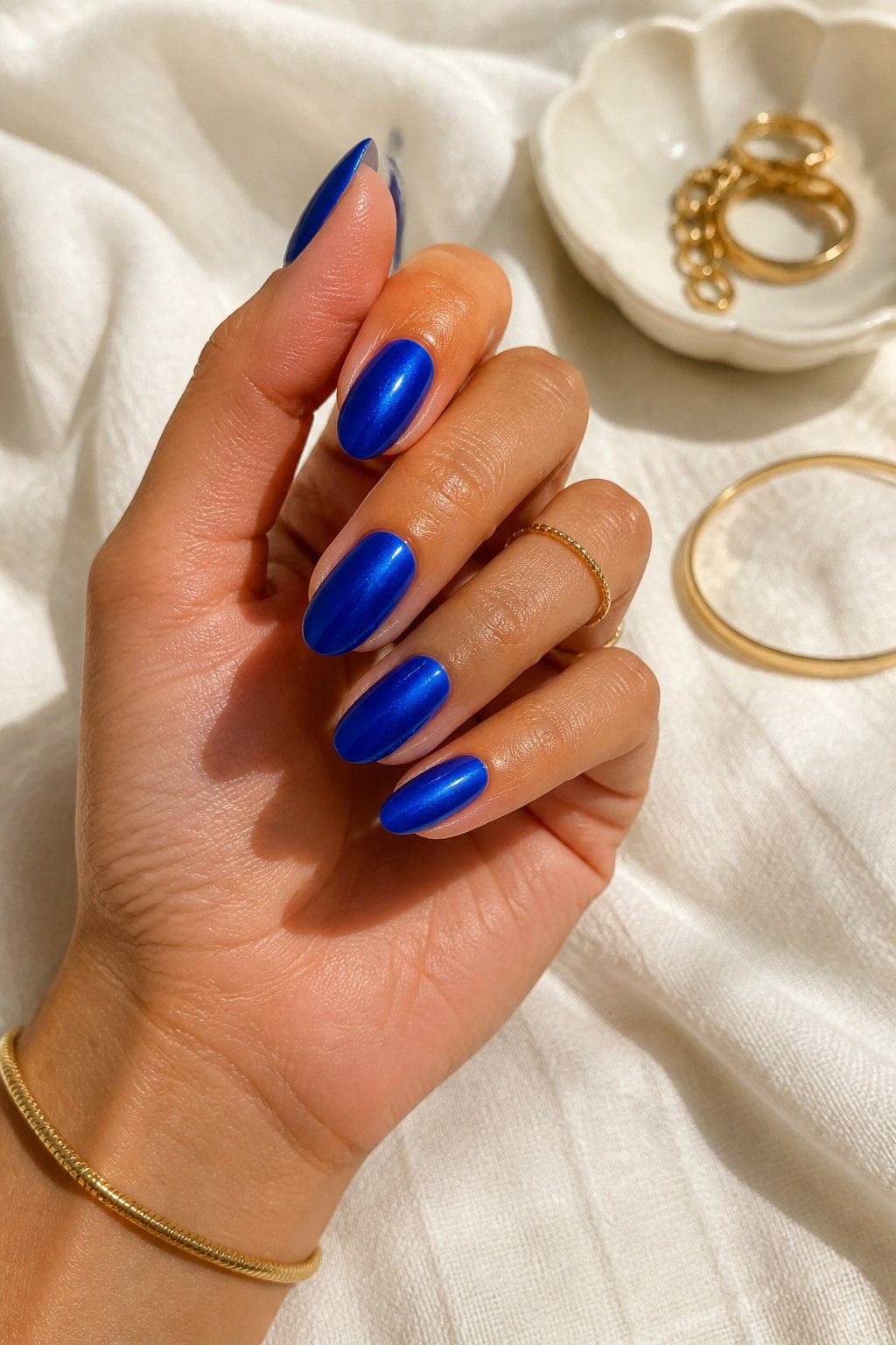
Ultramarine reads deeper than cobalt while still carrying that electric charge. Where cobalt sits bright and open, ultramarine pulls toward violet in the base, giving it a density that photographs almost Klein-blue under direct light but shifts moodier in shade. Manucurist labels theirs a bold summer shade, and Elle’s take puts it as the specific nail color to reach for when you want that Yves Klein energy without the full shout of cobalt.
Medium and sun-kissed skin tones carry this shade best, though the saturation level matters more than undertone alone. Fairer complexions can wear it, but the contrast turns sharp; on deeper skin the violet base gets lost and you might as well run true cobalt or go darker to midnight. The real statement ultramarine makes is controlled drama: bright enough for a white linen vacation outfit, deep enough not to look recreational against black or navy workwear. I would not pair it with turquoise or mermaid accents; the tonal clash fights the whole point of choosing a color this specific. Wear it full nail, no glitter, and let the depth do the work.
Denim Blue
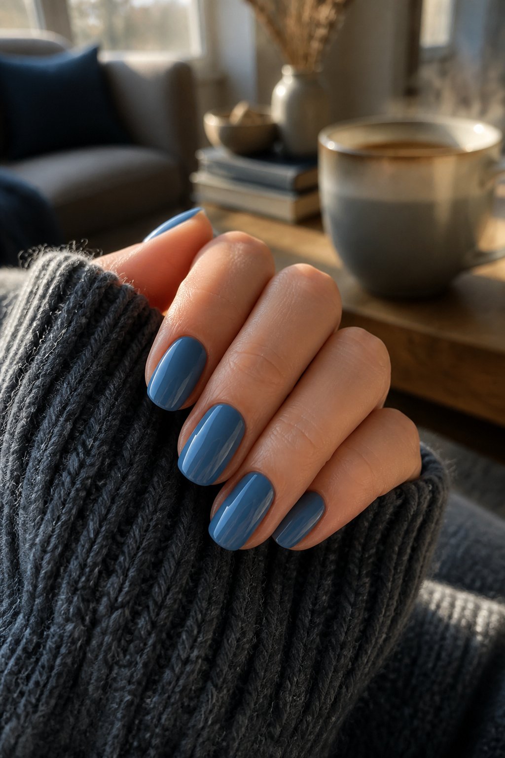
Denim blue nails carry the same quiet usefulness as the fabric they’re named after. The shade sits in that middle space between pale sky and deep navy, dusty enough to read as neutral but still unmistakably blue. On a squoval shape, the color looks polished without trying too hard.
What makes it wearable day-to-day is this built-in versatility. The tone pairs naturally with jeans, obviously, but also softens against cream knits and holds its own against black tailoring. It reads casual with a weekend sweater, then shifts just enough toward dressed-up under office lighting or evening lamps. No single season owns it either; the dustiness keeps it from feeling too winter-heavy or too summer-bright.
For skin tone matching, cooler undertones tend to pull the gray notes forward, while warmer complexions bring out any hidden teal. Either way works. The finish matters more than the exact mix: a glossy top coat keeps denim blue from looking flat, while matte risks turning it muddy. If you’re DIY-ing, look for polishes labeled dusty or faded rather than bright or electric; those descriptors usually hit the right midpoint.
Mermaid
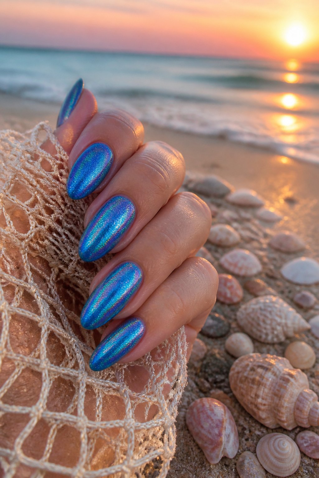
A mermaid blue nail polish earns its name from the holographic shimmer that catches light like moonlight on water, not from any literal fin motif. The translucent base lets your natural nail line show through while the iridescent particles shift between blue and violet depending on the angle, something no opaque cream finish can replicate.
This is the shade that works when you want blue nails that read as jewelry rather than color blocking. On darker skin tones, the contrast is especially striking, and the iridescence flatters medium or sun-kissed complexions in ways flat electric blues sometimes flatten. Fair skin can carry it too, though the shift reads more subtly against lighter backgrounds.
The occasion is where mermaid blue separates itself from your standard navy or cobalt. It carries enough sparkle for evening without the full commitment of glitter, and the translucent build means chips hide better than they would in a solid pigment. Two or three thin layers give you the full water-glass effect; one layer works as a wash over a nude base if you want the shimmer without the full statement.
Wear it solo, or pair it with a bare nail for a graphic negative-space look that still feels pulled together. The holographic quality does the heavy lifting, so you do not need intricate nail art on top.
Midnight
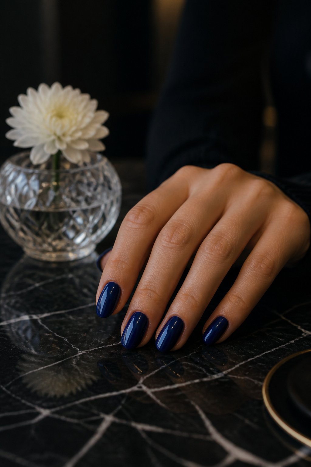
Midnight sits a shade deeper than navy, closer to the edge of black without ever crossing it. Under indoor light, it pools into something almost bottomless, a color that seems to drink the room in rather than reflect it. Step outside, and the same polish shifts, revealing the blue that was hiding there all along, the way deep water flashes color when the sun hits it at an angle.
That near-black quality does something particular to the shape of the nail. Short nails gain weight with midnight on them, looking deliberate rather than stubby, the darkness giving the free edge a defined border that lighter blues blur. Longer nails run a different risk: the same depth that flatters a short square can turn an almond shape theatrical, almost villainous, in a way that works for evening but reads as costume under fluorescent office light.
The skin tone guidance holds up here. Medium and sun-kissed complexions carry midnight most naturally; the warmth underneath keeps the shade from flattening into pure goth territory. Fairer skin needs the balance of a warmer base coat or a hint of shimmer mixed in, something to keep the look from sliding into bruise-adjacent. Darker skin gets the contrast outright, the midnight turning into frame rather than feature, which is often exactly what you want when the rest of the outfit is doing the talking.
A single coat of midnight reads as lazy, patchy, uncertain. Two coats settles it into itself. Three starts to look like vinyl, which is a choice, but not the subtle one this shade does best.
Dark Night
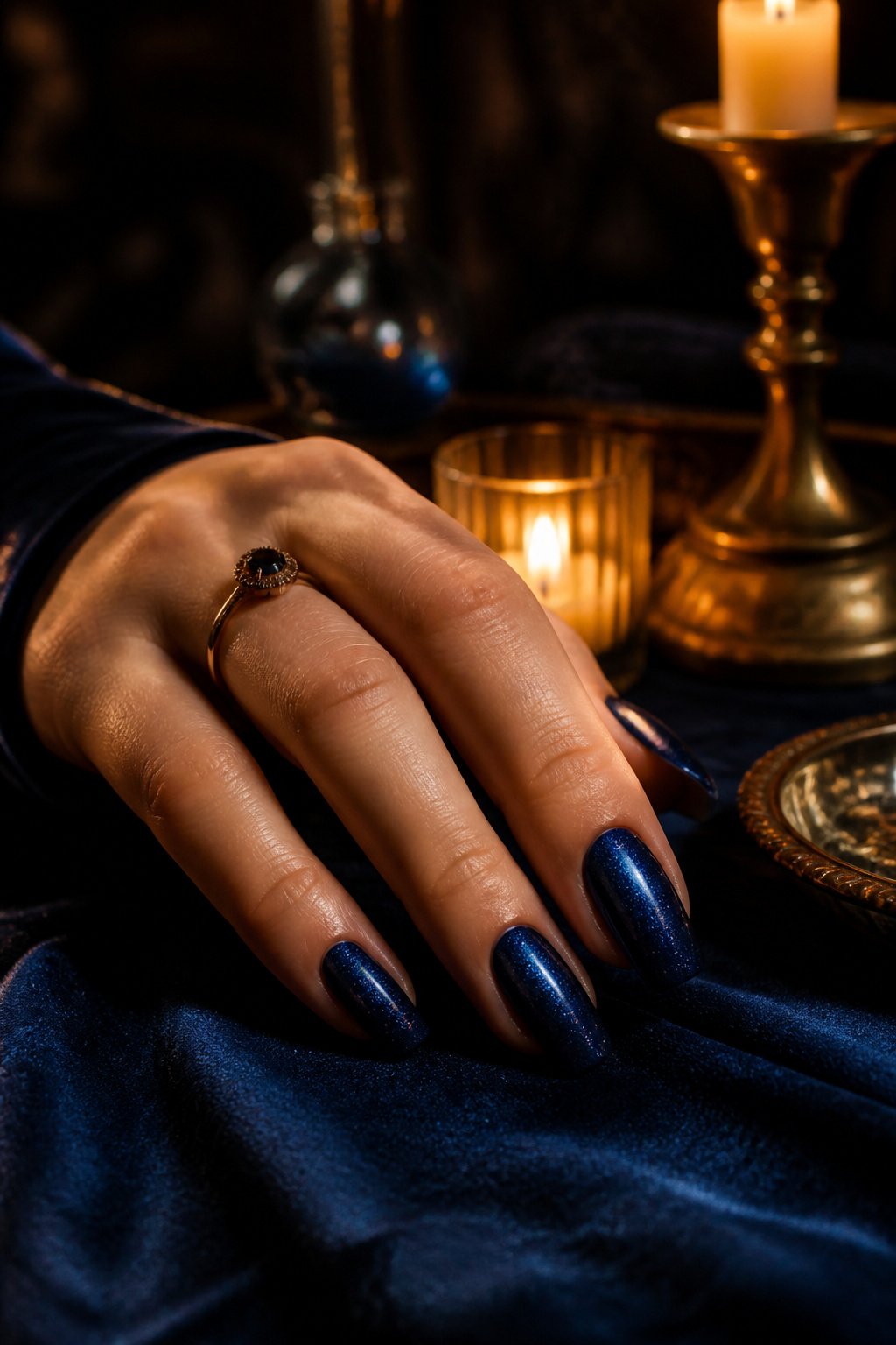
Dark Night sits right beside Midnight on the color wheel, but the two diverge once light hits them. Where Midnight reads as a deep, abyssal blue that pulls toward the ocean, Dark Night carries subtle shimmering reflections that surface only when your hands move under a lamp or across a desk. That near-black base keeps it readable as blue rather than a confused black, but the finish adds a texture true black polish never achieves.
The shimmer matters more than decoration. True black can flatten the nail, making short shapes look stubby and long ones look severe. Dark Night’s iridescent shift catches the eye at the edges, creating depth that flatters all nail lengths without the maintenance of a full glitter topcoat. For medium to darker skin tones, the intensity reads as contrast rather than shadow; on fairer complexions, the shimmer keeps the shade from washing into something purely gothic.
I tend to reach for it when I want the drama of black with a little more movement, something that shifts from office fluorescent to evening candlelight without changing polishes.
Floral Accents
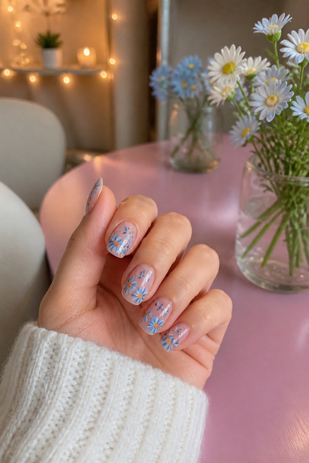
Blue-toned daisies peeking from the cuffs, edges and tips of a sheer, milky base turn a simple manicure into something intentional rather than busy. The restraint matters: one or two petals at the cuticle line, or a small cluster riding the sidewall, keeps the eye moving without overwhelming the nail.
On a true blue base, softer petals read best. White or pale yellow daisy centers pop against cobalt or navy without fighting for attention, while green stems or leaves tie back to the cool undertone of the blue itself. Metallic gold dots at the flower center, borrowed from night-sky techniques using a fine brush, add just enough warmth to keep the palette from going flat.
The art typically stays small. Mini hearts or micro-florals on one finger, maybe two, preserve the statement quality of the blue underneath. Full-coverage botanicals on every nail tip the design from playful into costume; the sources that rank well for this look keep the placement scattered, the scale thumbnail-sized, and the base either sheer enough to breathe or deep enough to read as a solid field behind the accent.
Micro French Tips
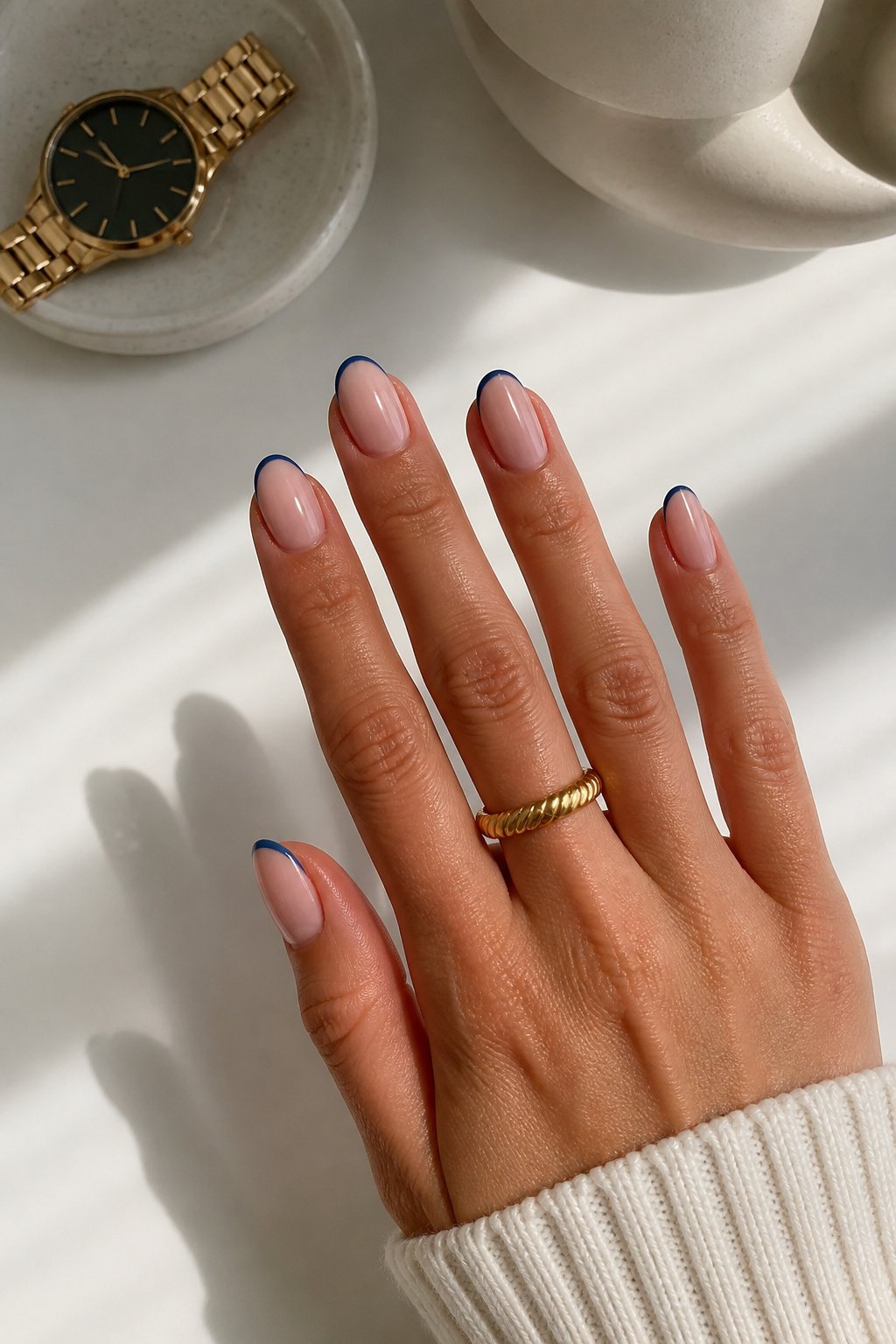
A micro French tip keeps the colored line to about one millimeter, maybe two, along the free edge. Anything wider starts reading as a standard French manicure, and the whole point of this look is restraint.
The blue swap is straightforward: replace the traditional white with a fine line of navy, indigo, or midnight blue against a sheer or neutral base. One pairing that works is a barely-there pinkish layer with a dark blue tip; for more contrast, a bright, clean base sets off an ultramarine line.
What makes the micro width worth the effort is that it stays wearable. The sources frame this as the middle ground between invisible and loud: graphic enough to register, minimal enough for an office or a weekend without a second thought. Precision matters more than color choice here. A shaky hand or a too-thick brush turns the line from sleek to sloppy fast, so a striping brush or a careful dot of polish dragged across the edge beats a standard brush every time.
Ombre Effects
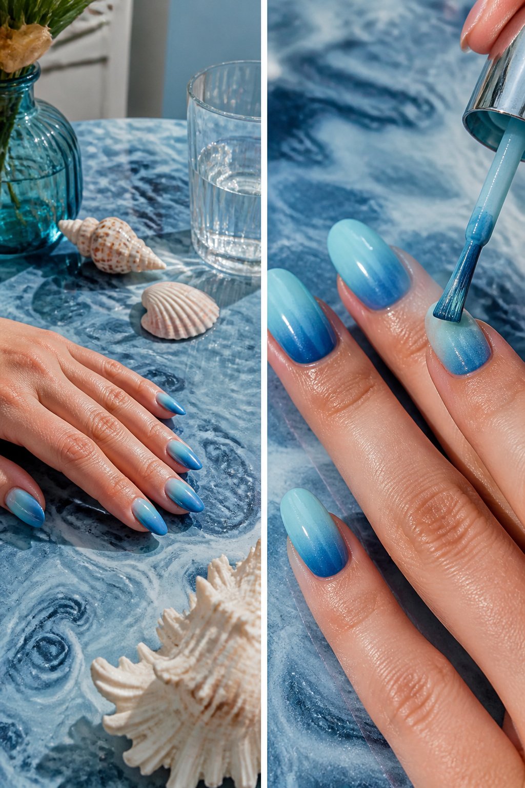
A single-source ombre asks the polish to do the work instead of your brushwork. Two blues on the same strip, blended where they meet with a damp sponge or a thin fan brush, gives the softest shift. Blue into blue is forgiving because the tones are already cousins; a midnight melting into steel stays elegant even if the middle band is half a millimeter off. Blue into another color, say a slate fading to dove gray, needs more care because the eye catches a harsh line where warm meets cool.
The technique sits at intermediate level, not beginner. You are managing wet times across ten nails so nothing sets before you blend, and the sponge method eats polish fast, which means budgeting extra product or accepting a streaky first pass. What convinced me, reading through a dozen tutorials, is that the people who get it cleanest work in thin coats and stop at two. A third pass for depth usually turns the transition muddy.
Tie and Dye
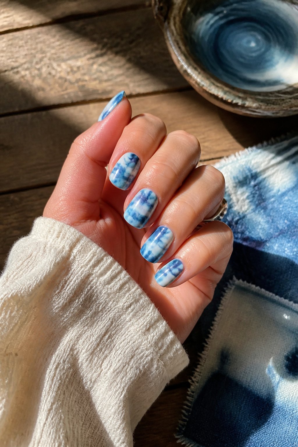
Tie and dye on nails borrows the same logic as the fabric technique: color spreads and swirls without a hard edge. The transfer works because polish stays wet long enough to push around, unlike acrylic paint that sets in seconds. A sponge dabs the gradient on, usually over a white base such as Milky White, and the tool matters more than the shade. I have seen the best results with two blues that share a temperature, both cool or both warm, since clashing undertones turn muddy where they meet. Midnight mixed with Lilas, for instance, keeps that oceanic watercolor look because both carry a violet trace. The swirls come from working while the layers are still tacky, not from any special brush. A wooden cuticle pusher or even a toothpick dragged through wet polish creates the ripple. Prep still rules the outcome: a buffer sponge opened nail plate and a degreased surface keep the soft colors from lifting at the edges by day three.
Aura Nails
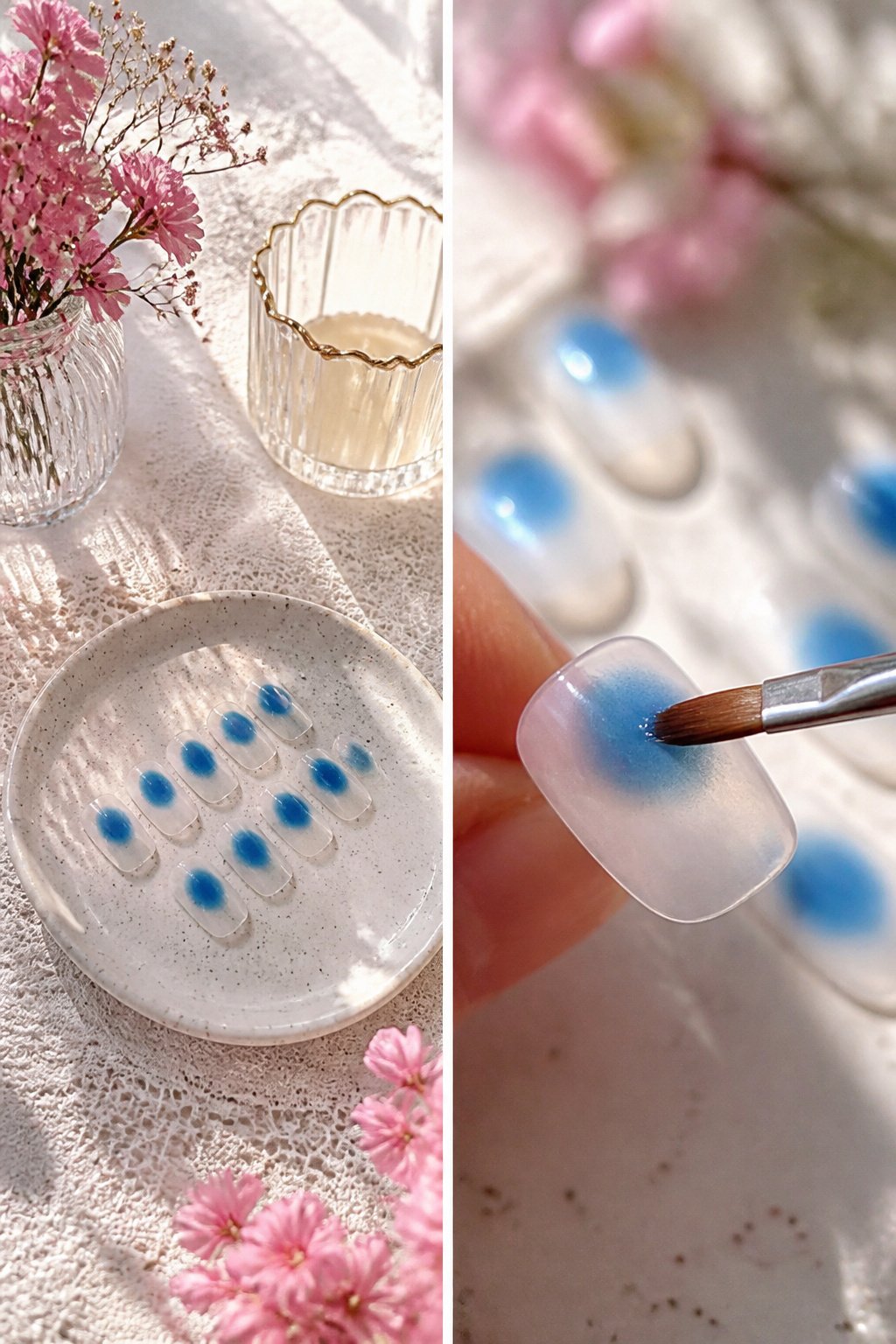
Aura nails get their name from the way color seems to radiate outward like an energy field around the finger. The visual effect is a circular gradient, not the straight-band fade of an ombre. A halo of lighter blue rings a deeper center, so the nail looks lit from within rather than shaded from tip to base.
The distinction matters when you are choosing a technique. Ombre runs color along the length of the nail; aura concentrates it at the center and lets it feather outward in all directions. Sources describe the result as ocean-at-dawn, a dreamy wash where Hortencia forms the base, a touch of Light Blue softens the middle ring, and Ultramarine anchors the very center. The sponge application is what creates that blurred, atmospheric edge rather than a hard line.
For blue nails specifically, the palette stays in the same family: powdery outer tones moving toward saturated depth at the core. The near-translucent outer ring is what gives the design its reflective, almost weightless quality, especially on longer nails where the gradient has room to breathe. Shorter lengths work, but the full effect needs enough surface for the color transition to read as circular rather than just a spot in the middle.
Cat Eye
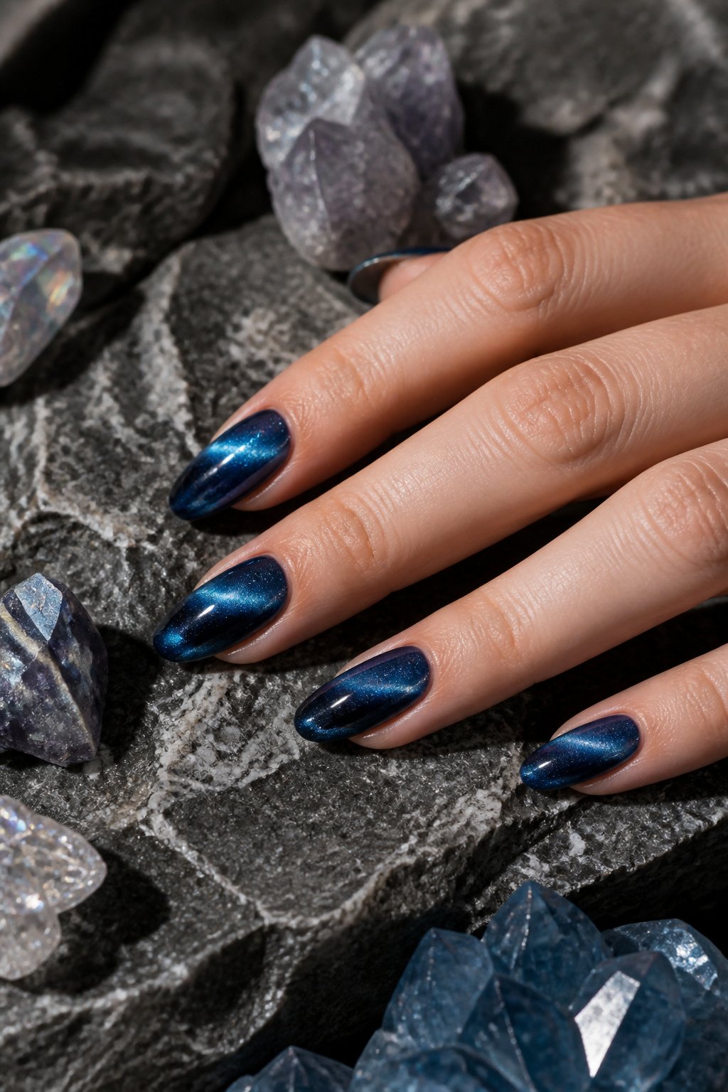
Magnetic polish, sometimes called cat eye, builds its effect from iron particles suspended in the gel. Hold a small magnet over the uncured layer and those particles pull into a narrow band that catches light like the slit pupil of a cat. The line stays fixed once the lamp cures it, but the shimmer travels as the hand turns, brightening and dimming with each angle.
A stony sapphire blend with a cool, velvety finish carries the cat-eye trend into summer 2026 better than flat color ever could. The magnetic streak gives the blue depth without clutter, and the movement of the hand does the work of ornament. Deeper autumn blues like a smoky azure or an intense blue-gray also take the effect well; the darker ground makes the light-catching line stand out sharper. What fails is choosing a blue so pale the particles have no contrast to push against, or so glitter-heavy the magnetic line fights for attention. Two coats, magnet held steady ten seconds, cure. The result shifts from office dim to afternoon window without ever looking like the same nail twice.
Star Motifs
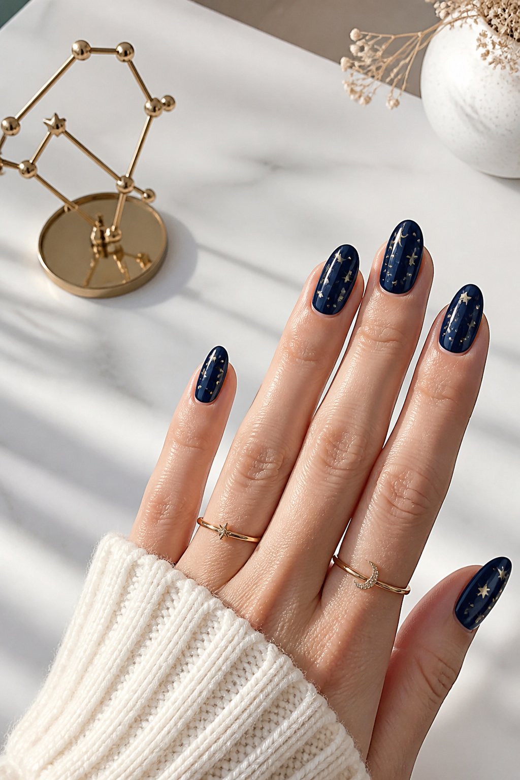
A single star motif on a navy base reads like a deliberate choice rather than a leftover sticker. The Manucurist method uses Navy Blue as the base and Metallic to dot on the stars, which gives them that slight lift without turning the nail into a Christmas ornament. Metallic finish wins here because it catches light the way matte or cream never will; on a dark blue, matte stars sink in and disappear at arm’s length.
Scattered placement works for everyday wear. One star near the cuticle, another floating toward the tip, keeps the eye moving without demanding it. Focal placement, a single larger star dead center, shifts the nail into statement territory and needs the rest of the hand quiet to support it.
The 2026 runway push for blue at Acne Studios and Burberry makes this feel current rather than childish, but the finish is what controls that. Glazed or pearly effects on the base, as Lebrat-Personnaz suggests for cobalt, would push star motifs into something almost mermaid-like, which is a different mood entirely. For the clean version, keep the base glossy and the stars metallic, and stop before you add a third element. Two finishes is enough; three competes with itself.
Graphic Blue Nail Art
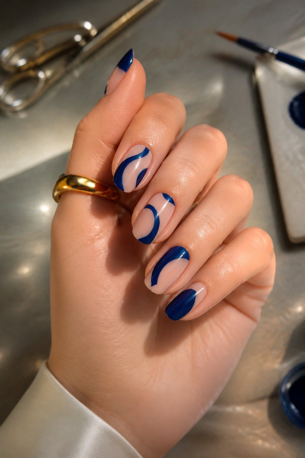
Graphic blue nail art works best when it leaves something out. The sources show two ways to play this: bold shapes against bare nail, or blue layered over a nude base so the negative space reads as part of the design. Pairing Riviera or Ultramarine with a nude polish like Active Smooth creates that graphic punch without crowding the whole nail.
The shapes that read as graphic rather than delicate are simple and weighty. Wavy lines drawn with a fine brush, scattered dots in Ultramarine, a block of Navy Blue with Metallic stars placed sparingly. These hold up because the lines are thick enough to see from a distance and the spacing is deliberate. A manicure that tries too many elements at once loses the effect; two or three well-placed marks per nail does the work.
Negative space is doing the heavy lifting here. The sources suggest either a full nude base with blue on top, or blue as the ground with nude or metallic breaking it up. Either way, roughly half the nail stays quiet. That restraint is what separates graphic from busy, and it is why this style lasts through a week of wear better than something that covers every millimeter.
Glazed Finish
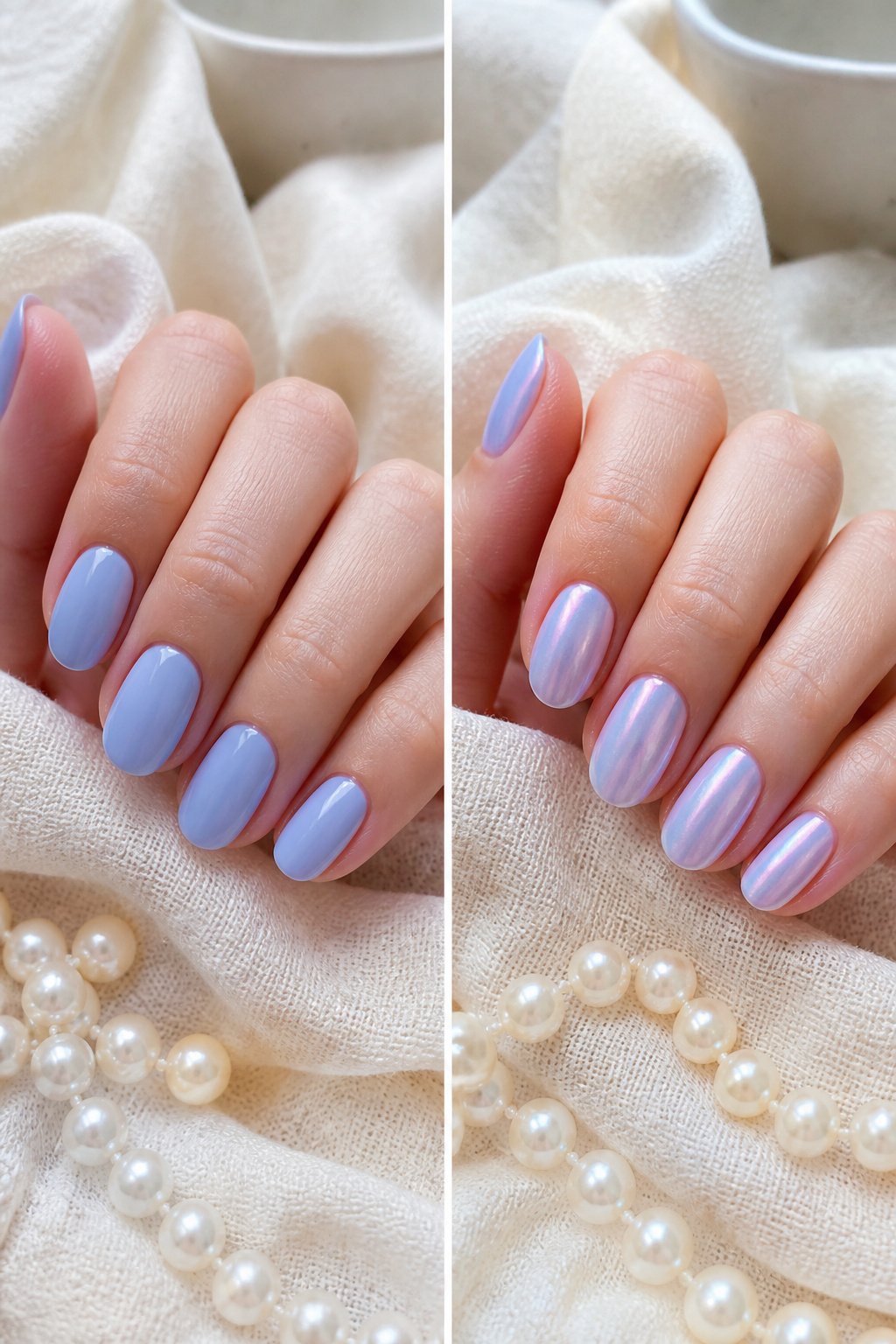
A glazed finish is a single-source translucent layer, not a topcoat from a separate bottle, that lets the blue beneath show through while muting it into something softer and more dimensional. The effect reads as lit-from-within rather than sitting on top, which is why it caught on after the Hailey Bieber "glazed donut" nails went viral in 2022. Standard gloss adds reflectivity but stays clear; pearl introduces white or ivory shimmer that shifts the underlying color toward opalescence. Glaze does neither. It suspends a whisper of pigment, often silica or mica-based, in a sheer base that filters the blue without overpowering it. On cobalt, the result is almost stained-glass; on lighter blues, it turns milky and atmospheric.
"This summer, we’re seeing both a return of playful colour and ultra-glossy ‘healthy nails’. Vibrant blues, juicy oranges, sheer pinks and glazed finishes are everywhere."
— Elle
What that means for your manicure: if your blue feels too loud or too flat, a glazed layer is the middle path that keeps the color alive while making it wearable for everyday. The technique works best over a fully cured base color, applied thin enough that the nail line still shows some depth. Too thick and you lose the translucency entirely; too thin and the effect reads as merely dull.
Pearly Effects
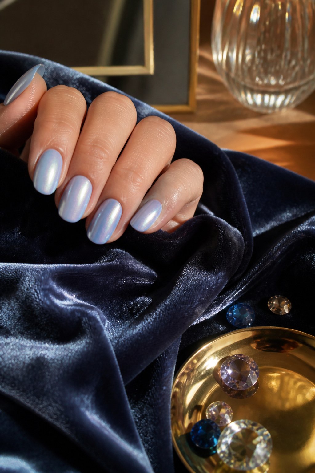
Pearl shifts blue away from flat color and toward something that catches office light or candlelight differently depending on the angle. On a short, rounded nail, that shift reads modern; the same finish on a long square tip starts to feel like a prom manicure from 2003. The sweet spot is softly squared or short almond lengths, where the iridescence has enough surface to play but not so much that it turns theatrical.
Skin tone matters for which pearl to pick. Fairer complexions suit pastel blues with a shimmering shift, while medium or sun-kissed skin carries electric or midnight bases with iridescent topcoats far better. Darker skin tones need the richer, more saturated pearl blues to avoid a washed-out effect.
A pearly blue also works as a detail rather than a full coat. A micro-French line in pearlescent cobalt over a milky base gives the finish a contemporary frame without the vintage baggage. The key is keeping the line thin and the base sheer; too much opacity on either layer and the look drifts toward costume.
Glossy Finish
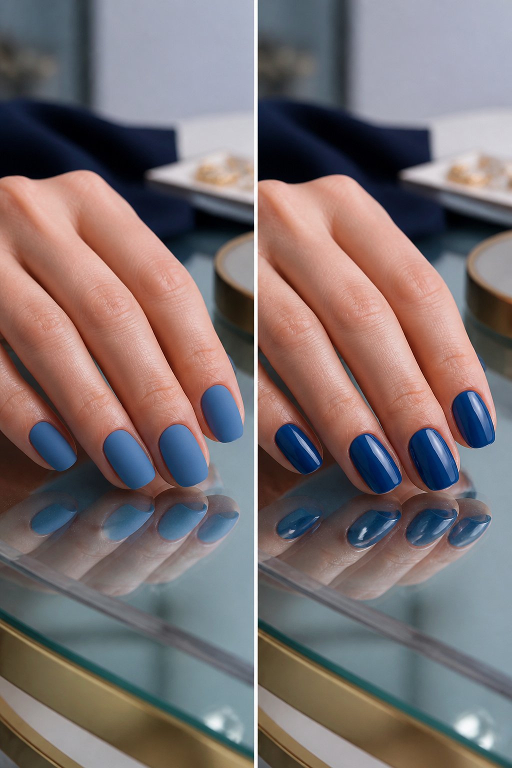
A glossy topcoat is the fastest way to make any blue polish feel finished. The wet-looking surface catches light evenly, so the color reads as deeper and more saturated than the same shade under a matte sealant. That depth matters especially with blues, since mid-tone and darker blues can flatten out and look dusty once the shine disappears.
Matte finishes have their place, but they tend to mute the dimension that makes blue interesting in the first place. A navy or midnight blue under matte topcoat reads closer to charcoal; under gloss, it keeps the cool undertone that distinguishes it from black. Glossy blue nails suit evening and professional settings where you want the color to register as intentional, not experimental.
The practical downside is maintenance. Gloss shows every smudge and growth at the cuticle line within days. For someone who wants a blue manicure to last a full work week without touch-ups, the same color in a satin or glazed finish hides wear better. Gloss rewards the person who either does not mind frequent upkeep or treats polish as a two-day accessory rather than a long-term commitment.
Blue by Season
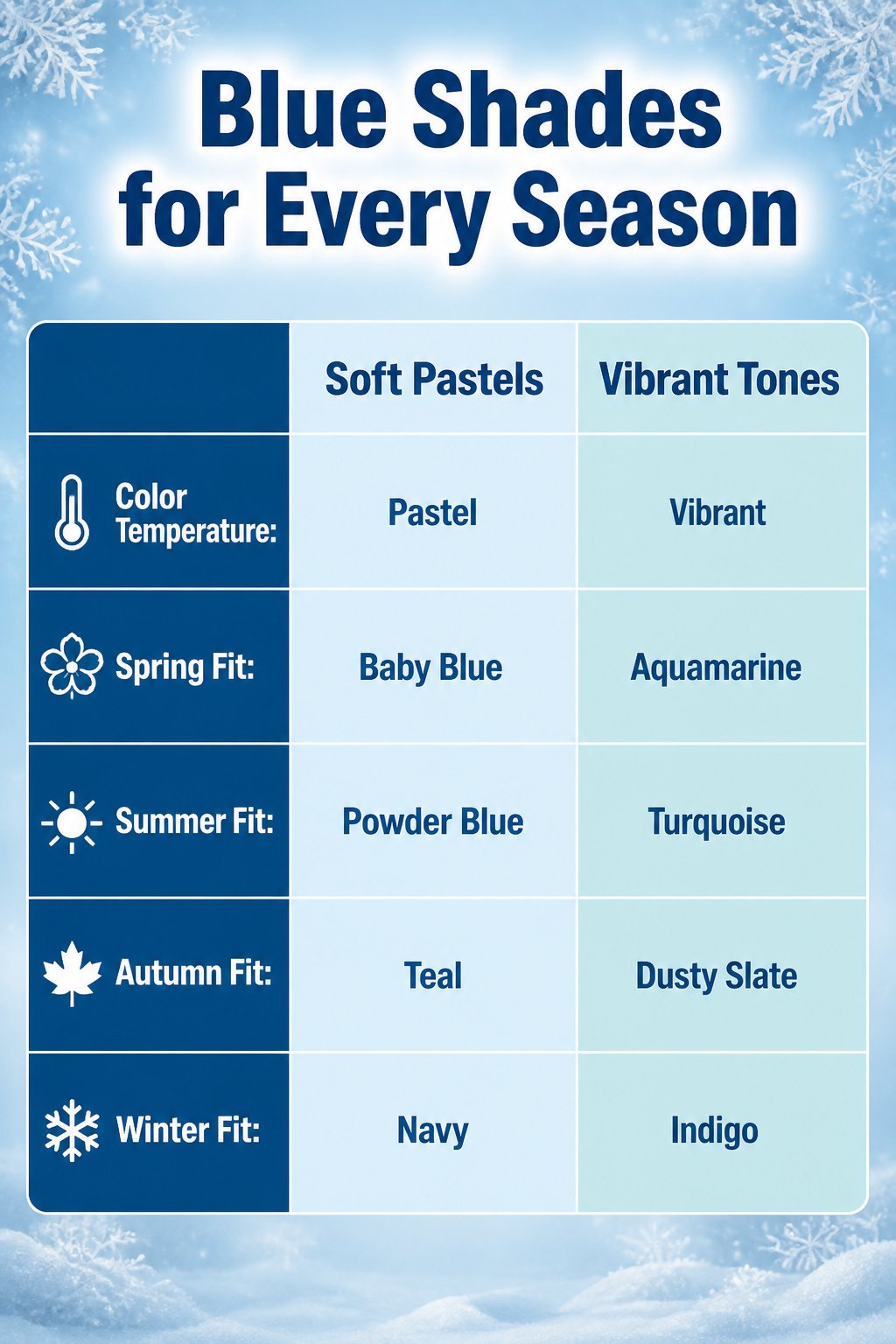
Soft pastels like baby blue and powder blue feel right when the light starts shifting in March, though I used to grab them too early and watch the color clash with bare branches and gray sidewalks. By June, the same hand wants something louder: aquamarine, cerulean, or a straight-up swimming-pool turquoise that reads as water rather than sky. Autumn pulls those tones toward warmth; a teal with enough green in it, or a dusty slate blue, picks up fallen leaves better than anything icy ever could. Winter is where the depth lives. Midnight navy, indigo dark enough to look black in low light, or a sapphire with real pigment density holds up against wool coats and early sunsets. The mistake is treating blue as one color year-round and wondering why the same bottle feels off by October. Shade temperature matters more than the hue itself.
Nail Art Techniques
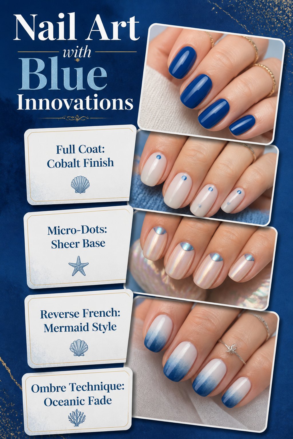
Blue serves as a remarkably flexible starting point for nail art, working either across the whole nail or as a precise accent. On short, rounded or softly square nails, a full coat of cobalt in glazed, pearly or ultra-glossy finish reads modern without trying hard. For something quieter, micro-French tips in the same cobalt shade keep the color at the edge where it frames the nail rather than dominating it.
Minimalist applications let the blue itself carry the weight. A milky or sheer base with micro-dots placed at the center of the nail bed and near the cuticle adds just enough color to register as intentional. Mini hearts or small floral designs restricted to one finger follow the same logic: the blue makes the statement so the layout can stay simple. Reverse French designs or chrome effects push this toward an almost mermaid-like finish without tipping into costume.
For more involved techniques, blue handles ombre and watercolor gradients cleanly. A sponge application of Midnight mixed with Lilas over a white or milky white base gives an oceanic fade that still reads as nail art rather than a technique demo. Wavy lines in Lilas over a deep Dark Night base mimic sea ripples; Navy Blue with Metallic dotted on top builds a night sky. The common thread is that blue at any depth works as either the ground or the figure, and the manicure stays wearable so long as you choose which role it plays before you start painting.
Skin Tone Matching
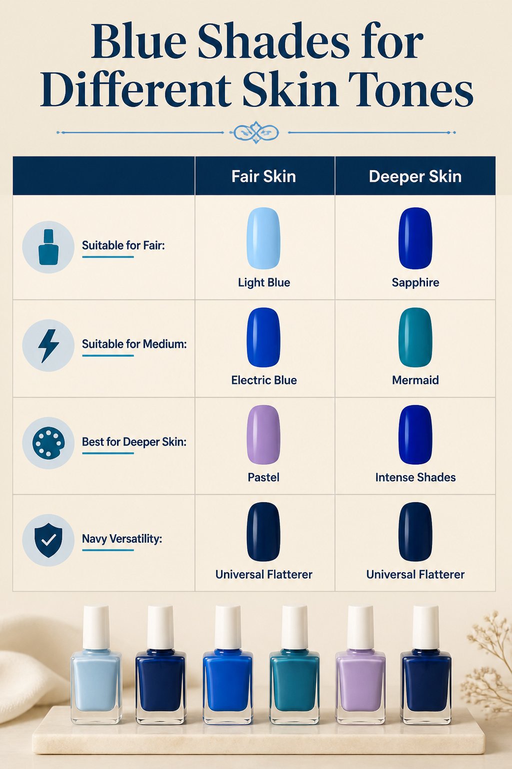
Lighter blues sit better on fair skin, where pastel shades like light blue or lilac keep the contrast gentle rather than chalky. Medium and sun-kissed tones carry electric or midnight blues more naturally, and deeper skin makes the most of vibrant, intense shades like sapphire or mermaid. The standard advice holds up, but navy breaks the rule entirely: it flatters every tone, a rare neutral in a color family that otherwise demands matching.
Testing before committing to a full bottle is simple enough. Most brands sell mini sets or offer swatch sticks in-store; holding the dry swatch against your inner wrist in natural light shows whether the blue pulls gray, purple, or green against your particular undertone. Drugstore displays with removable color strips work the same way if you are already running errands.
I have watched friends skip this step, buy a pastel on trend, and realize only at home that it washes them out. The waste of an unused bottle is what the two-minute test prevents.
Frequently Asked Questions
What are the best blue nail colors for summer?
Turquoise and ultramarine are the two summer standouts. Turquoise shifts between green and blue depending on the light, so it flatters sun-kissed or medium skin without tipping into neon. Ultramarine carries that electric Klein-blue charge that works against white linen vacation outfits yet still reads as controlled against darker workwear. Both shade specifically brighter and warmer than year-round navy or cobalt, and both are called out in dedicated summer guides.
How do I choose the right blue for my skin tone?
Fair skin does best with pastels like light blue, lilas, or turquoise toward its lighter range; the soft contrast stays luminous rather than stark. Medium or sun-kissed complexions carry electric blues such as ultramarine and midnight most naturally, since the underlying warmth keeps deep shades from flattening into goth territory. Darker skin tones get the strongest payoff from vibrant or iridescent blues, mermaid shimmer, and dark night, all of which create contrast rather than receding visually.
What nail art designs can I create with blue polish?
Floral accents in blue-toned daisies on a milky base, micro French tips in navy or midnight against sheer pink, ombre effects blending two blues with a damp sponge, tie-dye swirls over white using a toothpick dragged through wet polish, aura nails with a halo of lighter blue around a deeper center, cat-eye magnetic lines in sapphire, scattered metallic star motifs on dark blue, and bold graphic shapes or negative-space blocks in Riviera or ultramarine on a nude ground.